4 Summarizing Data with Pictures
4.1 The Maps That Showed What Everyone Already Knew
In the 1930s, the federal government’s Home Owners’ Loan Corporation sent agents into 239 American cities to evaluate neighborhoods for mortgage lending risk. The agents drew maps. They shaded neighborhoods in four colors. Green meant “best,” areas deemed safe for investment. Blue meant “still desirable.” Yellow was “definitely declining.” Red was “hazardous.”
The red zones, overwhelmingly, were where Black Americans and other minority populations lived.
These maps became the architecture of a system known as redlining. Banks used them, or maps like them, to deny mortgages to residents of red-shaded areas. The Federal Housing Administration used similar logic to guarantee loans in white suburbs while refusing them in integrated or minority neighborhoods. Over decades, this system funneled wealth into some communities and starved others. The effects compounded. Neighborhoods denied investment deteriorated. Deteriorating neighborhoods were cited as evidence that the original ratings were correct. The cycle fed itself for generations.
For years, researchers documented redlining’s legacy using tables of numbers. They calculated disparities in homeownership rates, differences in median household wealth, gaps in school funding. The numbers were damning. They were also, for many audiences, abstract. A table showing that the median Black household holds one-tenth the wealth of the median white household is a fact. It is an important fact. But it can sit on a page without making the pattern immediately legible or hard to dismiss.
Then came the maps.
In 2016, a collaborative team of researchers at the University of Richmond’s Digital Scholarship Lab, Virginia Tech, and the University of Maryland launched Mapping Inequality, a project that digitized and overlaid those original 1930s HOLC maps onto modern cities. Suddenly, anyone with a web browser could see the red-shaded zones from the 1930s and compare them to today’s patterns of poverty, health outcomes, environmental hazards, and racial demographics. The overlap was striking. Not surprising to anyone who had lived through that history, but striking to see in color on a screen.
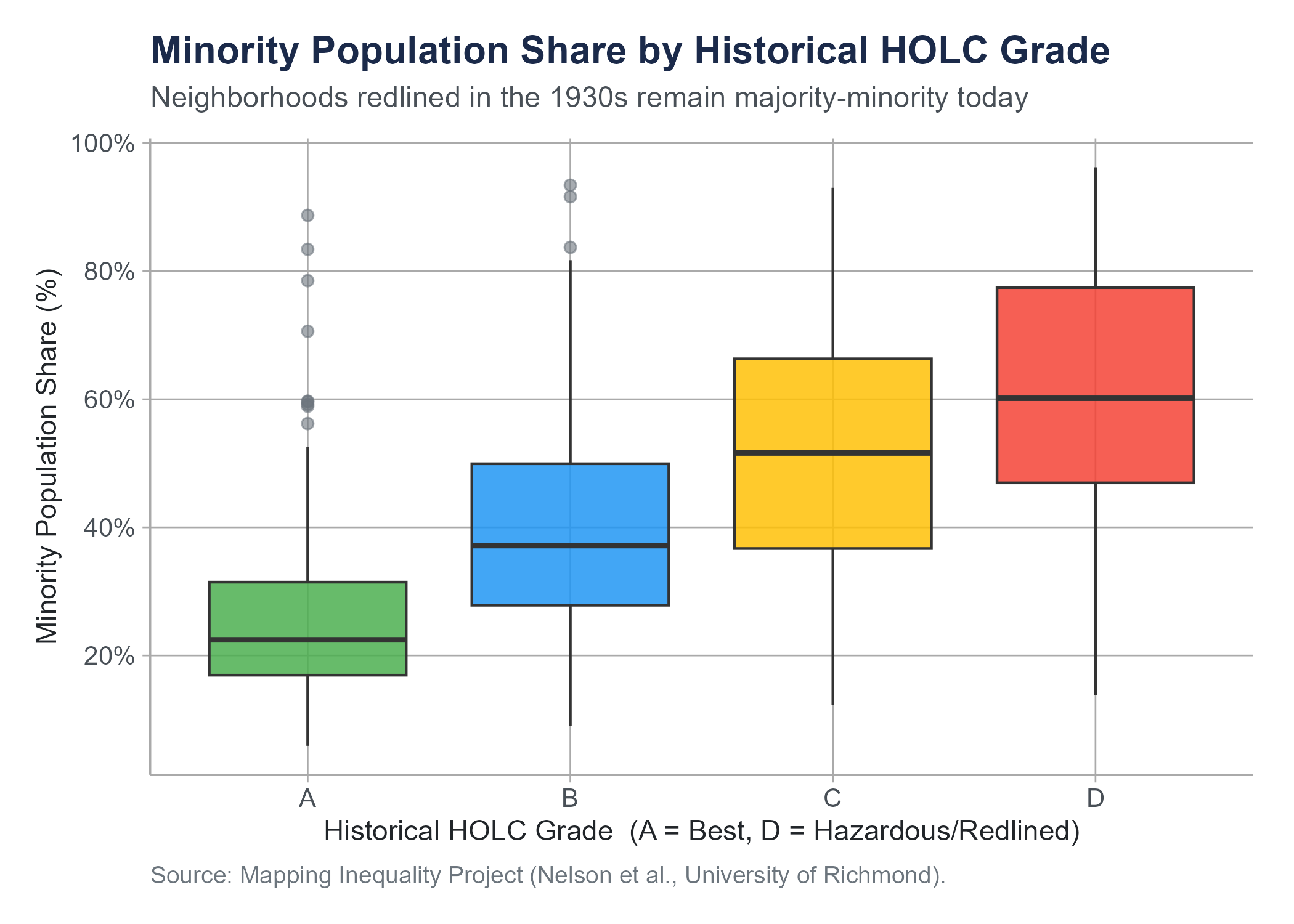
Researchers at the National Community Reinvestment Coalition used these visualizations alongside quantitative analysis to demonstrate that neighborhoods redlined decades ago remain disproportionately low-income and minority today. A 2018 study by the NCRC found that 74% of neighborhoods graded “hazardous” eight decades ago are still low-to-moderate income, and 64% are still majority-minority communities. The numbers told the story. The maps made you see it.
The figure below makes that 64% claim visible in data drawn directly from the Mapping Inequality project. It is a type of chart called a box plot, which we define formally in Section 4.4. For now, read each box as a compact summary of the distribution of minority population shares within neighborhoods of that historical HOLC grade: the line inside each box is the median, the box spans the middle half of the data, and the points are neighborhoods far from the typical pattern. The gradient from Grade A to Grade D is unmistakable.
For an interactive StoryMap exploring the geographic footprint of redlining and its present-day consequences, visit: storymaps.arcgis.com/stories/e32a080e412446ddb073f1cf8d4e3fa9
The original Mapping Inequality interactive project, which lets you browse digitized HOLC maps for any major American city, is at: dsl.richmond.edu/panorama/redlining
This is what data visualization does at its best. It takes patterns that exist in tables and formulas and makes them visible, immediate, and hard to ignore. A well-made chart does more than present information. It creates understanding. And sometimes, as in the case of redlining, it creates the kind of understanding that leads to action.
This chapter is about learning to create that kind of understanding. We will cover the major types of statistical visualizations, when to use each one, how to read them, and how to recognize the many ways they can deceive. Along the way, we will encounter a concept that ties visualization to analysis in a fundamental way, the idea of correlation, and we will spend serious time on why correlation is one of the most abused concepts in public discourse.
4.2 Principles of Effective Visualization
Before we get into specific chart types, let us establish some ground rules. Not every picture is worth a thousand words. Some are worth about twelve, and several of those words are unprintable.
Edward Tufte, a statistician and artist whose books on data visualization have become foundational texts in the field, proposed a concept he called the data-ink ratio. The idea is simple. In any visualization, some of the ink on the page (or pixels on the screen) represents actual data. The rest is decoration: gridlines, background shading, 3D effects, clip-art icons, that sort of thing. Tufte argued that we should maximize the proportion of ink devoted to data and minimize everything else. Every drop of ink that does not convey information is visual noise that makes the data harder to read.
This does not mean charts should be ugly or spartan. It means every element should earn its place. A gridline that helps the reader estimate a value is useful. A gradient background that exists because it looks fancy is not. A legend that identifies groups is necessary. A decorative border is clutter.
Here are some practical principles that will serve you well throughout this course and in any work involving data.
Show the data. The purpose of a visualization is to reveal patterns in data. If the chart obscures the data, something has gone wrong. Three-dimensional bar charts look impressive and make it nearly impossible to accurately compare bar heights because of the perspective distortion. A flat bar chart is always better.
Choose the right chart for your question. Different chart types are designed for different purposes. A histogram shows the distribution of a single numerical variable. A bar chart compares counts or proportions across categories. A scatter plot shows the relationship between two numerical variables. Using the wrong chart type is like using a hammer to drive screws.
Label clearly. Every axis needs a label with units. Every chart needs a title or caption that tells the reader what they are looking at. If colors represent groups, include a legend. If the data comes from a particular source, say so. A chart without labels is a puzzle, and your audience did not sign up for puzzle hour.
Do not distort the data. This is both a design principle and an ethical one. Truncating axes, manipulating aspect ratios, using misleading scales, or cherry-picking time ranges can make data appear to say something it does not. The section on data distortion later in this chapter treats these violations as the ethical failures they are, not merely as technical mistakes.
Respect your audience. A chart intended for an executive summary needs to be simpler than one in a technical report. A chart in a newspaper needs to be interpretable by a general audience. Know who you are communicating with and design accordingly.
Tufte’s The Visual Display of Quantitative Information (1983) remains one of the most influential books on data visualization ever written. If you find yourself drawn to this topic, it is worth reading in full. His other books, Envisioning Information, Visual Explanations, and Beautiful Evidence, are also excellent. Fair warning: after reading Tufte, you will never look at a PowerPoint chart the same way again. This may or may not improve your life.
4.3 Histograms and Density Plots
Let us start with the most fundamental question you can ask about a numerical variable: how are its values distributed?
Suppose you have salary data for 500 employees at a company. You could report the mean and the standard deviation, and those numbers would tell you something. But they would leave a lot out. Are salaries clustered tightly around the average, or are they spread out? Is there one peak or two? Are there extreme values pulling the average in one direction? A single number cannot answer these questions. A picture can.
4.3.1 Histograms
A histogram divides the range of a numerical variable into equal-width intervals called bins and counts how many observations fall into each bin. The result is a bar chart where the horizontal axis represents the variable’s values, the vertical axis represents frequency (count) or relative frequency (proportion), and the height of each bar shows how many observations land in that range.
Reading a histogram is straightforward. Where are the bars tallest? That is where the data is concentrated. How wide is the spread of bars? That tells you about variability. Is the distribution symmetric, or does it trail off more to one side?
Several features of a distribution become visible in a histogram.
Shape. Is the distribution roughly symmetric (a mirror image around the center), skewed right (a long tail extending toward higher values), or skewed left (a long tail toward lower values)? Income distributions are almost always skewed right. Most people earn modest amounts, and a smaller number earn very large amounts, pulling the tail rightward.
Center. Where does the distribution seem to be centered? In a symmetric distribution, this is near the peak. In a skewed distribution, the peak and the mean may be in noticeably different places.
Spread. How much do the values vary? A histogram where all the bars are packed tightly together indicates low variability. One where bars stretch across a wide range indicates high variability.
Outliers. Are there isolated bars far from the main body of the distribution? These represent unusual values that may deserve investigation.
Modality. Does the distribution have one peak (unimodal), two peaks (bimodal), or more? A bimodal distribution often suggests that two different groups have been mixed together. If you plotted the heights of all adults in a room without separating by sex, you might see two peaks: one near the average height for women and one near the average height for men. In general, whenever you see an unexpected second peak, ask whether your data might contain two distinct subgroups.
One important choice when creating a histogram is the number of bins. Too few bins and the histogram is too coarse to reveal the shape of the distribution. Too many bins and the histogram becomes noisy, with every small random fluctuation creating its own bar. There is no single correct number of bins. Most software chooses a reasonable default, but you should always try a few different options and see which tells the clearest story.
4.3.2 Density Plots
A density plot (also called a kernel density estimate) is a smoothed version of a histogram. Instead of counting observations in bins, it estimates a smooth curve that represents the distribution. You can think of it as a histogram with infinitely narrow bins that have been smoothed out.
The vertical axis of a density plot represents probability density, not frequency. The total area under the curve equals 1. This means the height of the curve at any point does not tell you the exact number or proportion of observations at that value. Instead, the area under the curve between any two values tells you the proportion of observations in that range.
Density plots have some advantages over histograms. They are not sensitive to bin width choices. They make it easy to overlay multiple distributions on the same plot for comparison. And they give a cleaner, more immediately readable sense of the distribution’s shape.
The trade-off is that density plots can smooth away features that a histogram would reveal. A sharp cutoff in the data (say, no one in your dataset earns below minimum wage) might appear as a gentle taper in a density plot. And because the curve extends beyond the actual data range, a density plot might suggest values that are impossible (negative incomes, for instance). These are cosmetic issues, not serious analytical errors, but they are worth knowing about.
In practice, histograms and density plots are complementary. Many analysts create both, or overlay a density curve on top of a histogram to get the best of both representations.
4.4 Box Plots
Histograms and density plots are excellent for exploring a single distribution, but what if you want to compare distributions across groups? If you have salary data for five departments, overlaying five histograms on one chart becomes cluttered fast. This is where box plots come in.
In Chapter 3, we introduced the five-number summary: the minimum, first quartile (\(Q_1\)), median, third quartile (\(Q_3\)), and maximum of a dataset. A box plot (sometimes called a box-and-whisker plot) is a visual representation of exactly those five numbers, extended to flag potential outliers. Reading a box plot fluently requires knowing its parts.
The box spans from \(Q_1\) (the 25th percentile) to \(Q_3\) (the 75th percentile). This box contains the middle 50% of the data, a range called the interquartile range (IQR). A line inside the box marks the median (the 50th percentile).
The whiskers extend from the box to the most extreme data points that fall within 1.5 times the IQR from the edges of the box. Specifically, the lower whisker extends to the smallest value at or above \(Q_1 - 1.5 \times \text{IQR}\), and the upper whisker extends to the largest value at or below \(Q_3 + 1.5 \times \text{IQR}\).
Any observations beyond the whiskers are plotted individually as points and are considered potential outliers. These are values that are unusually far from the center of the distribution. As emphasized in Chapter 3, potential outliers are not automatically errors. They deserve investigation, not automatic deletion.
Box plots are compact. You can line up ten or twenty of them side by side and compare distributions at a glance. Where is the median higher? Which group has more variability? Which distributions are symmetric, and which are skewed? Are there outliers, and in which groups?
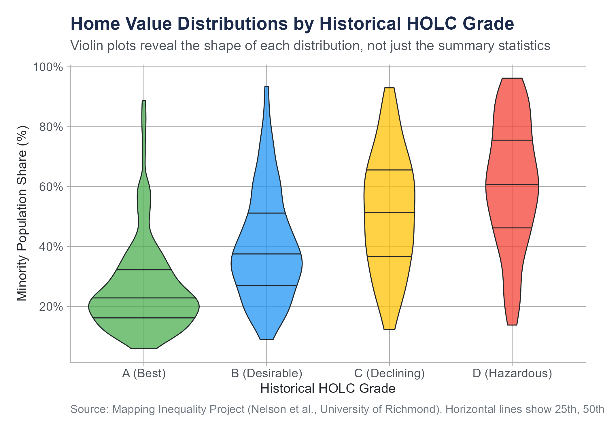
One important limitation: box plots do not show the shape of the distribution within the box. A symmetric distribution and a bimodal distribution could produce identical box plots if they have the same five-number summary. For this reason, some analysts prefer violin plots, which combine the compactness of box plots with the shape information of density plots by showing a mirrored density curve on each side of the box. The figure below shows violin plots of the same redlining data as Figure 4.1, making visible the distributional shape within each HOLC grade that the box plot alone cannot show.
Box plots are also less intuitive for audiences unfamiliar with them. If you are presenting to a general audience, explain what the parts represent before expecting interpretation. For technical and academic audiences, box plots are a standard and efficient tool.
4.5 Bar Charts
Bar charts are the workhorses of categorical data visualization. They represent counts, proportions, or some summary statistic for each category as the height (or length) of a bar.
This sounds simple, and it is. But simplicity does not mean bar charts are foolproof. They are, in fact, one of the most frequently botched chart types in business presentations and news media.
4.5.1 When to Use Bar Charts
Use a bar chart when you want to compare a quantity across categories. How many customers are in each region? What proportion of survey respondents chose each option? What is the average satisfaction score for each product?
Bar charts work for nominal categories (regions, product names, blood types) and ordinal categories (education levels, satisfaction ratings). For ordinal categories, order the bars in their natural sequence. For nominal categories, order them by frequency (tallest to shortest) to make comparisons easier, unless there is a conventional ordering your audience expects.
4.5.2 Dos and Don’ts
Do start the vertical axis at zero. This is the most important rule for bar charts. The visual comparison of bar heights works because the height of each bar is proportional to the value it represents. If the axis starts at some number other than zero, the visual proportions are distorted and the chart becomes misleading. A bar that appears twice as tall as another should represent a value that is actually twice as large.
Do keep it simple. One set of bars, clearly labeled, with a clear title. If you need to compare two sets of categories, a grouped bar chart (bars side by side within each category) or a stacked bar chart can work, but these get complicated fast. If you find yourself creating a chart with twelve colors and a legend that takes up half the page, reconsider your approach.
Don’t use 3D effects. Three-dimensional bar charts add visual noise and make it harder to compare bar heights accurately. There is no situation in which a 3D bar chart communicates information better than a 2D one.
Don’t use bar charts for continuous data. If your horizontal axis represents a continuous variable like time or temperature, a line chart or histogram is usually more appropriate. A bar chart for stock prices over 60 consecutive trading days is technically possible but makes the chart harder to read than a simple line.
Don’t overload. A bar chart with 40 categories is not a bar chart. It is a wall of color. If you have many categories, consider filtering to the most important ones, grouping smaller categories into an “other” category, or using a different visualization entirely.
4.5.3 A Special Case: Pie Charts
We should talk about pie charts, because you are going to encounter them everywhere, and because many data visualization experts would prefer you did not use them.
A pie chart represents proportions as slices of a circle. The idea is intuitive. The whole circle is 100%, and each slice represents a category’s share.
The problem is that humans are not very good at comparing angles and areas. We are much better at comparing lengths. Studies in visual perception research have consistently shown that people estimate proportions more accurately from bar charts than from pie charts. When there are more than a few categories, or when the proportions are similar in size, pie charts become very difficult to read accurately.
Pie charts can work when you have only two or three categories with very different proportions and the primary message is something like “Category A dominates.” In almost every other situation, a bar chart is more effective.
Use pie charts sparingly, if at all. If you do use one, never use a 3D pie chart. The perspective distortion makes slices in the front appear larger than equally-sized slices in the back.
4.6 Scatter Plots
Everything we have discussed so far involves visualizing one variable at a time, or one variable broken down by categories of another. But some of the most interesting questions in statistics are about relationships between two numerical variables. Does more education lead to higher income? Does advertising spending relate to sales? Does temperature affect the number of bike-share riders on a given day?
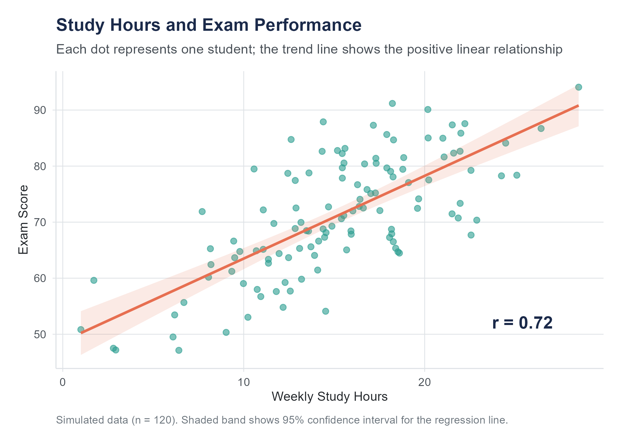
A scatter plot answers these questions visually. It places one variable on the horizontal axis (often called \(x\)) and another on the vertical axis (often called \(y\)). Each observation is a point on the plot, positioned according to its values on both variables.
When you look at a scatter plot, you are looking for patterns.
Direction. Do the points tend to go upward from left to right (a positive association, meaning higher values of \(x\) tend to go with higher values of \(y\))? Or downward (a negative association, meaning higher \(x\) goes with lower \(y\))? Or is there no apparent trend?
Form. Is the pattern roughly linear (the points scatter around a straight line), or is it curved? A linear pattern is simpler to describe and model. A curved pattern requires more sophisticated tools.
Strength. How tightly do the points cluster around the pattern? If the points hug a line closely, the relationship is strong. If the points form a loose cloud, the relationship is weak.
Unusual observations. Are there points far from the overall pattern? These could be data errors, or they could be unusual cases worth investigating.
Scatter plots are powerful because they show you the raw data. Unlike summary statistics that condense information into a few numbers, a scatter plot preserves every observation. You can see clusters, gaps, outliers, and nonlinear patterns that no single number could capture.
Before the next figure, a brief preview of two terms we will define more fully later. The Pearson correlation coefficient \(r\) is a number between \(-1\) and \(+1\) that measures the strength and direction of a linear relationship between two variables; it is formally introduced in Section 4.7. The confidence band around a trend line (a shaded region showing uncertainty in the estimated relationship across all values of \(x\), distinct from the confidence intervals for parameters defined formally in Chapter 7) can be read as saying: “the true line probably falls somewhere within this region.”
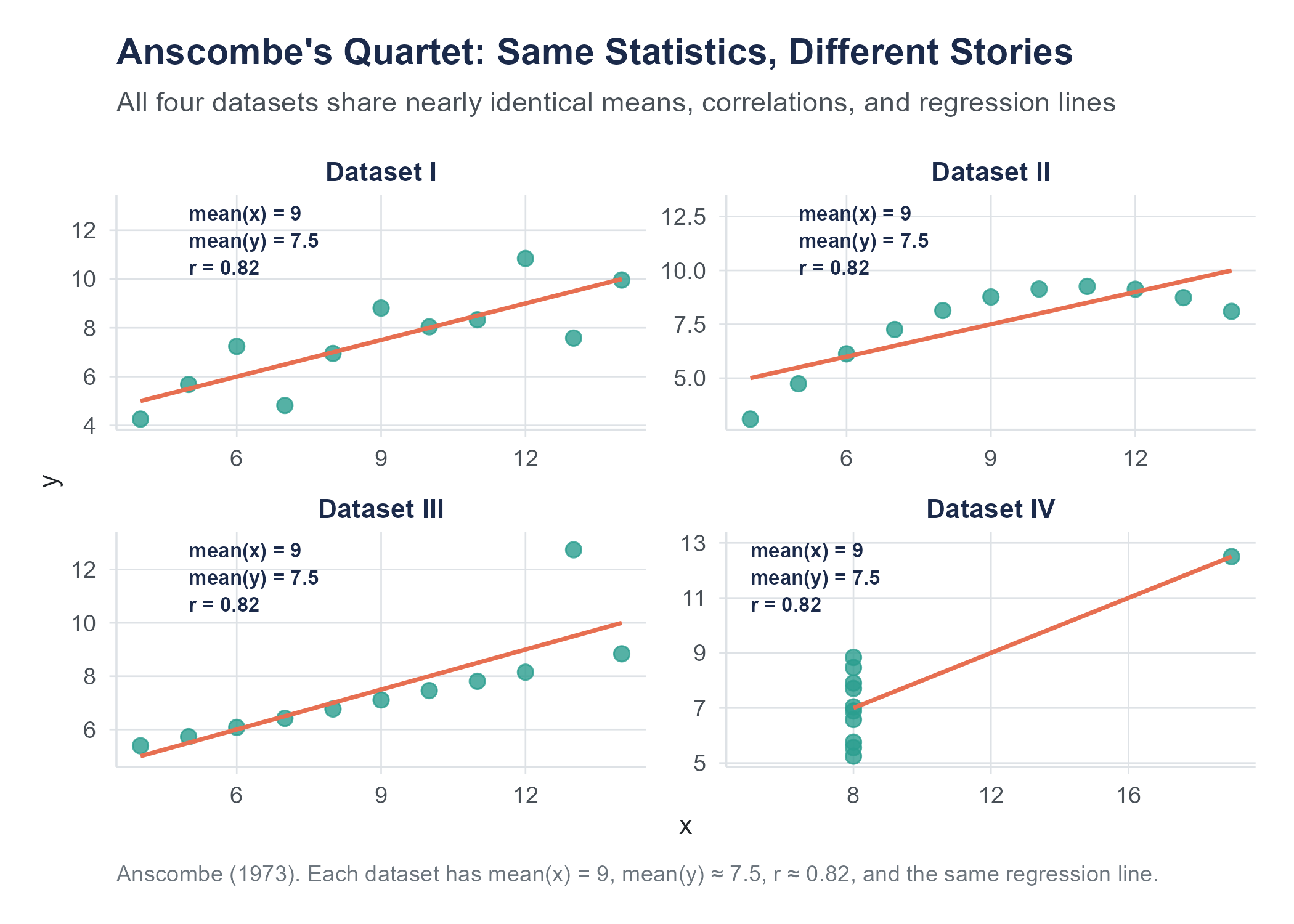
In 1973, Francis Anscombe, then at Yale University, published “Graphs in Statistical Analysis” (The American Statistician, 27(1), 17–21), in which he constructed four datasets that have approximately the same means, variances, correlation, and regression line, yet look completely different when plotted. Anscombe’s Quartet remains one of the most famous demonstrations of why you should always visualize your data before relying on summary statistics alone. More recently, Alberto Cairo created the original “Datasaurus” dataset; Justin Matejka and George Fitzmaurice of Autodesk Research extended it into the “Datasaurus Dozen” (CHI 2017): thirteen datasets, including one shaped like a dinosaur, that all share the same summary statistics. The lesson is clear. Numbers alone can hide what a picture reveals.
Open the Datasaurus Explorer to interact with these datasets directly and see the point illustrated.
4.7 Correlation
Looking at a scatter plot and describing what you see in words like “positive,” “strong,” or “linear” is useful but subjective. Two people looking at the same scatter plot might disagree about whether the relationship is “moderately strong” or just “moderate.” We need a number.
4.7.1 Pearson’s Correlation Coefficient
The most common measure of the linear relationship between two numerical variables is Pearson’s correlation coefficient, denoted \(r\). It ranges from \(-1\) to \(+1\). This is the same \(r\) that appeared in the scatter plot figures above, and now we can define it precisely.
Here is what the values mean.
- \(r = +1\) means a perfect positive linear relationship. Every point falls exactly on a line that slopes upward.
- \(r = -1\) means a perfect negative linear relationship. Every point falls exactly on a line that slopes downward.
- \(r = 0\) means no linear relationship. Knowing the value of \(x\) tells you nothing about the value of \(y\), at least not through a linear pattern.
- Values between 0 and \(\pm 1\) indicate varying degrees of linear association. The closer \(|r|\) is to 1, the tighter the points cluster around a straight line.
The formula for Pearson’s \(r\) for a sample of \(n\) paired observations \((x_1, y_1), (x_2, y_2), \ldots, (x_n, y_n)\) is
\[r = \frac{\displaystyle\sum_{i=1}^{n}(x_i - \bar{x})(y_i - \bar{y})}{\displaystyle\sqrt{\sum_{i=1}^{n}(x_i - \bar{x})^2} \cdot \sqrt{\sum_{i=1}^{n}(y_i - \bar{y})^2}}\]
where \(\bar{x}\) is the sample mean of the \(x\) values and \(\bar{y}\) is the sample mean of the \(y\) values.
This formula looks intimidating, but the logic is elegant. The numerator multiplies each \(x\) value’s deviation from its mean by the corresponding \(y\) value’s deviation from its mean, then sums these products. If \(x\) and \(y\) tend to be above their means together and below their means together (positive association), the products are mostly positive, making the sum positive. If high \(x\) tends to go with low \(y\) (negative association), the products are mostly negative. The denominator standardizes the result to fall between \(-1\) and \(+1\).
An equivalent formula that some textbooks prefer uses z-scores:
\[r = \frac{1}{n-1}\sum_{i=1}^{n}\left(\frac{x_i - \bar{x}}{s_x}\right)\left(\frac{y_i - \bar{y}}{s_y}\right)\]
where \(s_x\) and \(s_y\) are the sample standard deviations of \(x\) and \(y\) respectively. This version makes it clear that \(r\) is the average product of the standardized values. When both variables are above their means (both z-scores positive) or both below (both negative), the product is positive. When one is above and the other below, the product is negative.
4.7.2 Interpreting Correlation
How strong is “strong”? There is no universal standard, but here are some commonly used rough guidelines for interpreting the magnitude of \(r\).
| \(|r|\) | Interpretation |
|---|---|
| 0.00 to 0.19 | Very weak or negligible |
| 0.20 to 0.39 | Weak |
| 0.40 to 0.59 | Moderate |
| 0.60 to 0.79 | Strong |
| 0.80 to 1.00 | Very strong |
These are rough categories, not rigid thresholds. Context matters substantially. In physics, a correlation of 0.6 between two quantities that theory says should be perfectly related would be considered poor, since measurement and experimental error should be much smaller than that. In psychology or education research, a correlation of 0.4 between a personality measure and a behavioral outcome might be considered quite strong, given the enormous complexity of human behavior and the imperfect quality of most measurements. Always interpret \(r\) in the context of your field and your question.
There are several important limitations of Pearson’s \(r\) that you need to understand.
Correlation measures linear relationships only. If \(x\) and \(y\) have a perfect curved relationship (say, \(y = x^2\)), the correlation can be zero or near zero even though the variables are perfectly related. Always look at the scatter plot.
Correlation is sensitive to outliers. A single extreme observation can dramatically change the value of \(r\). One data point far from the cloud of other points can inflate or deflate the correlation, depending on where it falls. Again, look at the scatter plot.
Correlation does not imply causation. This is so important it gets its own section.
Correlation is unitless. It does not matter whether you measure height in inches or centimeters, or weight in pounds or kilograms. The correlation between height and weight will be the same regardless of the units, because the formula standardizes both variables.
Correlation treats both variables symmetrically. The correlation of \(x\) with \(y\) is the same as the correlation of \(y\) with \(x\). This is different from regression, where the roles of \(x\) and \(y\) are distinct. We will encounter regression in later chapters.
4.7.3 Building Your Correlation Intuition
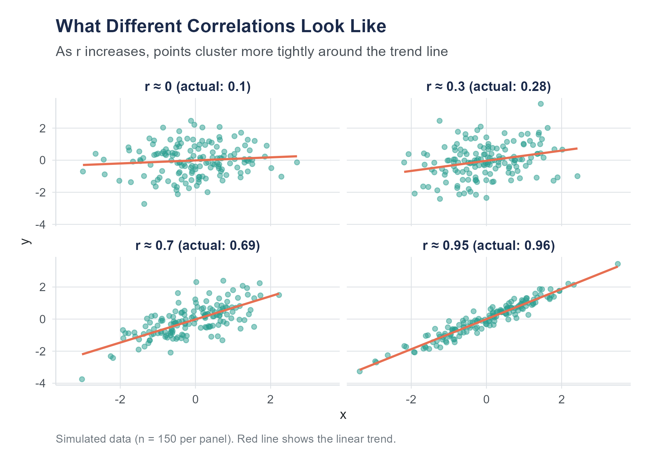
One of the best ways to understand correlation is to practice estimating it. Look at a scatter plot and guess the correlation before calculating it. Over time, your visual intuition will calibrate to the numbers.
Here are some benchmarks to anchor your intuition.
When \(r\) is near 0, the scatter plot looks like a shapeless cloud. There is no discernible upward or downward trend. If you squint, you might think you see a pattern, but that is your brain finding patterns where none exist, a tendency we will discuss more in the chapter on probability.
When \(|r|\) is around 0.3, there is a slight trend. You can sort of see it, but the cloud of points is wide relative to the trend. Think of the relationship between shoe size and GPA in a sample that mixes adults and children of different ages: very slight association driven by age as a confounding variable.
When \(|r|\) is around 0.7, the trend is clear. The points form a band rather than a cloud, and the direction is obvious. The relationship between height and weight in a sample of adults is often in this range.
When \(|r|\) is above 0.9, the points nearly form a line. There is very little scatter. Physical measurements of the same object taken with slightly different instruments often correlate this strongly.
Open the Correlation Game on the companion website. It shows scatter plots and asks you to estimate \(r\) before revealing the answer. Play it enough times and you will develop a reliable visual sense for what different correlation strengths look like, a skill that transfers directly to reading scatter plots in research and practice.
4.8 The Correlation-Causation Trap
If there is one lesson from this chapter that you carry with you for the rest of your life, let it be this.
Correlation does not imply causation.
You have probably heard this before. You will hear it again. You will hear it so many times that you may start to think it is a cliché that does not need repeating. And then you will read a headline that says “Study Finds Coffee Drinkers Live Longer” and think “I should drink more coffee,” and at that moment you will be falling into the correlation-causation trap just like everyone else.
Let us be precise about what the problem is.
When two variables are correlated, there are several possible explanations.
X causes Y. This is the explanation that news headlines jump to. More education causes higher income. Smoking causes lung cancer. Sometimes it is true. But correlation alone cannot establish it.
Y causes X. The direction of causation can be the reverse of what you assume. Maybe higher income allows people to pursue more education, rather than education causing higher income. In reality, it is probably a bit of both.
Z causes both X and Y. This is the confounding variable (or lurking variable) problem, and it is the most common trap. Ice cream sales and drowning deaths are positively correlated. Ice cream does not cause drowning. Hot weather causes both more ice cream consumption and more swimming, and more swimming means more drownings. The confounding variable is temperature. In Chapter 2, we examined this problem in detail and showed how directed acyclic graphs (DAGs) can make confounding relationships visible. The three conditions for establishing causality discussed in Chapter 2 (concomitant variation, time order, and elimination of alternatives) are exactly what prevents us from jumping from correlation to causation.
The correlation is coincidental. With enough variables, some will correlate by pure chance. This is where things get both funny and alarming.
4.8.1 Spurious Correlations
Tyler Vigen, then a student at Harvard Law School, created a website and later a book called Spurious Correlations (2015; tylervigen.com/spurious-correlations) that pairs variables with high correlations and no plausible causal connection. The results are memorable.
The number of films Nicolas Cage appeared in between 2000 and 2009 correlates with the number of people who drowned by falling into a swimming pool during those same years (\(r = 0.664\)). Per capita cheese consumption in the United States correlates almost perfectly with the number of people who died by becoming tangled in their bedsheets (\(r = 0.947\)). The divorce rate in Maine correlates with per capita consumption of margarine (\(r = 0.993\)).
All three correlations were computed by Vigen from real government data: the CDC National Center for Health Statistics, USDA food supply data, and state-level vital statistics. The correlations are real. The patterns do appear in the data over these periods. That is exactly what makes them useful as teaching examples. These are memorable because the causal explanations are absurd. Nicolas Cage movies do not cause drowning. Cheese does not cause bedsheet entanglement. But the correlations are real, in the sense that the numbers actually do move together over those time periods.
The point is not that correlation is useless. Correlation is a valuable tool. The point is that correlation tells you two things move together. It does not tell you why. Figuring out why requires the kind of study design discussed in Chapter 2, ideally a controlled experiment with random assignment, combined with domain knowledge and critical thinking.
4.8.2 Why We Keep Falling for It
The correlation-causation trap is persistent because our brains are wired to seek causal explanations. This is a feature, not a bug. Early humans who assumed the rustling in the grass was caused by a predator survived more often than those who assumed it was just the wind. But in a world of complex data and multiple interacting variables, our instinct to see causation in every pattern leads us astray.
Media coverage makes it worse. “Correlation found between X and Y” is a boring headline. “X causes Y” is a compelling one. Science journalists, pressed for clicks and constrained by space, often frame correlational findings as causal ones. Even when the article itself includes appropriate caveats, the headline does not.
What can you do? Three things.
First, whenever you see a claimed association, ask yourself what confounding variables might explain it. If a study finds that people who own dogs have lower blood pressure, could it be that people who are healthier and more active are more likely to own dogs? Could it be that wealthier people are more likely to both own dogs and have access to better healthcare?
Second, ask whether the study design supports causal claims. Observational studies, no matter how large or sophisticated, cannot establish causation on their own. Only experiments with random assignment can do that (Chapter 2). There are advanced statistical methods that try to approximate experimental conditions using observational data, but even these come with assumptions and limitations.
Third, be especially skeptical of causal claims about topics where confounding is likely rampant: topics like nutrition (“eating X causes Y”), lifestyle (“doing X makes you live longer”), and anything involving self-selected groups (“people who choose X are more successful”).
AI tools can compute correlations instantly, but they struggle with the context that separates useful analysis from misleading analysis. Ask an AI to analyze the relationship between two variables and it will report the correlation coefficient, often slipping into causal language. “Higher values of X lead to higher values of Y” when the data shows only association. The word “lead” implies a direction of influence that correlation cannot establish, but AI tools reach for causal phrasing because it sounds more informative.
AI chart-making tools introduce a different set of problems. Default visualization choices in many platforms favor pie charts over bar charts, add unnecessary 3D effects, truncate axes to make small differences look dramatic, and choose color schemes that obscure rather than reveal patterns. An AI asked to “make a chart of this data” will produce something that looks polished and professional while violating several of the principles discussed in this chapter.
The human analyst’s job is twofold: choose the visualization that tells the truth about the data, and describe the patterns without overstating what the data can support. Correlation is a tool for measuring association. Turning it into a causal claim requires the kind of study design discussed in Chapter 2, not a confident-sounding sentence from a language model.
4.9 Distortion as an Ethical Failure
In Section 4.2, we listed “Do not distort the data” as one of the five core principles of effective visualization. It is worth pausing to make something explicit: the violations described in this section are not merely technical mistakes. When a chart manipulates scales, cherry-picks time windows, or removes axes to create a false impression, it misrepresents reality to an audience. That is an ethical failure, not just a design flaw. The question to ask about any visualization is not only “does it look right?” but “does it accurately represent what the data say?”
4.9.1 Truncated Axes
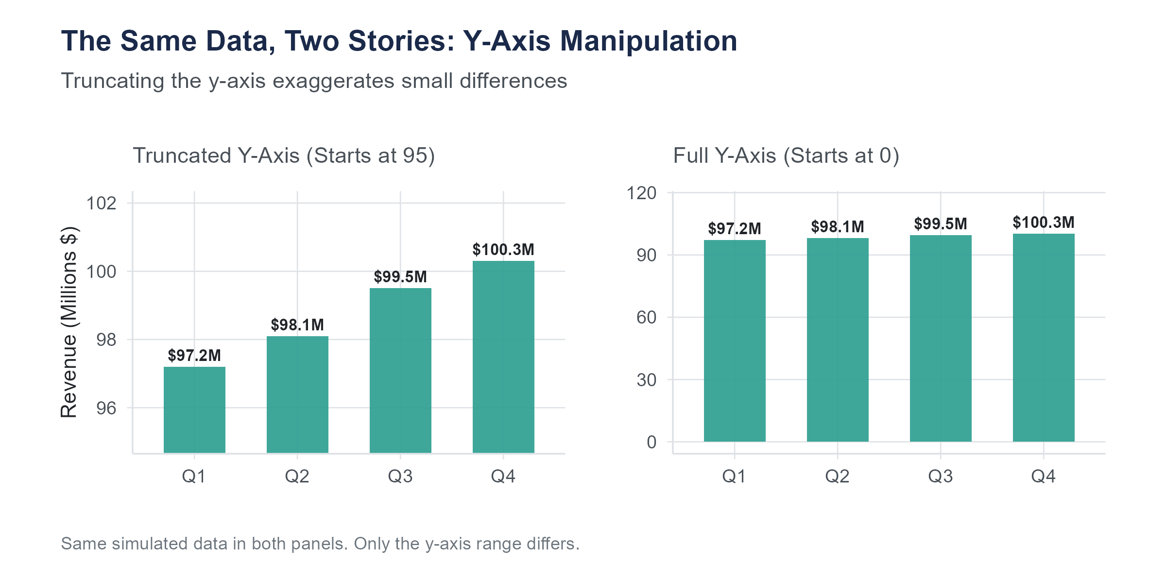
The most common way to mislead with a visualization is to truncate the vertical axis, starting it at some value other than zero. For bar charts, this is almost always deceptive, because it exaggerates differences between bars.
Imagine a bar chart comparing approval ratings for two candidates. Candidate A has 51% approval and Candidate B has 49%. If the axis runs from 0% to 100%, the two bars look nearly identical, which accurately reflects a very small difference. If the axis runs from 47% to 53%, the bars look dramatically different, with Candidate A’s bar appearing to tower over Candidate B’s. The underlying numbers are the same. The visual impression is completely different.
For line charts, axis truncation is more of a judgment call. A line chart showing a company’s revenue over time might reasonably start the axis at a value near the lowest data point, because the purpose is to show the trend, not the absolute magnitude. But even with line charts, a truncated axis can exaggerate small fluctuations into what looks like dramatic volatility.
The key question is whether the visual impression matches the substantive reality. If a small difference is substantively unimportant, the chart should not make it look dramatic. If it is substantively important, the chart should help the reader see it, but with clear labeling that indicates the scale.
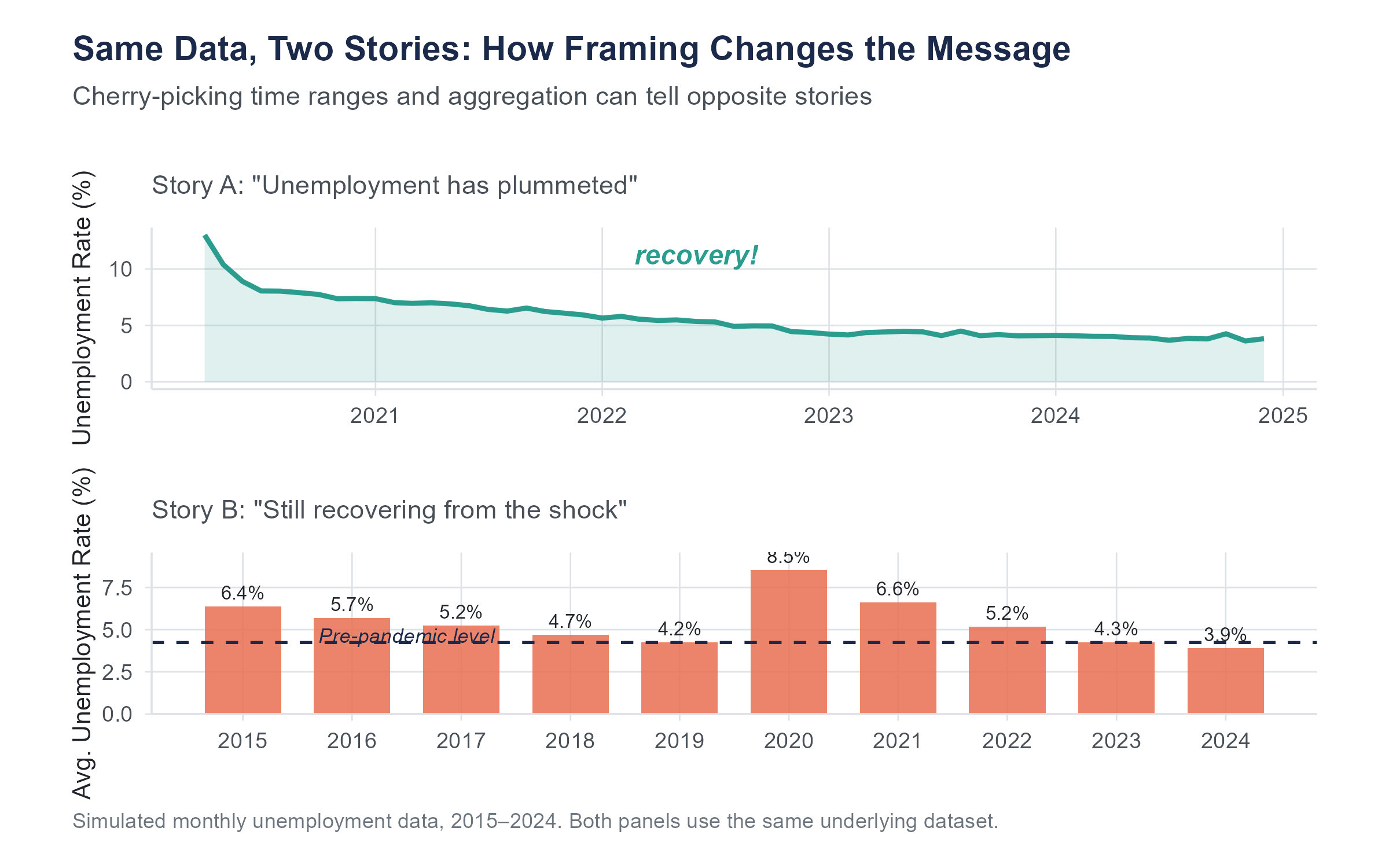
4.9.2 Cherry-Picked Time Ranges
Choosing where to start and end a time series can completely change the story. A stock that has risen 30% over five years looks great. That same stock, if it dropped 50% in year one and has been recovering since, tells a different story. A politician can claim economic growth by choosing a starting point in a recession and an ending point during recovery. A critic can claim economic decline by choosing the reverse.
Always look at the full axis range and ask yourself whether a different starting point would change the impression.
4.9.3 Manipulated Aspect Ratios
Stretching a chart vertically exaggerates changes. Squashing it horizontally compresses them. The same data can look like a dramatic trend or a flat line depending on the aspect ratio. There is no single “correct” aspect ratio, but extreme ratios should make you suspicious.
4.9.4 Misleading Area and Volume Comparisons
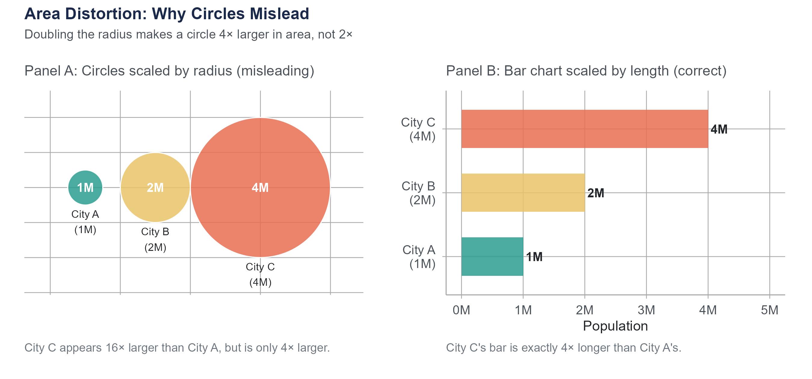
When visual elements are scaled by area or volume rather than by length, differences get distorted in ways that are easy to overlook. Suppose a chart represents city populations as circles scaled by radius. City A has twice the population of City B, so the designer makes City A’s radius twice as large. But area grows as the square of radius: City A’s circle has four times the area of City B’s. It looks four times as large rather than twice as large. Three-dimensional representations are worse: doubling each linear dimension produces an eightfold increase in volume.
The rule is simple: if you are comparing quantities, scale visual elements by length (bar charts, dot plots), not by area or volume. When you see bubble charts or pictograms with scaled icons, check how the scaling was done. If the caption says “area is proportional to value,” verify it against the numbers shown. If the caption says nothing about scaling, assume the designer may not have checked.
4.9.5 The Dual-Axis Trap
Charts with two different vertical axes, one on the left and one on the right, allow two variables to be plotted on the same chart. This sounds helpful, but it creates a serious problem. By choosing the scales for the two axes, you can make any two variables appear to track each other closely, even if the relationship is meaningless.
To see why, consider a chart showing Nicolas Cage film releases on the left axis and U.S. pool drownings on the right. If you scale the two axes so that both series occupy roughly the same vertical space on the chart, the lines appear to move in tandem, because the designer forced them to through scale choice. This is, in fact, how many spurious correlations are visualized. If you see a dual-axis chart, be skeptical. Ask whether the apparent relationship would survive a different choice of scales.
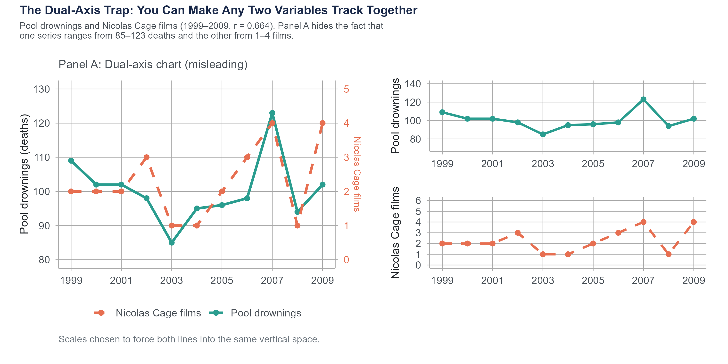
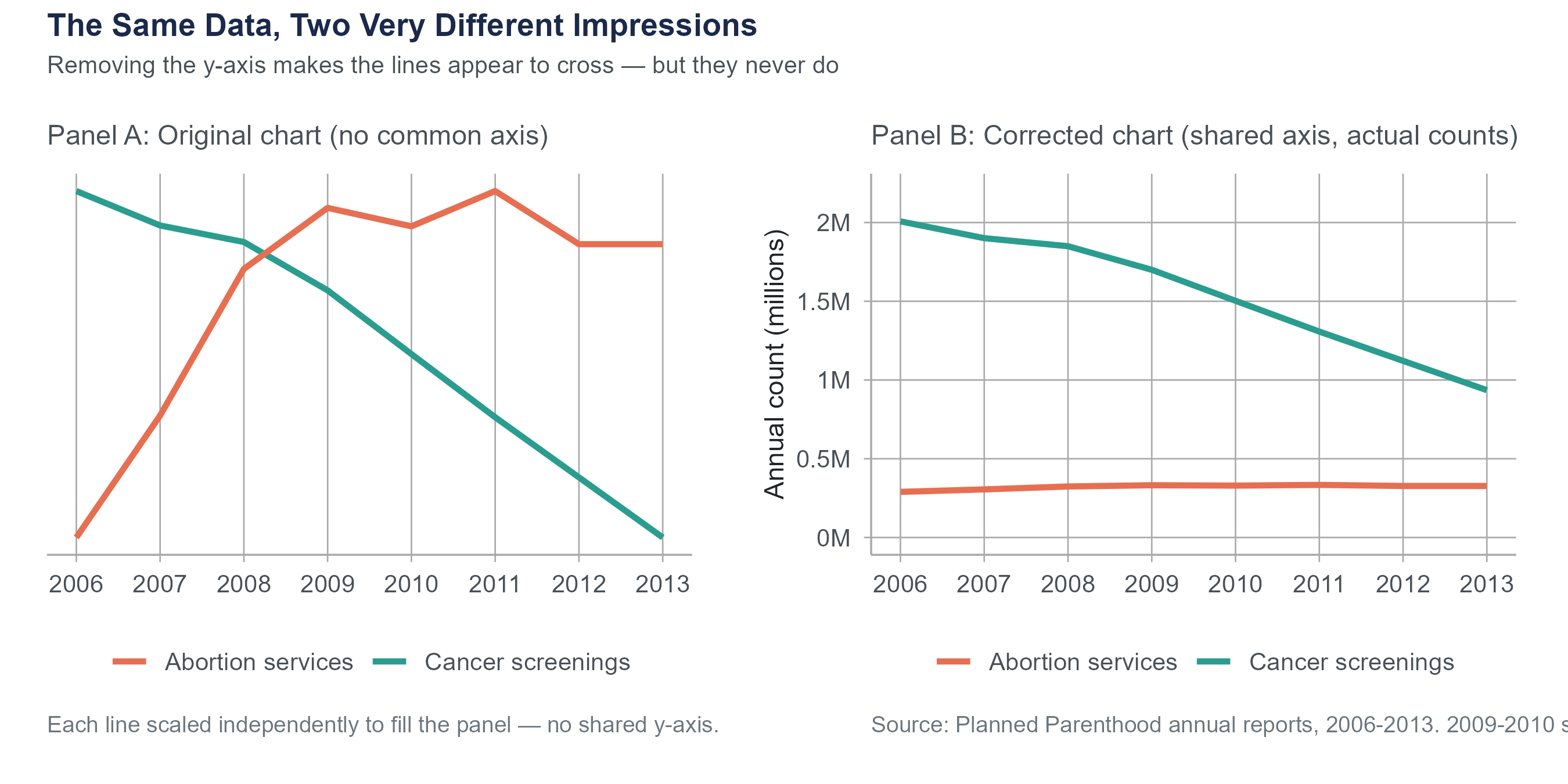
In September 2015, Representative Jason Chaffetz displayed a chart at a House Oversight Committee hearing that appeared to show Planned Parenthood’s cancer screening services plummeting while its abortion services skyrocketed. The chart was created by Americans United for Life and used no vertical axis at all. The two trend lines were placed on the same graphic with no common scale, making it impossible to judge actual magnitudes. When replotted with a proper axis, the picture was far less dramatic. Cancer screenings had indeed declined (from about 2 million to about 935,000 annually between 2006 and 2013), but they still substantially exceeded abortion services (roughly 300,000 annually). The original chart was not technically lying about the direction of the trends, but by removing the scale, it created a deeply misleading visual impression.
This is not a partisan point. Misleading charts appear across the political spectrum and in corporate communications, news media, and advocacy from every direction. When someone removes the axis, ask yourself why. When someone uses visual tricks to exaggerate a difference, ask who benefits from that exaggeration. Your job as a statistically literate person is not to take any chart at face value, but to read the data behind the picture.
For a comprehensive treatment of statistical deception, see Calling Bullshit: The Art of Skepticism in a Data-Driven World (2020) by Carl Bergstrom and Jevin West of the University of Washington, or their freely available course materials at callingbullshit.org.
4.10 Putting It All Together
Choosing the right visualization is not a matter of personal preference. It is driven by the type of data you have and the question you are trying to answer. Here is a quick reference.
| Your question | Variable types | Best chart type |
|---|---|---|
| What does the distribution of one numerical variable look like? | One numerical | Histogram or density plot |
| How do distributions compare across groups? | One numerical, one categorical | Side-by-side box plots (or violin plots) |
| How many observations are in each category? | One categorical | Bar chart |
| What proportions do categories represent? | One categorical | Bar chart (or pie chart, reluctantly) |
| What is the relationship between two numerical variables? | Two numerical | Scatter plot |
| How does a numerical variable change over time? | One numerical, one time variable | Line chart |
| How do multiple numerical variables relate to each other? | Multiple numerical | Correlation matrix or scatter plot matrix |
This table is a starting point, not a constraint. As you gain experience, you will develop an intuition for when standard chart types work and when a creative variation might be more effective. But when in doubt, stick with the basics. A clear, well-labeled standard chart beats a clever but confusing novel visualization every time.
Here is a principle that ties together everything in this chapter. The purpose of data visualization is not to impress. It is not to decorate. It is to make the truth easier to see. The redlining maps at the start of this chapter did exactly that. They took patterns that existed in tables of numbers and made them visible in a way that was immediate and undeniable. That is the standard to aim for.
4.11 Looking Ahead
Chapter 4 completes the descriptive foundations of the book. You now have both the numerical vocabulary from Chapter 3 (mean, median, IQR, standard deviation) and the visual vocabulary from this chapter (histograms, box plots, scatter plots, and the ethical dimension of visualization). Chapter 5 marks a shift. Instead of describing data we have already collected, we will begin asking probabilistic questions: how likely is a given outcome, how do we reason about uncertainty before observing data, and how does the math of probability connect to everything the rest of the book will build on? The transition from descriptive statistics to probability and inference is the most important conceptual step in the course, and Chapter 5 begins it by grounding the ideas in a scenario most readers encountered directly: diagnostic testing during a pandemic.
4.12 Key Terms
- Bar chart: A visualization that uses the height or length of bars to represent counts, proportions, or summary statistics for categories of a categorical variable.
- Bin: An interval used to group values when constructing a histogram. The number and width of bins affect the histogram’s appearance and the features it reveals.
- Bimodal: A distribution with two distinct peaks, often suggesting that the data contains two different subgroups.
- Box plot (box-and-whisker plot): A visual representation of the five-number summary. The box spans \(Q_1\) to \(Q_3\), the line inside marks the median, whiskers extend to the most extreme non-outlier observations, and individual points beyond the whiskers are flagged as potential outliers.
- Confounding variable (lurking variable): A variable that influences both the explanatory variable and the response variable, creating a misleading association between them. See Chapter 2 for a full treatment.
- Correlation: A measure of the strength and direction of the linear relationship between two numerical variables.
- Data-ink ratio: A concept introduced by Edward Tufte referring to the proportion of ink in a visualization that represents actual data rather than decoration or non-data elements.
- Density plot (kernel density estimate): A smoothed curve that estimates the distribution of a numerical variable. The total area under the curve equals 1.
- Five-number summary: The minimum, \(Q_1\), median, \(Q_3\), and maximum of a dataset. Introduced in Chapter 3 and visualized by the box plot.
- Histogram: A visualization that divides the range of a numerical variable into bins and uses bar heights to represent the frequency or relative frequency of observations in each bin.
- Interquartile range (IQR): The difference \(Q_3 - Q_1\). Represents the spread of the middle 50% of the data. Resistant to outliers.
- Outlier: An observation that falls unusually far from the rest of the data. In a box plot, observations beyond \(1.5 \times \text{IQR}\) from the nearest quartile are flagged as potential outliers.
- Pearson’s correlation coefficient (\(r\)): A sample statistic measuring the strength and direction of the linear relationship between two numerical variables, ranging from \(-1\) (perfect negative linear relationship) to \(+1\) (perfect positive linear relationship). The corresponding population parameter is \(\rho\) (rho).
- Scatter plot: A visualization that plots two numerical variables against each other, with each observation represented as a point.
- Skewed distribution: A distribution that is not symmetric. A right-skewed distribution has a long tail extending toward higher values (mean > median). A left-skewed distribution has a long tail extending toward lower values (mean < median).
- Spurious correlation: A correlation between two variables that exists statistically but has no causal explanation, often arising from coincidence or a shared common cause.
- Truncated axis: An axis on a chart that does not start at zero, which can exaggerate visual differences between values.
- Violin plot: A visualization that combines the compactness of a box plot with the shape information of a density plot, showing a mirrored density curve on each side of a central summary. Useful when comparing full distributional shapes across groups.
4.13 Further Reading and References
The following works are cited in this chapter or provide valuable additional context.
On redlining and the Mapping Inequality project: Nelson, R.K., Winling, L., Marciano, R., Connolly, N.D.B., et al. (2016). Mapping inequality: Redlining in New Deal America. In R.K. Nelson & E.L. Ayers (Eds.), American Panorama. University of Richmond Digital Scholarship Lab. dsl.richmond.edu/panorama/redlining.
Mitchell, B., & Franco, J. (2018). HOLC “redlining” maps: The persistent structure of segregation and economic inequality. National Community Reinvestment Coalition. The source for the 74% and 64% persistence figures cited in the opening section.
On data visualization principles: Tufte, E.R. (1983). The visual display of quantitative information. Graphics Press. The source of the data-ink ratio concept.
Cairo, A. (2016). The truthful art: Data, charts, and maps for communication. New Riders. A thorough, practical guide to visualization design and the ethics of representation.
Bergstrom, C.T., & West, J.D. (2020). Calling bullshit: The art of skepticism in a data-driven world. Random House. Covers misleading charts and statistical deception in accessible, example-driven form. Course materials available at callingbullshit.org.
On Anscombe’s Quartet: Anscombe, F.J. (1973). Graphs in statistical analysis. The American Statistician, 27(1), 17–21. The original paper constructing the four datasets that share identical summary statistics yet look completely different when plotted.
Matejka, J., & Fitzmaurice, G. (2017). Same stats, different graphs: Generating datasets with varied appearance and identical statistics through simulated annealing. Proceedings of the ACM CHI Conference on Human Factors in Computing Systems, 1290–1294. The Datasaurus Dozen, extending Anscombe’s insight to thirteen datasets including one shaped like a dinosaur.
On spurious correlations: Vigen, T. (2015). Spurious correlations. Hachette Books. Website at tylervigen.com/spurious-correlations. All correlations cited in Section 4.8.1 are from Vigen’s calculations using public government data sources (CDC National Center for Health Statistics, USDA food supply data, and state vital statistics). The underlying data is real; the correlations are real; the causal connections are not.
On the Chaffetz chart and misleading visualization in advocacy: The original Planned Parenthood chart used in the 2015 House Oversight Committee hearing was created by Americans United for Life. Reanalysis and visualization of the corrected chart appeared widely in fact-checking journalism, including PolitiFact and The Washington Post.
A full R walkthrough of this chapter is online at stats.marginoferrormedia.com/walkthroughs/r-ch04.html. It builds histograms, density plots, boxplots, and scatter plots on the redlining data, plus reproduces Anscombe’s quartet.
4.14 Exercises
4.14.1 Check Your Understanding
What is the data-ink ratio, and why did Edward Tufte argue it should be maximized? Give an example of a chart element that adds ink but not information.
You are given a histogram of household incomes in a large city. The histogram has a single peak near $40,000 and a long right tail extending past $500,000. Describe the shape of this distribution using the terms introduced in this chapter. Would you expect the mean or the median to be higher? Explain why, using what you learned in Chapter 3.
Explain the difference between a histogram and a bar chart. Give one situation where you would use each.
A box plot shows \(Q_1 = 20\), median \(= 35\), \(Q_3 = 45\). The lower whisker extends to 5 and the upper whisker extends to 68. Three points are plotted individually above 68, at values 85, 95, and 110.
- What is the IQR?
- Calculate the upper and lower fences using the \(1.5 \times \text{IQR}\) rule. Show your work.
- Confirm that all three individual points (85, 95, 110) exceed the upper fence. Are any of them within the fence?
Two scatter plots are shown. In Plot A, the points form a tight band sloping upward from left to right. In Plot B, the points form a loose cloud with no discernible trend. Estimate a plausible value of \(r\) for each plot and explain your reasoning.
Suppose \(r = 0\) for two variables \(x\) and \(y\). Does this mean that \(x\) and \(y\) are unrelated? Explain, and give an example where \(r = 0\) but a clear relationship exists.
A news headline reads “People Who Eat Organic Food Have 25% Lower Cancer Rates.” List at least three possible explanations for this correlation that do not involve organic food directly preventing cancer. For each explanation, name the type (reverse causation, confounding, or coincidence).
Why is starting the vertical axis of a bar chart at a value other than zero misleading? Is the same rule always true for line charts? Explain the difference.
Explain why pie charts are generally less effective than bar charts for comparing proportions across categories. Under what limited circumstances might a pie chart be acceptable?
The Pearson correlation coefficient between two variables is \(r = -0.85\). Describe what a scatter plot of these two variables would look like, including the direction, form, and strength of the pattern.
4.14.2 Apply It
The following table shows data for ten cities, listing average daily temperature (in degrees Fahrenheit) and the number of bike-share rides on a randomly selected day.
City Temp (°F) Rides A 32 120 B 45 310 C 55 485 D 62 580 E 70 710 F 75 750 G 80 820 H 85 680 I 90 590 J 95 430 - Create a scatter plot with temperature on the horizontal axis and rides on the vertical axis.
- Describe the pattern. Is it linear? What happens at very high temperatures?
- Would Pearson’s \(r\) be a good summary of this relationship? Why or why not?
A researcher collects data on hours of sleep and self-reported mood scores (1 to 10) for eight participants.
Participant Hours of Sleep Mood Score 1 4 3 2 5 4 3 6 5 4 6 6 5 7 7 6 7 6 7 8 8 8 9 9 - Compute the means \(\bar{x}\) and \(\bar{y}\).
- Using the formula \(r = \frac{\displaystyle\sum(x_i - \bar{x})(y_i - \bar{y})}{\displaystyle\sqrt{\sum(x_i - \bar{x})^2} \cdot \sqrt{\sum(y_i - \bar{y})^2}}\), calculate \(r\) by hand. Show your work.
- Interpret the value of \(r\) in context.
- Can you conclude that more sleep causes better mood? Explain using the Chapter 2 framework for causality (concomitant variation, time order, elimination of alternatives).
You have data on starting salaries of recent graduates from four departments at a university: Engineering, Business, Education, and Liberal Arts. You want to compare the distribution of starting salaries across departments. Which visualization would you choose and why? Describe what you would look for in the resulting chart, using specific features of the distributions (center, spread, shape, outliers).
Consider two variables measured on 200 college students: hours spent on social media per week and GPA. Suppose the correlation is \(r = -0.32\).
- Describe the direction and strength of this correlation.
- Does this correlation tell you that increasing social media use will lower a student’s GPA? Explain.
- Name two confounding variables that might help explain this correlation.
A marketing team creates a bar chart comparing quarterly sales for two products. Product A sold 1,010 units and Product B sold 990 units. The team starts the vertical axis at 980.
- Sketch or describe the chart with the axis starting at 0 instead.
- How does the visual impression change?
- In this case, does the small difference matter for the decision being made? How should that influence the choice of axis range?
Find a data visualization in a news article, social media post, or advertisement. Identify at least two design choices that either help or hinder accurate interpretation. If the visualization is misleading, describe specifically how and suggest an improvement.
The following table shows exam scores for two sections of a statistics course.
Section A Section B 62 71 68 73 72 75 75 78 78 79 80 80 82 82 85 84 88 86 95 88 - Compute the five-number summary for each section. (Recall the method from Chapter 3.)
- Draw side-by-side box plots (by hand or using software).
- Compare the two distributions. Which section has a higher median? Which has more variability? Are there any potential outliers? (Use the \(1.5 \times \text{IQR}\) rule.)
A dataset contains information about 1,000 houses sold in a metropolitan area, including sale price, square footage, number of bedrooms, lot size, year built, and neighborhood. For each of the following questions, state which type of visualization you would use and which variables would be on each axis.
- What is the distribution of sale prices?
- How do sale prices differ across neighborhoods?
- What is the relationship between square footage and sale price?
- How many houses were sold in each neighborhood?
Explain why a correlation of \(r = 0.993\) between the divorce rate in Maine and per capita margarine consumption does not mean that margarine causes divorce. Apply the four-part framework from this chapter (X causes Y, Y causes X, Z causes both, coincidence). What would a study designed to actually test a causal connection need to look like?
Using the z-score formula \(r = \frac{1}{n-1}\displaystyle\sum_{i=1}^{n}\left(\frac{x_i - \bar{x}}{s_x}\right)\left(\frac{y_i - \bar{y}}{s_y}\right)\), explain in plain language:
- Why the correlation is positive when high values of \(x\) tend to go with high values of \(y\).
- Why it is negative when high values of \(x\) tend to go with low values of \(y\).
- What happens to each product when both variables are above their means? When one is above and the other is below?
The following three exercises use the housing-redlining.csv dataset available on the companion website. This dataset is drawn from the Mapping Inequality project (Nelson et al., 2016, University of Richmond, Virginia Tech, and University of Maryland), which digitized the original HOLC neighborhood security maps and linked them to current U.S. Census demographic data. It contains 551 neighborhoods across 138 metropolitan areas, with variables including neighborhood_id, metro_area, holc_grade (historical HOLC grade: A, B, C, or D), total_population, pct_white, pct_black, pct_hispanic, pct_asian, and pct_minority.
Using the housing-redlining.csv dataset, create side-by-side box plots of
pct_minoritygrouped byholc_grade(A through D). Describe the pattern you observe. Which grade has the highest median percentage of minority residents? Which has the most variability? Are there potential outliers? Write two to three sentences interpreting what these box plots reveal about the persistent demographic legacy of redlining. (For reference, the meanpct_minorityvalues by grade are approximately 26% for Grade A, 40% for Grade B, 51% for Grade C, and 61% for Grade D.)Create a scatter plot of
pct_white(horizontal axis) versuspct_minority(vertical axis), using color or shape to distinguish the four HOLC grades. Compute the Pearson correlation betweenpct_whiteandpct_minorityacross all 551 neighborhoods. Describe the direction, strength, and form of the relationship. Does the pattern appear consistent across HOLC grades, or do certain grades cluster in particular regions of the plot? What does the clustering reveal about the relationship between historical redlining grades and present-day racial demographics?Choose any two of the 138 metropolitan areas in the dataset. For each metro area, create a bar chart showing the mean
pct_minorityfor each HOLC grade. Place the two bar charts side by side. Do both metro areas show the same pattern across grades, or does one show a larger gap between Grade A and Grade D neighborhoods? What does this comparison suggest about how redlining’s demographic legacy may vary across metropolitan areas?
4.14.3 Think Deeper
The Mapping Inequality project made redlining data visible in a way that tables of numbers could not. But visualization can also be used to mislead. How should we think about the power of visualization when it can be used both to reveal truth and to distort it? What responsibilities do data analysts have when choosing how to visualize data on sensitive topics like housing discrimination or public health?
A pharmaceutical company funds a study comparing its new drug to a competitor. The study finds the new drug is slightly more effective (\(r = 0.12\) between drug type and patient improvement). The company creates a visualization for a marketing brochure that uses truncated axes, strategic color choices (the competitor’s bar in gray, their drug’s bar in bright green), and a carefully chosen time window. No numbers on the chart are wrong. Every data point is real. Is this ethical? Should there be standards for how statistical results are visualized in advertising? Who should set and enforce those standards?
Pearson’s \(r\) only measures linear relationships. Many real-world relationships are nonlinear. A medication might help at low doses and harm at high doses (an inverted-U relationship). Economic growth might accelerate and then plateau. Student performance might improve with study time up to a point, then decline as fatigue sets in. Given that Pearson’s \(r\) could be near zero for all of these relationships, what does this suggest about the risk of using a single summary statistic to describe a relationship? How should analysts guard against this risk?
Dual-axis charts are popular in business presentations and news media. Critics argue they are inherently misleading because the creator can choose scales that make any two variables appear related. Defenders argue that with careful labeling and honest scale choices, dual-axis charts can be informative. Where do you stand, and why? Can you think of a specific case where a dual-axis chart would be useful, and another where it would be deceptive?
In the age of social media, data visualizations can go viral, reaching millions of people who have no training in statistical literacy. A misleading chart shared widely enough can shape public opinion before any correction reaches even a fraction of the original audience. What obligations, if any, do social media platforms have to flag or contextualize potentially misleading data visualizations? How would such a system work in practice, and what are the risks of getting it wrong?