10 Simple Linear Regression
10.1 The Scatter Plot That Launched a Thousand Debates
In 2016, the National Education Association published its annual report on education spending across the fifty states. The numbers invited an obvious question, one that parents, politicians, and school board members have argued about for decades. Does spending more money on education lead to better outcomes?
On one side of the argument, advocates for increased school funding pointed to states like Massachusetts and New Jersey, which spent well above the national average per student and consistently produced some of the highest standardized test scores in the country. On the other side, skeptics pointed to states like Utah, which spent among the least per student yet still posted respectable scores, and the District of Columbia, which spent more per student than nearly anywhere else in the nation yet ranked near the bottom on many achievement measures.
Someone, as someone always does, made a scatter plot. State-level per-pupil spending on the horizontal axis, average test scores on the vertical axis, one dot for each state. And that scatter plot became a Rorschach test for anyone with an opinion about education policy.
If you squinted one way, you could see a general upward trend. More spending, higher scores. If you squinted another way, you could see enormous variability, states that spent similar amounts producing wildly different results. A few outliers complicated both stories. The relationship was there, sort of, but it was messy. It was noisy. It was, in a word, real.
The question is not whether the scatter plot showed a pattern. The question is how to describe that pattern precisely enough that reasonable people can agree on what the data says, even if they disagree about what to do about it. That is the work of regression analysis, and it is what this chapter is about.
Regression is a family of methods for describing how one variable depends on another. The simplest version, the subject of this chapter, is simple linear regression: one explanatory variable, one response variable, and the assumption that the relationship is well summarized by a straight line. The line is a model of the relationship. Other forms of regression handle multiple predictors (Chapter 11), curves rather than lines, categorical outcomes, and many other situations, but the logic in this chapter is the foundation that the rest build on.
For the simple-line case, regression gives us a way to draw a single line through the cloud of points: a line that captures the overall direction of the relationship between two variables while acknowledging the scatter around it. It tells us how much one variable tends to change when the other changes by one unit. It tells us how much of the variation in outcomes is accounted for by the predictor. And it tells us, through the scatter that remains, how much we still do not know.
This is the first chapter where we build an explicit predictive model. The probability distributions in Chapters 5 and 6 and the null distributions of Chapter 8 were models of uncertainty; what changes here is that we use the data to fit a model that maps an input variable to a predicted output. If you have followed the progression of this book from descriptions of data to probability to inference, regression is the natural next step. It is where those ideas come together.
10.2 One Variable to Predict Another
Up to this point, we have mostly examined one variable at a time. What is the average? How spread out is the data? Is the population mean different from some hypothesized value? These are all questions about a single variable.
But many practical questions involve relationships between variables. Does studying more hours lead to higher exam scores? Does a company’s advertising budget predict its quarterly sales? Does the temperature on a given day predict how much electricity a city will consume?
In each of these cases, we have two variables. One of them is the explanatory variable (also called the independent variable or predictor), which is the variable we think might help explain or predict the other. The other is the response variable (also called the dependent variable or outcome), which is the variable we are trying to understand or predict.
The terminology matters because the roles are not symmetric. We are asking whether X helps us predict Y, not whether Y helps us predict X. In the education example, per-pupil spending is the explanatory variable and test scores are the response. In a study of exercise and blood pressure, minutes of weekly exercise is the explanatory variable and systolic blood pressure is the response.
This does not mean that X causes Y. That distinction is crucial. Regression describes the association between two variables. It quantifies how much Y tends to change when X changes. But association is not causation, and we have spent enough time in this book on that point that you know why. A regression line through the education spending data tells us what the data shows. Whether spending more money would actually improve scores requires a much deeper analysis involving experimental design, confounders, and all the cautions of Chapter 2.
Consider a less politically charged example. If you regress ice cream sales (\(X\)) against drowning incidents (\(Y\)) for each month of the year, you will find a positive slope. Months with higher ice cream sales tend to have more drownings. The regression line is real. The pattern is real. But nobody believes ice cream causes drowning. The lurking variable is temperature. Hot months drive people to both buy ice cream and swim more often. Regression faithfully describes the pattern in the data. It takes a human being, not a formula, to figure out what that pattern means.
10.3 The Regression Line
Imagine you have a scatter plot with dozens of data points showing the relationship between per-pupil spending (\(X\)) and average test scores (\(Y\)). The points form a cloudy, upward-drifting swarm. Your goal is to draw a single straight line through this cloud that captures the overall trend as well as possible.
The equation for any straight line is
\[\hat{y} = b_0 + b_1 x\]
where \(\hat{y}\) (read “y-hat”) is the predicted value of \(Y\) for a given value of \(X\), \(b_0\) is the y-intercept (the predicted value of \(Y\) when \(X = 0\)), and \(b_1\) is the slope (how much \(\hat{y}\) changes for each one-unit increase in \(X\)).
That hat on the \(y\) is important. It signals that \(\hat{y}\) is a prediction, not an observed value. Real data points sit at various distances above and below the line. The hat reminds us that the line gives us an estimate, not the truth.
But which line? You could draw infinitely many straight lines through a scatter plot. Some would cut through the middle of the cloud. Others would miss it entirely. We need a criterion for choosing the best one.
10.3.1 The Least Squares Criterion
Here is the idea. For each data point, the line makes a prediction. The difference between the actual \(y\) value and the predicted \(\hat{y}\) value is called a residual.
\[\text{residual}_i = y_i - \hat{y}_i\]
A positive residual means the point is above the line. A negative residual means it is below. A residual of zero means the point sits exactly on the line.
Some residuals will be positive, some negative. If you simply add them up, the positives and negatives tend to cancel each other out, which is not helpful. So instead, we square each residual to make them all positive, and then add up all the squared residuals.
\[\text{Sum of squared residuals} = \sum_{i=1}^{n} (y_i - \hat{y}_i)^2\]
The least squares regression line is the line that makes this sum as small as possible. Out of all possible straight lines, it is the one that minimizes the total squared distance between the observed data points and the line’s predictions. You will also encounter this method under the name Ordinary Least Squares (OLS) in econometrics and machine learning textbooks. The two names refer to the same thing.
Why squares rather than absolute values? Partly for mathematical convenience, the calculus works out more cleanly. But there is also a practical reason. Squaring gives extra weight to large residuals. A point that is far from the line contributes much more to the sum of squares than a point that is close. This means the least squares line is particularly motivated to avoid making big errors, which is usually what we want.
Think of it this way. You are stretching a rubber band from each data point to the line, and each rubber band has a tension proportional to the square of its length. The least squares line is the position that minimizes the total tension. It is the line that balances all those pulls as efficiently as possible.
There is another way to think about it that some students find helpful. Imagine you are placing a straight plank on a lumpy surface. The lumps are your data points, sticking up at various heights. You want the plank to settle into the position where it is, on average, closest to all the lumps. The least squares criterion is the mathematical rule that finds that position. Every other line you could draw through the scatter plot would produce a larger total squared distance from the data. This is the best line, in the specific sense that no other straight line does a better job of staying close to the points overall.
The least squares method dates back to the early 1800s, when both Carl Friedrich Gauss and Adrien-Marie Legendre claimed credit for developing it. Gauss used it to predict the orbit of the dwarf planet Ceres (then classified as an asteroid) after it disappeared behind the Sun, successfully locating it when other astronomers could not. The method was born from astronomy, but it has since found a home in everything from economics to epidemiology to machine learning. Two centuries later, least squares remains a workhorse method across statistics.
10.4 Fitting the Line
The formulas for the slope and intercept of the least squares line are derived using calculus, but you do not need to know the derivation to use them or understand them. Here they are.
10.4.1 The Slope
\[b_1 = r \frac{s_y}{s_x}\]
where \(r\) is the correlation between \(X\) and \(Y\), \(s_y\) is the standard deviation of \(Y\), and \(s_x\) is the standard deviation of \(X\).
This formula tells you something important. The slope is directly related to the correlation. If \(r\) is positive, the slope is positive, meaning \(Y\) tends to increase as \(X\) increases. If \(r\) is negative, the slope is negative. If \(r\) is zero, the slope is zero, and the best-fitting line is flat, meaning \(X\) tells you nothing about \(Y\).
The slope is also scaled by the ratio of the standard deviations. This ratio converts the unitless correlation into something with real units. If \(X\) is measured in thousands of dollars of spending and \(Y\) is measured in test score points, then \(b_1\) tells you how many test score points \(Y\) changes, on average, for each additional thousand dollars of spending.
There is an equivalent formula you will sometimes see written as
\[b_1 = \frac{\sum_{i=1}^{n}(x_i - \bar{x})(y_i - \bar{y})}{\sum_{i=1}^{n}(x_i - \bar{x})^2}\]
This computes the same number. The numerator is the sum of the cross-products of deviations (how much each \(x\) and \(y\) deviate from their means, multiplied together). The denominator is the sum of squared deviations in \(x\). The ratio tells you the average amount of change in \(y\) per unit change in \(x\), weighted by how far each \(x\) is from the mean.
Interpreting the slope. Suppose you fit a regression line to the full 50-state education data and get \(b_1 = 0.000635\). This means that for each additional dollar spent per student, the model predicts average test scores to be about 0.000635 points higher, or equivalently, for each additional $1,000 spent per student, scores are predicted to be about 0.64 points higher. This is a statement about the overall pattern in the data, not a guarantee about any individual state. Some states will score higher than the line predicts and some will score lower. The slope describes the trend, not the exceptions.
10.4.2 The Intercept
\[b_0 = \bar{y} - b_1 \bar{x}\]
where \(\bar{y}\) is the mean of \(Y\) and \(\bar{x}\) is the mean of \(X\).
This formula has a nice geometric consequence. The point \((\bar{x}, \bar{y})\) always lies exactly on the least squares line. In other words, the regression line passes through the center of the data. This makes intuitive sense. A line that summarizes the overall trend should at least get the center right.
Interpreting the intercept. The intercept \(b_0\) is the predicted value of \(Y\) when \(X = 0\). Sometimes this has a meaningful interpretation. If \(X\) is hours studied and \(Y\) is exam score, then \(b_0\) is the predicted score for a student who studied zero hours, the baseline score.
Other times, the intercept makes no practical sense. If \(X\) is per-pupil spending, then \(b_0\) is the predicted test score when spending is zero dollars, which is not a realistic scenario. No state spends zero dollars on education. In cases like this, the intercept is a mathematical necessity for defining the line, but its value does not carry a useful interpretation on its own. It simply anchors the line so that the slope can do its work.
This comes up more often than you might expect. In a regression predicting adult height from shoe size, the intercept would be the predicted height of someone with a shoe size of zero. In a regression predicting crop yield from inches of rainfall, the intercept would be the predicted yield with no rain at all. These are not useful numbers for making decisions. They exist because the algebra demands a starting point. When someone presents a regression equation, it is usually the slope that carries the interesting information. The intercept is the scaffolding.
10.4.3 A Worked Example
Suppose we have data from 10 states. After computing the necessary summaries, we find \(\bar{x} = 12.4\) (in thousands of dollars per pupil), \(\bar{y} = 265\) (average test score), \(s_x = 2.8\), \(s_y = 14.2\), and \(r = 0.68\).
Step 1. Compute the slope.
\[b_1 = r \frac{s_y}{s_x} = 0.68 \times \frac{14.2}{2.8} = 0.68 \times 5.071 = 3.45\]
Step 2. Compute the intercept.
\[b_0 = \bar{y} - b_1 \bar{x} = 265 - 3.45 \times 12.4 = 265 - 42.78 = 222.22\]
Step 3. Write the equation.
\[\hat{y} = 222.22 + 3.45x\]
Interpretation. For every additional $1,000 in per-pupil spending, the regression model predicts test scores to be about 3.45 points higher, on average. A state that spends $12,400 per student would have a predicted score of \(222.22 + 3.45(12.4) = 265\), which is the mean test score, confirming that the line passes through the point \((\bar{x}, \bar{y})\).
10.5 R-Squared: How Much Does the Model Explain?
The regression line gives us a prediction for each observation, but how good are those predictions? We need a measure of how well the line fits the data. That measure is \(R^2\), called the coefficient of determination.
The idea behind \(R^2\) starts with a simple question. The values of \(Y\) vary. Some of that variation might be related to \(X\), and some of it might not. How much of the total variation in \(Y\) can be accounted for by the linear relationship with \(X\)?
To answer this, we decompose the variation in \(Y\) into two parts.
Total variation. How much do the observed \(y\) values vary around their mean? We measure this with the total sum of squares.
\[SS_{Total} = \sum_{i=1}^{n}(y_i - \bar{y})^2\]
Explained variation. How much of that variation is captured by the regression line? This is the regression sum of squares.
\[SS_{Regression} = \sum_{i=1}^{n}(\hat{y}_i - \bar{y})^2\]
Unexplained variation. How much variation is left over after we account for the regression? This is the residual sum of squares, the same quantity we minimized when fitting the line.
\[SS_{Residual} = \sum_{i=1}^{n}(y_i - \hat{y}_i)^2\]
These three quantities are related by
\[SS_{Total} = SS_{Regression} + SS_{Residual}\]
The total variation equals the explained variation plus the unexplained variation. And \(R^2\) is simply the fraction of the total variation that is explained.
\[R^2 = \frac{SS_{Regression}}{SS_{Total}} = 1 - \frac{SS_{Residual}}{SS_{Total}}\]
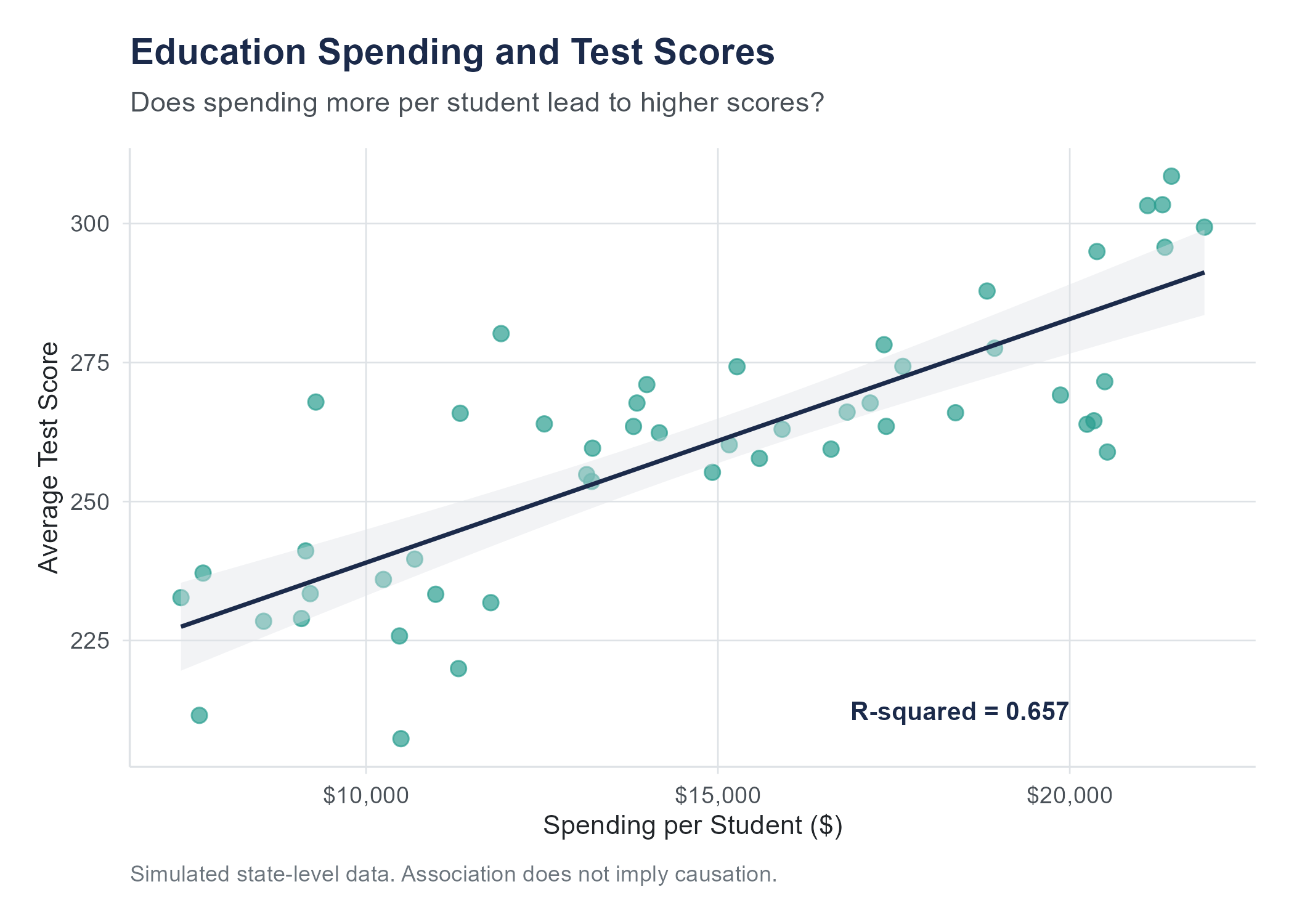
In simple linear regression (one predictor), \(R^2\) equals the square of the correlation coefficient \(r\). For the full 50-state education spending dataset, the correlation between per-pupil spending and average test scores is \(r = 0.434\). If \(r = 0.434\), then \(R^2 = 0.434^2 = 0.188\). This means that about 19% of the variation in test scores across states is associated with differences in per-pupil spending.
10.5.1 Interpreting R-Squared
An \(R^2\) of 0.188 means something concrete. If you knew nothing about spending levels, you would predict every state’s test score to be the mean, and all the variation would be unexplained. By knowing each state’s spending level, you can explain about 19% of the differences in scores. The remaining 81% is due to other factors, things like demographics, teacher quality, curriculum choices, poverty rates, and countless other variables that we have not included in this simple model.
People sometimes ask, “What is a good \(R^2\)?” The answer depends entirely on the context. In the physical sciences, where relationships between variables can be very tight, an \(R^2\) below 0.90 might be disappointing. In the social sciences, where human behavior is noisy and influenced by hundreds of factors, an \(R^2\) of 0.20 or 0.30 might be perfectly respectable. In education research, explaining 19% of the variation with a single predictor tells you the relationship is real but that most of the story lies elsewhere.
A useful analogy: \(R^2\) is like the volume knob on a radio that is tuned between stations. An \(R^2\) of 0 is pure static, no signal at all. An \(R^2\) of 1 is perfect clarity, all signal and no noise. Most real data in the social sciences falls somewhere in the range of a scratchy broadcast where you can make out parts of the melody but plenty of static remains. You know something is playing. You just cannot catch all the lyrics. The question is not whether the signal is perfect. The question is whether there is enough signal to be useful, and that depends on what you are trying to do with it.
10.5.2 Limitations of R-Squared
\(R^2\) is useful, but it has some important limitations that trip people up.
A high \(R^2\) does not mean the model is correct. You can get a high \(R^2\) from a linear model even when the true relationship is curved. The line might pass near the data for the wrong reasons. Always check the residual plots (more on this soon).
A low \(R^2\) does not mean the relationship is unimportant. Even a small \(R^2\) can represent a relationship that matters practically. If a medication explains only 5% of the variation in blood pressure, that might still be a clinically meaningful effect. A variable can be a weak predictor overall but still produce changes that have real consequences.
\(R^2\) says nothing about causation. This should sound familiar by now. A high \(R^2\) between two variables means they are closely associated. It does not tell you that changes in \(X\) cause changes in \(Y\).
\(R^2\) cannot tell you whether you have the right predictor. Maybe spending is correlated with test scores, but the real driver is something else, like median household income, which is correlated with both spending and scores. \(R^2\) tells you how much variation is accounted for, not whether your explanation is the right one.
10.6 Is the Slope Real? Inference for Regression
The regression output for the 50-state education spending data gives a slope of 0.000635; test scores increase by about 0.64 points for every additional $1,000 in per-pupil spending. But that number came from a sample. A different sample would give a different slope. Maybe a little higher, maybe a little lower, maybe even negative. The question is whether the slope you observed reflects a genuine relationship in the population, or whether it could have arisen by chance from data with no real pattern.
This is the same question we asked about means in Chapter 8 and about proportions in Chapter 7. The tools are the same: standard errors, test statistics, p-values, and confidence intervals. The application is new.
10.6.1 Standard Error of the Slope
The slope \(b_1\) is a sample statistic. Like any sample statistic, it has a sampling distribution: if you could repeat the study with a new random sample each time, you would get a different slope each time. The standard error of the slope, denoted \(SE(b_1)\), measures how much the slope would vary across those repeated samples.
Conceptually:
\[SE(b_1) = \frac{s_e}{\sqrt{\sum(x_i - \bar{x})^2}}\]
where \(s_e\) is the residual standard error, the standard deviation of the residuals (roughly, how far typical observations fall from the regression line). You do not need to compute this by hand, but software does it automatically, and the formula reveals three important facts about what makes a slope estimate more or less precise:
Less scatter around the line (smaller \(s_e\)) means a smaller standard error. When the data hugs the regression line tightly, the slope is estimated more precisely.
More spread in the \(X\) values (larger \(\sum(x_i - \bar{x})^2\)) means a smaller standard error. Data points spread across a wide range of \(X\) give the line more to “anchor” on, making the slope more stable.
Larger sample size contributes to both effects: more data points means more information and typically more spread in \(X\).
The residual standard error \(s_e\) itself is computed as:
\[s_e = \sqrt{\frac{\sum(y_i - \hat{y}_i)^2}{n - 2}}\]
We divide by \(n - 2\) because we estimated two parameters (slope and intercept) from the data, leaving \(n - 2\) degrees of freedom. This is analogous to dividing by \(n - 1\) when computing a sample standard deviation, and the logic is the same: we lose a degree of freedom for each parameter we estimate.
10.6.2 Testing Whether the Slope Is Zero
The hypothesis test for the slope asks: could this slope have come from a population where the true slope is zero?
\[H_0: \beta_1 = 0 \quad \text{(no linear relationship)}\] \[H_a: \beta_1 \neq 0 \quad \text{(a linear relationship exists)}\]
The test statistic follows the same logic as every other t-test you have encountered:
\[t = \frac{b_1 - 0}{SE(b_1)} = \frac{b_1}{SE(b_1)}\]
This t-statistic follows a t-distribution with \(n - 2\) degrees of freedom. A large \(|t|\) means the observed slope is many standard errors away from zero, which is strong evidence against the null hypothesis.
Worked example. Returning to the education spending data with \(n = 50\) states, the regression output gives \(b_1 = 0.000635\), \(SE(b_1) = 0.000191\). Then:
\[t = \frac{0.000635}{0.000191} = 3.33\]
With \(df = 48\), this gives a two-tailed p-value of approximately 0.002. At any conventional significance level, we reject the null hypothesis. The data provides strong evidence of a positive linear relationship between per-pupil spending and average test scores.
10.6.3 Confidence Interval for the Slope
Just as we constructed confidence intervals for means and proportions, we can construct one for the slope:
\[b_1 \pm t^* \times SE(b_1)\]
where \(t^*\) is the critical value from the t-distribution with \(n - 2\) degrees of freedom.
For a 95% confidence interval with \(df = 48\), \(t^* \approx 2.011\):
\[0.000635 \pm 2.011 \times 0.000191 = 0.000635 \pm 0.000384 = (0.000252, 0.001019)\]
Interpretation: We are 95% confident that the true slope is between 0.00025 and 0.00102. For each additional dollar of per-pupil spending, test scores increase by somewhere between 0.00025 and 0.00102 points, on average. Since the interval does not contain zero, this confirms the slope is statistically significant at the 5% level.
10.6.4 Reading Regression Output
Every statistics package produces a regression output table with the same basic columns. Here is what a typical table looks like:
| Coefficient | Std. Error | t value | p-value | |
|---|---|---|---|---|
| Intercept | 271.67 | 3.534 | 76.87 | < 0.001 |
| spending_per_student | 0.000635 | 0.000191 | 3.33 | 0.002 |
Each row represents a coefficient. The columns tell you:
- Coefficient: the estimated value (\(b_0\) or \(b_1\)).
- Std. Error: the standard error of that estimate.
- t value: the coefficient divided by its standard error.
- p-value: the probability of observing a t-statistic this extreme if the true coefficient were zero.
This is exactly the table that R’s summary(lm(...)) produces. The slope row is the one that usually matters most. If its p-value is small, you have evidence that the predictor is linearly related to the response.
10.6.5 Statistical vs. Practical Significance in Regression
A slope can be statistically significant but practically trivial. A p-value of 0.001 tells you the slope is almost certainly not zero. It does not tell you the slope is large enough to care about.
In the education example, the slope of 0.00182 means each additional dollar of spending is associated with 0.00182 more points on a standardized test. That is less than two-thousandths of a point per dollar. Even $10,000 of additional spending is associated with about 18 additional points. Whether that is a meaningful improvement depends on the scale of the test, the cost of the spending, and the goals of the policy. The p-value cannot answer those questions. The slope itself, combined with context and judgment, is what tells you whether the effect matters in practice.
Always report both the coefficient and its p-value. The coefficient tells you how big the effect is. The p-value tells you how sure you are that it is not zero. You need both.
10.7 Residuals: What the Model Misses
Every data point has a residual, the difference between what was actually observed and what the model predicted.
\[e_i = y_i - \hat{y}_i\]
Residuals are the leftovers. They are what remains after the model has done its best to explain the data. And they carry a great deal of information, because they tell you where the model works well and where it falls short.
If a state has a positive residual, it scored higher than the regression line predicted given its level of spending. Something about that state is producing better outcomes than spending alone would suggest. Maybe it has an unusually effective curriculum, or a high proportion of well-trained teachers, or a demographic profile that favors higher test performance.
If a state has a negative residual, it scored lower than predicted. Something about that state is dragging outcomes down relative to what spending alone would predict.
Large residuals deserve attention. They might indicate unusual cases that do not fit the general pattern, and investigating them often reveals interesting features of the data that the model cannot capture.
10.7.1 Properties of Residuals
The residuals from a least squares regression have two mathematical properties that are always true.
The residuals sum to zero. \(\sum_{i=1}^{n} e_i = 0\). Positive and negative residuals perfectly cancel out.
The residuals are uncorrelated with the predicted values \(\hat{y}\). This means there is no leftover linear pattern between the predictions and the residuals.
These properties are consequences of the least squares fitting procedure, not assumptions. They hold for every least squares regression, regardless of whether the data actually follows a linear pattern. They are mathematical facts, not things you need to check.
10.7.2 Signal, Noise, and the Population Model
A useful way to think about regression is in terms of signal and noise. The line is what regression treats as the systematic pattern: the signal. Everything that is not on the line is treated as random scatter: the noise. The residuals are the realized noise in the sample at hand.
At the population level, this is sometimes written
\[Y = \beta_0 + \beta_1 X + \varepsilon\]
where \(\beta_0\) and \(\beta_1\) are the unknown population intercept and slope (the parameters we are estimating with \(b_0\) and \(b_1\)), and \(\varepsilon\) is the random error term: what is left over once the linear signal has been removed. Each observation’s residual \(e_i = y_i - \hat{y}_i\) is the sample-level estimate of this otherwise unobservable \(\varepsilon\). We will see this notation again in Chapter 11, where multiple predictors enter the model and the bookkeeping of signal and noise becomes more involved. For now, the takeaway is that the residuals are not bookkeeping leftovers; they are the empirical signature of the noise, and the LINE assumptions in the next section are statements about how that noise is supposed to behave.
What you do need to check is whether the residuals behave in the ways that the regression model assumes. And that is our next topic.
10.8 The Assumptions Behind Regression
A regression line can always be computed. You can always fit a least squares line to a scatter plot. The software will never refuse. But the line is only meaningful, and the inferences drawn from it are only valid, if certain conditions are met.
These conditions are often summarized by the acronym LINE, which stands for Linearity, Independence, Normality, and Equal variance. Let us walk through each one.
10.8.1 L: Linearity
The relationship between \(X\) and \(Y\) should be approximately linear. This sounds obvious for a method called “linear regression,” but it is the assumption most often violated in practice.
If the true relationship between \(X\) and \(Y\) is curved, fitting a straight line will systematically overpredict in some regions of \(X\) and underpredict in others. The line might still pass near the data in some average sense, but the predictions will be biased, too high in some places and too low in others.
How to check it. Make a scatter plot of \(X\) versus \(Y\) before you fit the regression. Look for curvature. If the data bends, a straight line is not the right tool. You might need to transform the data (taking logarithms is a common approach) or use a more flexible model.
10.8.2 I: Independence
The observations should be independent of one another. The value of one observation should not provide information about the value of another.
Independence is violated when there is some kind of structure in how the data was collected. Time series data, where observations are recorded sequentially, often shows dependence because today’s value is related to yesterday’s. Clustered data (students nested within schools, patients nested within hospitals) can also violate independence, since observations from the same cluster tend to be more similar to one another than to observations from a different cluster.
How to check it. This is less about a plot and more about understanding how the data was collected. If the data was gathered by random sampling from a population, independence is usually reasonable. If the data has a time component or a grouping structure, be cautious.
10.8.3 N: Normality of Residuals
The residuals should be approximately normally distributed. This assumption matters most for inference, specifically for the confidence intervals and hypothesis tests that are built on top of the regression. The point estimates of slope and intercept do not require normality. But if you want to construct confidence intervals or test whether the slope is different from zero, you need the residuals to be roughly bell-shaped.
How to check it. Make a histogram of the residuals and see if it looks roughly symmetric and bell-shaped. Better yet, make a normal probability plot (also called a QQ plot), which plots the residuals against the values they would take if they were perfectly normal. If the points fall close to a straight diagonal line, the normality assumption is reasonable. Deviations from the line, especially in the tails, suggest non-normality.
For large samples, the normality assumption becomes less critical thanks to the Central Limit Theorem, which makes the sampling distributions of \(b_0\) and \(b_1\) approximately normal even when the residuals are not perfectly so. But for small samples, non-normal residuals can make your confidence intervals and p-values unreliable. This is worth emphasizing: the LINE assumptions are not just about making the line fit well; they are the foundation for all the inference tools (standard errors, t-tests, confidence intervals, p-values) described in the section on inference for regression.
10.8.4 E: Equal Variance (Homoscedasticity)
The spread of the residuals should be roughly the same across all values of \(X\). This is the same homoscedasticity assumption introduced in the ANOVA discussion in Chapter 9, applied here to the residuals around a regression line rather than to multiple groups. Another name for it is constant variance. The opposite, where the spread of residuals changes across \(X\), is called heteroscedasticity.
Why does this matter? The standard errors used in regression inference assume that the variability of \(Y\) around the line is the same everywhere. If the residuals fan out (getting wider as \(X\) increases, for example), the standard errors will be wrong. They might be too small in some regions and too large in others, leading to confidence intervals and hypothesis tests that cannot be trusted.
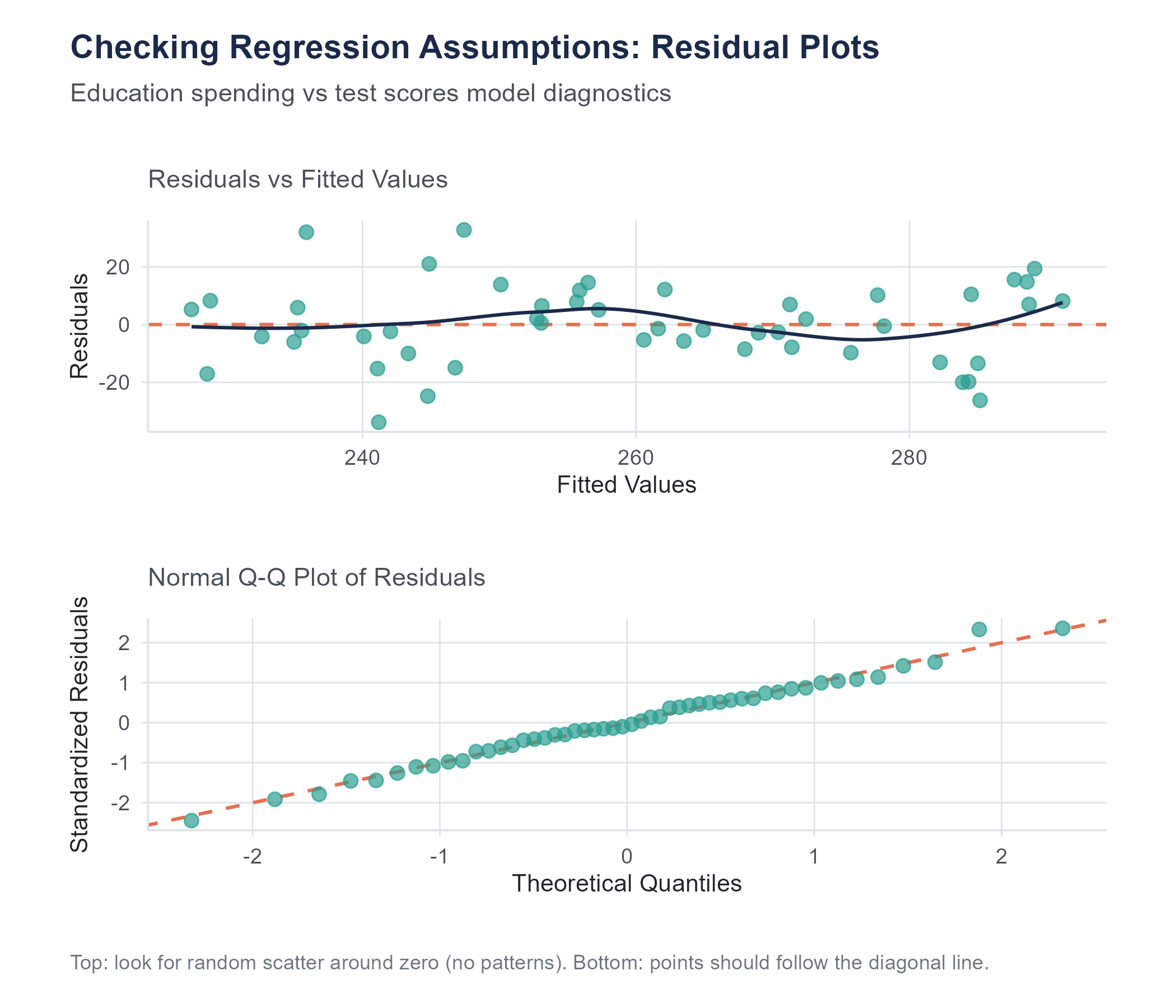
How to check it. Make a scatter plot of the residuals versus the fitted values (\(\hat{y}\)). If the assumption holds, the residuals should form a horizontal band of roughly constant width. If the band widens or narrows, or shows a funnel shape, the equal variance assumption is violated. We come back to this plot, and to the QQ plot for normality, in detail later in the chapter.
The word “homoscedasticity” comes from the Greek homos (same) and skedasis (scattering). Its opposite, “heteroscedasticity,” means “different scattering.” The vocabulary is intimidating, but the concept is simple. Does the scatter in the residuals stay the same across the range of predictions, or does it change? If it stays the same, you have homoscedasticity. If it changes, you have heteroscedasticity. The vocabulary is hard. The idea is not.
10.9 Checking Assumptions with Residual Plots
In practice, you check most of the LINE assumptions using two plots.
10.9.1 Residuals vs. Fitted Values Plot
This is the workhorse diagnostic. Plot the residuals (\(e_i\)) on the vertical axis against the fitted values (\(\hat{y}_i\)) on the horizontal axis. A clean plot (random scatter, centered on zero, with roughly constant spread from left to right) is consistent with both the linearity (L) and the equal-variance (E) assumptions discussed earlier.
The patterns to watch for are:
- A curved shape (U, frown, wave) → linearity is in trouble.
- A funnel that opens or closes → equal variance is in trouble.
- Distinct subgroups → an important grouping variable is missing from the model.
- A single point sitting far from the rest → an influential observation pulling the line.
10.9.2 Normal QQ Plot
Plot the ordered residuals against the theoretical quantiles of a normal distribution. This is the same QQ-plot reading practice introduced in Chapter 6: points close to the diagonal line are consistent with the normality (N) assumption, an S-shape signals heavy or light tails, and a frown or smile signals skew. Tail wobble in small samples is common and usually fine.
These diagnostic plots do not produce a yes-or-no answer. There is no test that says “your assumptions are perfectly met.” You are looking for gross violations: patterns obvious enough to call the inferential results into question. Minor wiggles are normal. Clear patterns are problems.
Beginning analysts sometimes freeze at this point, worried that they are not experienced enough to tell a “minor wiggle” from a “clear pattern.” This is a reasonable concern, and the honest answer is that it takes practice. But here is a useful benchmark: if you showed the residual plot to three reasonable people and all three noticed the same pattern without prompting, it is probably a real problem. If only one of them sees something, and only after squinting, it is probably fine. Statistics involves judgment, more than formulas, and this is one of those places where judgment matters.
Open the Regression Explorer on the companion website. Add data points, fit the model, and check residuals. Try adding a single outlier far from the trend and watch how much the slope shifts. Then remove it and see the line snap back.
10.10 Prediction and the Danger of Extrapolation
One of the most common uses of regression is prediction. Given a value of \(X\), what does the model predict for \(Y\)? The equation makes this straightforward. Plug in the value of \(X\), compute \(\hat{y}\), and you have your prediction.
If per-pupil spending is $14,000, and our regression equation is \(\hat{y} = 271.67 + 0.000635x\) (where \(x\) is in dollars), then the predicted test score is
\[\hat{y} = 271.67 + 0.000635(14{,}000) = 271.67 + 8.89 = 280.56\]
This prediction comes with the usual caveat that it is an average prediction. It does not mean a specific state spending $14,000 per student will have a score of exactly 280.56. It means that, based on the pattern observed in the data, 280.56 is our best guess for the average score among states spending that amount.
10.10.1 Interpolation vs. Extrapolation
Predictions are most trustworthy when they are made within the range of \(X\) values that were used to build the model. If our data includes states spending between about $10,000 and $33,000 per student, then predicting the score for a state spending $14,000 is interpolation. We are predicting within the observed range. The model has data to support this prediction.
Extrapolation is predicting outside the observed range. What if someone asks you to predict the test score for a state spending $40,000 per student, or $3,000 per student? The model will happily give you a number. The formula does not care whether you plug in 14,000 or 40,000 or 3,000. But the prediction is unreliable because you have no data to support it.
Why is extrapolation dangerous? Because the linear pattern you observed within one range may not hold outside that range. Maybe the relationship between spending and scores is linear between $10,000 and $33,000, but it levels off above $33,000 because there are diminishing returns to additional spending. Maybe it drops off below $5,000 because there is a minimum level of funding needed for schools to function. The straight line knows nothing about these possibilities. It just extends forever in both directions, regardless of whether the real relationship does the same.
A widely cited example of extrapolation gone wrong involves predicting athletic performance. If you plot world record times in the men’s 100-meter dash over the twentieth century, you see a clear downward trend. A regression line fit to this data would predict that, at some point in the future, humans will run the 100 meters in zero seconds. Then in negative seconds. The linear model does not know about the physical limits of human speed. It just extends the trend, and the trend eventually becomes absurd.
The rule of thumb is simple. Use regression for interpolation with reasonable confidence. Use it for modest extrapolation with caution. Use it for aggressive extrapolation at your peril.
A subtler form of extrapolation catches people off guard. Sometimes the range of \(X\) in your data is technically broad enough, but the prediction involves an unusual combination of circumstances. Suppose you build a regression predicting home sale prices from square footage, using data from a suburban neighborhood where most homes are between 1,200 and 3,000 square feet. Predicting the price of a 2,000-square-foot home is straightforward interpolation. But what about a 2,800-square-foot home that happens to be on a flood plain, or one that was built in 1890 when the rest of the neighborhood dates from the 1990s? The square footage falls within range, but the home itself is unlike anything in the dataset. This is a reminder that extrapolation is not only about the numerical range of \(X\). It is about whether the new observation resembles the observations that built the model.
10.11 A Complete Example
Let us walk through a full regression analysis, from scatter plot to diagnostics, using a concrete scenario.
A researcher collects data on 15 metropolitan areas, recording the average daily commute time in minutes (\(X\)) and the average stress level on a 1-to-100 scale from a survey of residents (\(Y\)). Here are the summary statistics.
\[n = 15, \quad \bar{x} = 28.6, \quad \bar{y} = 54.3, \quad s_x = 8.4, \quad s_y = 12.7, \quad r = 0.72\]
Step 1. Compute the regression equation.
\[b_1 = r \frac{s_y}{s_x} = 0.72 \times \frac{12.7}{8.4} = 0.72 \times 1.512 = 1.089\]
\[b_0 = \bar{y} - b_1 \bar{x} = 54.3 - 1.089 \times 28.6 = 54.3 - 31.15 = 23.15\]
\[\hat{y} = 23.15 + 1.089x\]
Interpretation. For each additional minute of average commute time, the model predicts stress levels to increase by about 1.09 points on the 100-point scale. A city with zero commute time would have a predicted stress level of 23.15, though this extrapolation should be taken with caution since no city in the dataset has a zero commute time.
Step 2. Compute \(R^2\).
\[R^2 = r^2 = 0.72^2 = 0.5184\]
About 52% of the variation in stress levels across these metropolitan areas is accounted for by differences in average commute time. The other 48% is due to other factors we have not measured, things like cost of living, population density, climate, access to green space, or local culture.
Step 3. Check assumptions. In a real analysis, you would now produce a residuals versus fitted values plot and a QQ plot. You would look for curvature in the residuals plot (checking linearity), a fan shape (checking equal variance), and departures from the diagonal in the QQ plot (checking normality). With only 15 observations, you would be especially attentive to any single point that seems to pull the line disproportionately.
Step 4. Make a prediction. What is the predicted stress level for a city with an average commute of 35 minutes?
\[\hat{y} = 23.15 + 1.089(35) = 23.15 + 38.12 = 61.27\]
Since 35 minutes falls within the range of commute times in the dataset, this is interpolation, and the prediction is reasonable within the limits of the model.
10.12 Before You Regress: Examine Your Variables
It is tempting to jump straight into regression the moment you have two numerical variables. Resist that temptation. Before fitting a line, spend time getting to know your variables and the relationship between them.
Start with a scatter plot. Is the relationship approximately linear? Is it curved? Is it strong or weak? Are there outliers that might dominate the fit? A scatter plot answers these questions at a glance, and the answers determine whether simple linear regression is appropriate.
Also consider looking at the correlation between your variables and, if you have more than two variables in your dataset, at the correlations between all pairs. A correlation matrix can reveal which variables are most strongly associated with each other, which might help you choose the best predictor for your regression, and which might alert you to potential confounders.
Return to the Regression Explorer. Load a dataset with multiple variables and explore pairwise scatter plots before building your model. Identify which predictors show the strongest linear relationship with your outcome before adding them to the regression.
10.13 Outliers and Influential Points
Not all data points contribute equally to the regression line. A few points can exert outsized influence, especially if they sit far from the bulk of the data on the \(X\) axis.
A high-leverage point is an observation with an \(X\) value far from \(\bar{x}\). Because the regression line must pass through \((\bar{x}, \bar{y})\) and is anchored there, points far from the center on the horizontal axis act like a long lever arm. They have the potential to swing the line more than points near the center.
An influential point is one whose removal would substantially change the regression line. Not all high-leverage points are influential. If a high-leverage point falls right on the trend established by the other data, it reinforces the line rather than pulling it somewhere new. But a high-leverage point that is also far from the trend line can dramatically change the slope and intercept.
When you find an influential point, the question is not “should I delete it?” The question is “why is it unusual?” Maybe it represents a data entry error that should be corrected. Maybe it represents an unusual case that has a reasonable explanation. Maybe it reveals that the data comes from two different populations that should be analyzed separately.
Deleting a point simply because it is inconvenient is not good practice. Investigating it almost always is.
A good example comes from public health. In studies of air pollution and mortality rates across cities, researchers occasionally find a city whose mortality rate is far lower than its pollution level would suggest. The temptation is to remove it as an outlier, since it makes the regression line less steep and the story less dramatic. But investigating that city might reveal something valuable. Maybe it has an unusually extensive public transit system that reduces individual exposure despite high ambient pollution levels, or maybe its population skews younger than average. The outlier, rather than being a problem to eliminate, becomes a clue pointing toward factors the model has not captured. Some of the most interesting findings in research have come from taking outliers seriously instead of deleting them.
A practical guideline is to fit the regression with and without the suspicious point. If the slope, intercept, and \(R^2\) barely change, the point is unusual but not influential, and you can proceed with it included. If removing it dramatically changes the results, you need to understand why before deciding how to handle it. Report both analyses if the point is ambiguous. Transparency about influential observations is always better than silent deletion.
Regression results shape policy, and the level of aggregation can change the story in ways that mislead. The education spending data in this chapter is measured at the state level: each data point represents one state’s average spending and one state’s average test scores. A positive slope tells you that states spending more tend to have higher average scores. It does not tell you that an individual student in a higher-spending school will score higher.
This distinction matters because it is routinely ignored. State-level regression results have been used to justify funding formulas that affect millions of students, despite the fact that the relationship between spending and outcomes at the individual or school level may look very different from the state-level pattern. This error, drawing individual-level conclusions from group-level data, is called the ecological fallacy, and it has a long, damaging history in social science and policy.
The same issue arises in health research (countries with higher fat consumption have higher cancer rates, but that does not mean the person eating butter is at higher risk), in criminal justice (neighborhoods with higher poverty have higher crime, but that does not mean a given poor person is more likely to commit a crime), and in business (regions with higher advertising spend have higher sales, but the individual-level effect of an ad may be small).
When you use regression to inform decisions about people, always ask whether the data was measured at the same level as the decisions you are making. If the data is aggregated and the decisions are individual, be cautious about generalizing.
10.14 Correlation and Regression: Close Relatives
Correlation was introduced in Chapter 4, where Pearson’s \(r\), scatter plots, and Anscombe’s Quartet provided the visual and numerical foundation for thinking about how two numerical variables move together. With regression now in hand, it is worth being explicit about how the two methods are related, because they are close relatives but play different roles.
Correlation (\(r\)) measures the strength and direction of the linear relationship between two variables. It is a unitless number between \(-1\) and \(+1\). It treats \(X\) and \(Y\) symmetrically. The correlation between \(X\) and \(Y\) is the same as the correlation between \(Y\) and \(X\).
Regression uses one variable to predict another. It is asymmetric. The regression of \(Y\) on \(X\) gives a different equation than the regression of \(X\) on \(Y\). The slope of the regression has units (points per thousand dollars, stress per minute, kilograms per centimeter) and a directional interpretation that correlation lacks.
The two are connected mathematically. The slope of the regression line is \(b_1 = r \frac{s_y}{s_x}\), and \(R^2 = r^2\). But they answer different questions. Correlation answers, “How tightly do \(X\) and \(Y\) move together?” Regression answers, “By how much does \(Y\) change, on average, when \(X\) changes by one unit?”
You need both. Correlation tells you whether a relationship is worth modeling. Regression models it.
10.15 What Regression Cannot Do
Before we close, it is worth stating plainly what simple linear regression cannot do.
It cannot establish causation. We have said this, but it bears repeating. A regression line between education spending and test scores does not mean that increasing spending will increase scores. There may be confounding variables that explain both.
It cannot capture nonlinear relationships. If the scatter plot bends, a straight line misses the story. More advanced techniques (polynomial regression, transformations, nonlinear models) are needed.
It cannot handle multiple predictors. Simple linear regression uses one explanatory variable. If test scores are influenced by spending, poverty rates, teacher salaries, and class sizes, you need multiple regression, which is the subject of the next chapter.
It cannot rescue bad data. If the data was collected with bias, if the sample is unrepresentative, if the measurements are unreliable, regression will faithfully produce an answer that inherits all of those flaws.
Regression is a powerful tool. But like any tool, it is only as good as the hands that wield it and the materials it is given.
There is one more limitation worth mentioning, because it trips up beginners and experts alike. Simple linear regression assumes that the relationship you care about can be summarized by a single straight line for the entire dataset. But sometimes the relationship differs across subgroups. The effect of study hours on exam scores might be steep for students who are studying effectively and flat for students who are just rereading the same highlighted passages. The regression line, averaged across everyone, might show a moderate positive slope that accurately describes nobody. When you suspect that different groups in your data have different relationships between \(X\) and \(Y\), a single regression line is papering over important differences. This is another reason to look at your scatter plot carefully before fitting a line, and to consider whether color-coding the points by a grouping variable reveals patterns that a single line would miss.
Give an AI tool two columns of numbers and ask it to “analyze the relationship,” and you will almost certainly get a regression line. The slope, the intercept, the \(R^2\), and a p-value will appear in seconds. What you will almost never get, unless you explicitly ask, is a residual plot.
This is a problem, because the regression output can look perfectly reasonable, statistically significant slope, respectable \(R^2\), while the residual plot reveals that the model is fundamentally wrong. A curved pattern in the residuals means the linear model is missing the real relationship. A funnel shape means the inference (standard errors, p-values, confidence intervals) cannot be trusted. A single influential point dragging the line means the slope describes one outlier rather than the data.
AI tools will also extrapolate without warning. Ask for a prediction at a value of \(X\) far outside the observed range and the tool will compute \(\hat{y}\) without hesitation, even when the prediction is absurd. It has no concept of “the data doesn’t go there.”
The fix is simple in principle: always plot your data before fitting a model, and always check the residual plots after. But it requires the discipline to ask the AI for diagnostics rather than accepting the first output it produces. The AI is doing the arithmetic. You are doing the thinking.
10.16 Looking Ahead
Simple linear regression models the relationship between one explanatory variable and one response variable. But most outcomes in the real world are influenced by more than one factor. Test scores depend on spending, yes, but also on demographics, teacher quality, class size, and a dozen other variables. Salary depends on experience, but also on education, occupation, industry, and geography. The next chapter extends regression to handle multiple predictors simultaneously. Multiple regression lets you ask, “What is the relationship between \(X\) and \(Y\), after accounting for the effects of other variables?” That question, and the careful interpretation it demands, is where regression becomes both one of the workhorses of applied statistics and one of the methods most often misused.
10.17 Further Reading and References
The following works are cited in this chapter or provide valuable additional context for the ideas covered here.
On the history of regression: Stigler, S. M. (1986). The history of statistics: The measurement of uncertainty before 1900. Harvard University Press. (Covers the competing claims of Gauss and Legendre over the invention of the least squares method, the historical episode described in this chapter’s note on the prediction of Ceres.)
On education spending and student outcomes: Jackson, C. K., Johnson, R. C., & Persico, C. (2016). The effects of school spending on educational and economic outcomes: Evidence from school finance reforms. Quarterly Journal of Economics, 131(1), 157–218. (A rigorous causal analysis showing that increased school spending, when targeted at low-income districts, leads to improved educational attainment and adult earnings, using methods that go beyond the simple correlations discussed in this chapter.)
On the ecological fallacy: Robinson, W. S. (1950). Ecological correlations and the behavior of individuals. American Sociological Review, 15(3), 351–357. (The classic paper demonstrating that correlations at the aggregate level can differ dramatically from correlations at the individual level, a warning relevant to the state-level education spending analysis in this chapter.)
On regression diagnostics: Fox, J. (2016). Applied regression analysis and generalized linear models (3rd ed.). Sage Publications. (A comprehensive treatment of regression diagnostics, influence measures, and assumption checking, going well beyond the introduction provided in this chapter.)
For further reading on regression: Gelman, A., Hill, J., & Vehtari, A. (2020). Regression and other stories. Cambridge University Press. (A modern, applied approach to regression that emphasizes interpretation, assumptions, and causal reasoning, written for a broad audience of data analysts and researchers.)
10.18 Key Terms
Explanatory variable (independent variable, predictor): The variable used to predict or explain the response. Plotted on the horizontal axis. Denoted \(X\).
Response variable (dependent variable, outcome): The variable being predicted or explained. Plotted on the vertical axis. Denoted \(Y\).
Regression line: A straight line of the form \(\hat{y} = b_0 + b_1 x\) that summarizes the linear relationship between \(X\) and \(Y\) in a dataset.
Least squares regression: The method of fitting the regression line by minimizing the sum of the squared residuals.
Slope (\(b_1\)): The amount by which \(\hat{y}\) changes for each one-unit increase in \(X\). Computed as \(b_1 = r \frac{s_y}{s_x}\).
Standard error of the slope (\(SE(b_1)\)): A measure of how much the estimated slope would vary across repeated samples. Used to construct confidence intervals and hypothesis tests for the slope.
t-test for the slope: A hypothesis test of \(H_0: \beta_1 = 0\), testing whether the observed slope is significantly different from zero. The test statistic is \(t = b_1 / SE(b_1)\) with \(n - 2\) degrees of freedom.
Intercept (\(b_0\)): The predicted value of \(Y\) when \(X = 0\). Computed as \(b_0 = \bar{y} - b_1 \bar{x}\).
Residual (\(e_i\)): The difference between an observed value and its predicted value, \(e_i = y_i - \hat{y}_i\). Positive residuals indicate the observation is above the line, negative residuals indicate it is below.
Sum of squared residuals (SSR or \(SS_{Residual}\)): The total of all squared residuals, \(\sum (y_i - \hat{y}_i)^2\). The quantity minimized by the least squares method.
Coefficient of determination (\(R^2\)): The proportion of the total variability in \(Y\) that is explained by the linear relationship with \(X\). Equals \(r^2\) in simple linear regression.
Ecological fallacy: The error of drawing conclusions about individuals from data measured at the group or aggregate level. A positive relationship at the state level does not necessarily hold at the individual level.
Interpolation: Predicting \(Y\) for an \(X\) value within the range of the observed data.
Extrapolation: Predicting \(Y\) for an \(X\) value outside the range of the observed data. Generally unreliable because the linear pattern may not hold beyond the observed range.
Linearity assumption: The condition that the relationship between \(X\) and \(Y\) is approximately a straight line.
Independence assumption: The condition that the observations are independent of one another.
Normality assumption: The condition that the residuals are approximately normally distributed. Most important for inference (confidence intervals, hypothesis tests) rather than for the point estimates of slope and intercept.
Equal variance (homoscedasticity): The condition that the spread of residuals is roughly the same across all values of \(X\).
Heteroscedasticity: The condition where the spread of residuals changes across values of \(X\), violating the equal variance assumption.
High-leverage point: A data point with an \(X\) value far from \(\bar{x}\), giving it the potential to strongly influence the regression line.
Influential point: A data point whose removal would substantially change the fitted regression line.
Normal probability plot (QQ plot): A diagnostic plot that compares the distribution of the residuals to a normal distribution. Points should fall along a straight diagonal line if the normality assumption is satisfied.
Residual standard error (\(s_e\)): The standard deviation of the residuals, measuring the typical distance of observed values from the regression line. Computed as \(s_e = \sqrt{SS_{Residual} / (n - 2)}\).
A full R walkthrough of this chapter is online at stats.marginoferrormedia.com/walkthroughs/r-ch10.html. It fits lm(avg_score ~ spending_per_student) to reproduce the chapter’s coefficients (slope ≈ 0.000635, t ≈ 3.33, p ≈ 0.0017), computes prediction intervals, and runs residual diagnostics.
10.19 Exercises
10.19.1 Check Your Understanding
In the regression equation \(\hat{y} = b_0 + b_1 x\), explain what the hat symbol over \(y\) means and why it is important.
In your own words, explain the least squares criterion. What is being minimized, and why do we square the residuals instead of just adding them up?
A regression analysis of hours spent exercising per week (\(X\)) and resting heart rate in beats per minute (\(Y\)) produces the equation \(\hat{y} = 82.4 - 1.3x\). Interpret the slope in the context of this problem. Then interpret the intercept.
Explain what \(R^2\) measures. If \(R^2 = 0.64\), what does this tell you? What does it not tell you?
What is a residual? If a data point has a residual of \(-7.2\), what does that tell you about how the model’s prediction compares to the actual observation?
State the four assumptions of simple linear regression using the LINE acronym. For each, explain in one or two sentences what the assumption means.
Describe what you would look for in a residuals vs. fitted values plot if you were checking the linearity and equal variance assumptions. What patterns would concern you?
Explain the difference between interpolation and extrapolation. Why is extrapolation risky even when the regression model fits the observed data well?
A researcher computes \(r = 0.85\) between two variables and reports that \(X\) causes changes in \(Y\) because the regression has a high \(R^2\). What is wrong with this reasoning?
Can you always compute a least squares regression line for any scatter plot, even one with a curved pattern? If so, why is it a problem to do so?
A regression of monthly sales (\(Y\)) on advertising spending (\(X\)) produces a slope of \(b_1 = 2.4\) with a standard error of \(SE(b_1) = 0.8\) and a sample size of \(n = 30\). Compute the t-statistic for the slope. With \(df = 28\), would this slope be statistically significant at \(\alpha = 0.05\)? Explain what this test tells you.
A regression output shows a slope of 0.03 with a p-value of 0.001 and an \(R^2\) of 0.02. A classmate says, “The p-value is tiny, so this must be a strong and important relationship.” Do you agree? Explain the difference between statistical significance and practical significance in this context.
10.19.2 Apply It
(See Appendix B for complete variable descriptions for all datasets used in these exercises.)
Use the dataset education-spending.csv for the following problems. This is a simulated dataset, mathematically modeled to reflect the kinds of state-level patterns reported in the NCES Digest of Education Statistics, NAEP composite test scores, and the Census Bureau’s Small Area Income and Poverty Estimates (SAIPE). The 50 rows represent the 50 U.S. states. Variables include state, spending_per_student (per-pupil spending, dollars), avg_score (an average composite test score in NAEP-style units), median_household_income (dollars), pct_poverty, student_teacher_ratio, and pct_free_lunch. The correlations and orders of magnitude in the simulated data are calibrated to the relationships observed in the underlying real sources, but no individual state’s row should be read as that state’s actual reported value.
Create a scatter plot of per-pupil spending (\(X\)) versus average test score (\(Y\)). Describe the overall pattern. Does the relationship appear approximately linear? Are there any obvious outliers?
Compute the correlation between per-pupil spending and average test score. Based on this value, describe the strength and direction of the linear relationship.
Using the summary statistics provided with the dataset (or computed by your software), calculate the slope and intercept of the least squares regression line for predicting test score from per-pupil spending. Write the equation in the form \(\hat{y} = b_0 + b_1 x\).
Interpret the slope of the regression line in the context of education spending and test scores. Be specific about units.
Interpret the intercept of the regression line. Does the intercept have a meaningful interpretation in this context? Explain why or why not.
Compute \(R^2\) and interpret it in context. What percentage of the variability in test scores is explained by per-pupil spending? What might account for the unexplained variability?
Using the regression equation, predict the average test score for a state that spends $11,500 per pupil. Is this interpolation or extrapolation? How do you know?
Using the regression equation, predict the average test score for a state that spends $40,000 per pupil (note that this is above the maximum spending level in the dataset). Why should you be cautious about this prediction?
Identify the state with the largest positive residual and the state with the largest negative residual in the dataset. For each, calculate the residual and explain what it tells you about that state’s performance relative to what the model predicts.
Create a residuals vs. fitted values plot and a QQ plot for the residuals. Based on these plots, assess whether the LINE assumptions appear to be met. Describe any patterns you observe and what they suggest about the model’s adequacy.
Using your regression model from problem 3, examine the regression output from your software. Report the standard error of the slope, the t-statistic, and the p-value. Is the slope statistically significant at \(\alpha = 0.05\)? Construct a 95% confidence interval for the slope and interpret it in the context of education spending and test scores.
Identify any high-leverage or influential observations in your regression model. In R,
cooks.distance(model)produces Cook’s distance for each observation; a common rule of thumb flags any observation with Cook’s distance greater than \(4/n\) as worth a second look. Plot Cook’s distance against observation index, mark the threshold, and identify which states (if any) cross it. Then refit the regression with those states removed. How much do the slope, intercept, and \(R^2\) change? Should those states be excluded from the analysis, or do they represent genuine variation in the population? Justify your answer.
10.19.3 Think Deeper
The opening story of this chapter describes the scatter plot of education spending vs. test scores. Suppose someone uses this regression to argue that the state legislature should increase per-pupil spending by $2,000, predicting it will raise test scores by a specific amount. What assumptions is this person making beyond what the regression supports? What confounding variables might complicate this claim? What study design would give stronger evidence about the causal effect of spending?
Two researchers analyze the same education dataset. Researcher A fits a regression of test scores on per-pupil spending and gets \(R^2 = 0.19\). Researcher B fits a regression of test scores on median household income and gets \(R^2 = 0.25\). Researcher B concludes that income “matters more” than spending for education outcomes. Evaluate this conclusion. What is right about it? What is misleading? What additional analysis would you want before drawing conclusions about which variable matters more?
A school district collects data over 20 years on its annual budget (adjusted for inflation) and average student test scores. They fit a regression and find a positive slope with \(R^2 = 0.72\). A board member argues this proves that their funding increases have been effective. Discuss at least two threats to the validity of this conclusion. Consider the independence assumption, the possibility of confounders that change over time, and the difference between cross-sectional and longitudinal data.
Consider the residuals from a regression of test scores on per-pupil spending. Suppose the residuals vs. fitted values plot shows a clear funnel shape, with residuals becoming more spread out as fitted values increase. What does this violation of the equal variance assumption mean in practical terms for the education data? Which predictions from the model should you trust more, and which less? What could you do to address this problem?
A data journalist publishes an article with the headline, “States That Spend More on Education See Only Modest Test Score Gains, Regression Shows.” The regression has a small positive slope and an \(R^2\) of 0.15. A reader comments that the analysis is misleading because it ignores the differences between states. Another reader comments that the low \(R^2\) proves spending does not matter. Evaluate both the headline and the two reader comments. Who is closest to the truth, and what nuance is everyone missing?