6 The Normal Distribution and the Central Limit Theorem
6.1 Every Baby Gets Weighed
Within minutes of being born, before most newborns have even opened their eyes, someone places them on a scale. The number that appears, measured in grams, gets recorded in a chart, compared against a threshold, and sometimes used to make fast decisions about that infant’s care.
A full-term baby in the United States weighs, on average, about 3,400 grams, roughly 7.5 pounds. Most babies cluster near that number. Some weigh a bit more, some a bit less, and as you move further from the average in either direction, you find fewer and fewer babies. A 2,200-gram baby is uncommon. A 4,800-gram baby is uncommon. A baby under 1,500 grams is rare and almost certainly in serious medical trouble.
If you were to plot the birth weights of thousands of full-term newborns on a histogram, the shape would be unmistakable. It would rise smoothly to a peak near the center, then fall off symmetrically on both sides, forming the shape that statisticians call the normal distribution and everyone else calls the bell curve.
Hospitals do not use this shape merely as a curiosity. They use it to set clinical thresholds. A birth weight below 2,500 grams is classified as “low birth weight.” Below 1,500 grams is “very low birth weight.” These cutoffs are not arbitrary round numbers picked for convenience. They correspond roughly to positions on the normal distribution where outcomes begin to worsen in measurable, predictable ways. Babies in the tails of the distribution, those unusually small or unusually large, face higher risks of complications, and the further into the tail they fall, the higher the risk.
The pediatrician examining a newborn is, in a very real sense, asking a statistical question. Given what we know about the distribution of birth weights, how unusual is this baby’s weight? And if it is unusual, how concerned should we be?
That question, “how unusual is this value given the distribution?”, is the question this entire chapter is built to answer. The normal distribution gives us a framework for quantifying “unusual.” The Central Limit Theorem, which we will reach by the end of the chapter, explains why this framework works far more broadly than you might expect.
Birth weights are also a good reminder that statistics is never just about numbers on a page. Behind every data point is a baby, a family, a set of circumstances. The statistical tools we develop here are means to an end, and that end is better decisions, better care, and better understanding of the world.
6.2 The Normal Distribution
6.2.1 Shape, Center, and Spread
The normal distribution is a continuous probability distribution defined by two parameters. The mean, \(\mu\) (the Greek letter mu), determines where the center of the bell sits on the number line. The standard deviation, \(\sigma\) (the Greek letter sigma), determines how wide or narrow the bell is.
A normal distribution with \(\mu = 100\) and \(\sigma = 15\) is centered at 100 and has most of its values falling within about 15 units of the center on either side. A normal distribution with \(\mu = 100\) and \(\sigma = 5\) is centered at the same place but is much more tightly concentrated. A normal distribution with \(\mu = 0\) and \(\sigma = 1\) is centered at zero and is the version we will use most often as a reference. That particular version has a name, the standard normal distribution, and we will return to it shortly.
Every normal distribution, regardless of its mean or standard deviation, shares the same fundamental shape. It is
- Symmetric around the mean. The left half is a mirror image of the right half.
- Unimodal, meaning it has a single peak, which occurs at the mean.
- Asymptotic, meaning the tails extend infinitely in both directions, getting ever closer to the horizontal axis but never quite touching it.
That last property sometimes bothers students. If the tails go on forever, doesn’t that mean a normal distribution assigns some probability to absurd values, like a negative birth weight? Technically, yes. But the probability in the far tails is so vanishingly small that it is practically zero. A normal model with \(\mu = 3400\) grams and \(\sigma = 500\) grams assigns a probability of less than one in a billion to a negative birth weight. The model is not perfect, but it is useful, and “useful but imperfect” is the description of every statistical model ever built.
The statistician George Box captured this idea in a now-famous line. “Essentially, all models are wrong, but some are useful,” he wrote in 1987 (a shorter version of the same idea had appeared in his 1976 paper Science and Statistics). The normal distribution is wrong as a literal description of birth weights, test scores, or anything else. But as an approximation, it is useful enough to support good decisions and precise enough to ground serious scientific research.
The normal distribution turns up in a wide range of places. Heights of adult humans in a given demographic group follow it closely. So do repeated measurements of the same physical quantity, like the diameter of a machined part or the temperature reading from a well-calibrated thermometer. IQ scores are designed to be normally distributed, with a mean of 100 and a standard deviation of 15, because the test is constructed to produce that shape. Blood pressure readings, SAT scores, the weights of apples from a single orchard, and the amount of cereal a machine dispenses into a box all approximate the bell curve with varying degrees of fidelity.
Why does this one shape keep appearing? Part of the answer is mathematical, and we will encounter it formally when we reach the Central Limit Theorem later in this chapter. The informal version is that when a quantity is influenced by many small, independent factors, none of which dominates the others, the resulting distribution tends to be approximately normal. An adult’s height is the product of dozens of genetic factors, nutritional influences, and environmental conditions, each contributing a little, none contributing overwhelmingly. The amount of cereal dispensed into a box depends on the speed of the conveyor, the density of the cereal, minor vibrations of the machine, and air currents in the factory. Add up enough small, independent contributions and the bell curve emerges, almost as if by invitation.
6.2.2 The Density Curve
The normal distribution is described by a probability density function (PDF). For a normal distribution with mean \(\mu\) and standard deviation \(\sigma\), the density function is
\[f(x) = \frac{1}{\sigma\sqrt{2\pi}} \, e^{-\frac{1}{2}\left(\frac{x - \mu}{\sigma}\right)^2}\]
You do not need to memorize this formula. You certainly do not need to compute it by hand. But it is worth pausing to notice a few things about it.
First, the formula depends on only two quantities, \(\mu\) and \(\sigma\). Once you know the mean and the standard deviation, you know everything there is to know about a normal distribution. That is an elegant feature. Many real-world phenomena are approximately characterized by just those two numbers.
Second, the function produces the height of the curve at any given point \(x\). The height itself is not a probability. For continuous distributions, probabilities correspond to areas under the curve. The probability that a randomly selected value falls between two points \(a\) and \(b\) is the area under the density curve from \(a\) to \(b\). The total area under the entire curve equals 1, which makes sense because the probability that a value falls somewhere is 100%.
Third, the expression \((x - \mu)/\sigma\) appears inside the exponent. This quantity, the distance of \(x\) from the mean measured in standard deviation units, will turn out to be important enough to earn its own name.
6.3 Z-Scores
6.3.1 Standardizing Values
Suppose a baby is born weighing 2,900 grams. Is that weight concerning? The answer depends on context, specifically on what the typical weight is and how much variation there is. If the average birth weight is 3,400 grams with a standard deviation of 500 grams, then 2,900 grams is one standard deviation below the mean. Not typical, but not alarming.
The z-score (also called the standard score) converts any value from a normal distribution into the number of standard deviations it falls above or below the mean.
\[z = \frac{x - \mu}{\sigma}\]
For our 2,900-gram baby, with \(\mu = 3400\) and \(\sigma = 500\):
\[z = \frac{2900 - 3400}{500} = \frac{-500}{500} = -1.0\]
A z-score of \(-1.0\) means the value is one standard deviation below the mean. A z-score of \(+2.0\) means two standard deviations above. A z-score of \(0\) means the value is exactly at the mean.
6.3.2 Why Z-Scores Matter
Z-scores let you compare values across different scales. Imagine you want to compare two students’ performances. Akira scored 680 on the SAT Math section, where the mean is 528 and the standard deviation is 120. Sasha scored 29 on the ACT Math section, where the mean is 20.7 and the standard deviation is 5.4.
Who performed better relative to their peers?
For Akira:
\[z = \frac{680 - 528}{120} = \frac{152}{120} \approx 1.27\]
For Sasha:
\[z = \frac{29 - 20.7}{5.4} = \frac{8.3}{5.4} \approx 1.54\]
Sasha’s z-score is the higher of the two, meaning that score sits further above the mean of its test’s distribution, measured in standard deviations. By this comparison, Sasha’s relative performance was stronger.
Z-scores make the incomparable comparable. Grams, test scores, temperatures, blood pressure readings, it does not matter what the original units are. Once you convert to z-scores, everything is on the same scale, measured in standard deviations from the mean.
This is why z-scores show up everywhere in applied work. Researchers compare treatment effects across different outcome measures by converting to z-scores. Coaches evaluate athletes across different events using z-scores. Economists compare economic indicators with different units and scales by standardizing them. Whenever someone says “after adjusting for the scale of measurement,” they are often talking about something equivalent to a z-score transformation.
Z-scores also provide the foundation for many everyday decisions that people encounter without thinking about the underlying statistics. When a pediatrician plots a toddler’s weight on a growth chart and says “your child is at the 30th percentile,” that percentile came from a z-score calculation. The child’s weight was compared to a reference population, standardized, and then converted to a percentile. When a credit bureau assigns you a credit score, the underlying model uses standardized variables, each individual factor in your credit history is compared to the distribution of that factor across millions of consumers. Even the draft picks in professional sports rely on z-score logic. A scout comparing a quarterback’s arm strength to a wide receiver’s speed needs a common scale, and standardization provides one.
Z-scores also help you spot data entry errors. If you are looking at a dataset of adult heights and you see a z-score of 7.2, something is almost certainly wrong. A value more than four or five standard deviations from the mean is so improbable under a normal distribution that a typo or measurement error is a far more likely explanation than an actual extreme observation.
Clinical thresholds derived from the normal distribution shape real lives, and the reference population behind the distribution matters. Pediatric growth charts, for example, are built from data on specific populations. For decades, the primary U.S. growth charts were based largely on formula-fed, predominantly white infants. A breastfed baby from a different background whose growth pattern was perfectly healthy could be flagged as “below the 5th percentile,” triggering unnecessary interventions, parental anxiety, and supplemental feeding that undermined breastfeeding.
The World Health Organization addressed this in 2006 by releasing growth standards based on breastfed children from six countries across five continents. The new charts changed which children were classified as underweight or overweight, with real consequences for clinical decisions and public health policy.
The broader lesson applies wherever normal distribution thresholds are used. Standardized test score cutoffs, insurance risk categories, diagnostic thresholds, all of them depend on a reference population. When that reference population does not represent the people being evaluated, the thresholds can systematically misclassify entire groups. A z-score is only as fair as the distribution it was computed from. Asking “whose data defined this distribution?” is not a technical question. It is an ethical one.
6.3.3 From Z-Scores to the Standard Normal
When you compute a z-score, you are transforming a value from an \(N(\mu, \sigma)\) distribution into the corresponding value on the \(N(0, 1)\) distribution, the standard normal. Every normal distribution, after z-score transformation, becomes the standard normal. This is powerful because it means we only need one table, one set of calculations, and one reference distribution to handle all normal distributions.
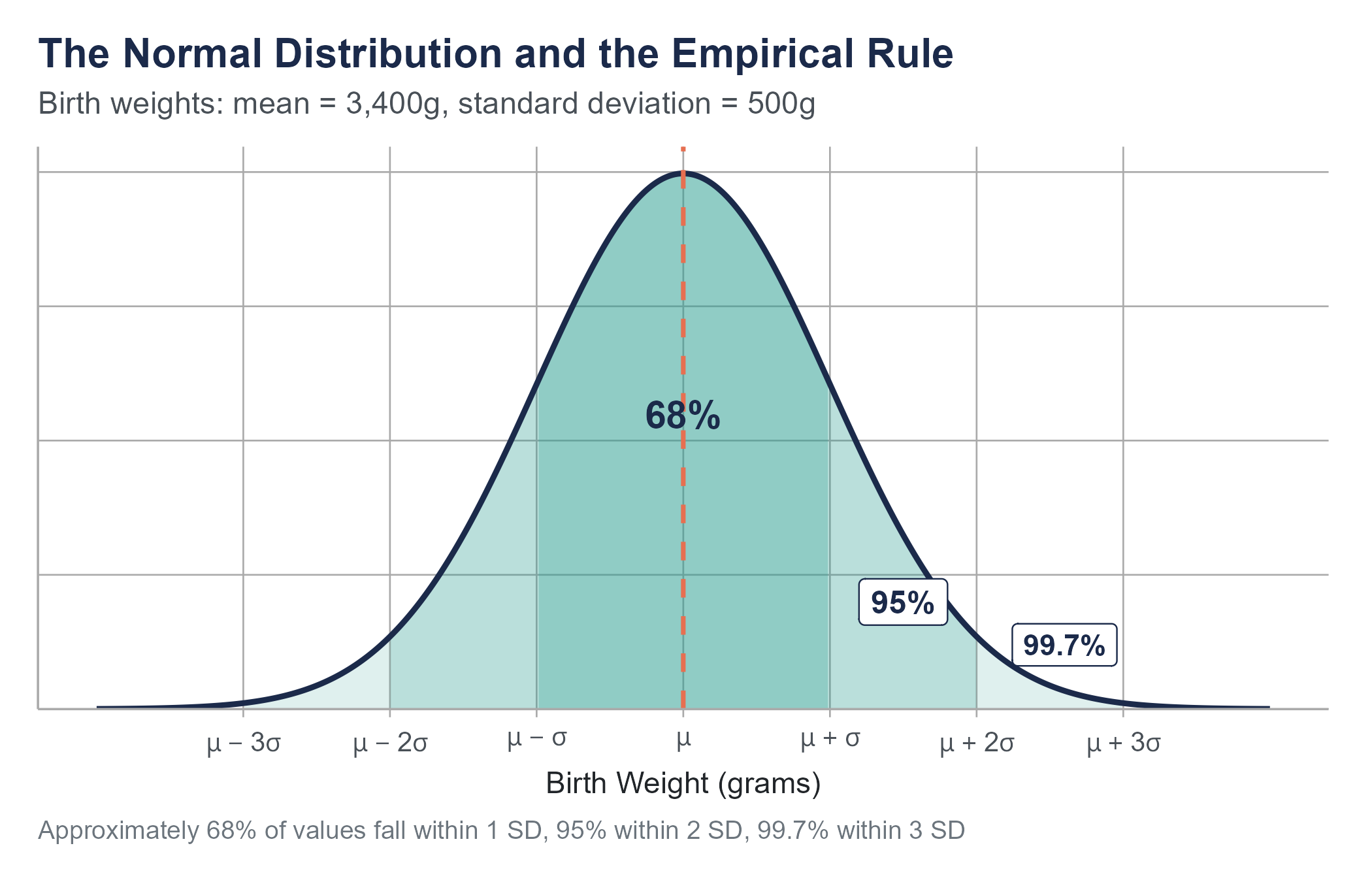
6.4 The Empirical Rule
Before we get into precise probability calculations, there is a useful approximation that you should commit to memory. For any normal distribution, approximately
- 68% of values fall within 1 standard deviation of the mean (between \(\mu - \sigma\) and \(\mu + \sigma\))
- 95% of values fall within 2 standard deviations of the mean (between \(\mu - 2\sigma\) and \(\mu + 2\sigma\))
- 99.7% of values fall within 3 standard deviations of the mean (between \(\mu - 3\sigma\) and \(\mu + 3\sigma\))
This is called the Empirical Rule, sometimes the 68-95-99.7 Rule.
For birth weights with \(\mu = 3400\) grams and \(\sigma = 500\) grams, the Empirical Rule tells us
- About 68% of babies weigh between 2,900 and 3,900 grams
- About 95% weigh between 2,400 and 4,400 grams
- About 99.7% weigh between 1,900 and 4,900 grams
That last number means roughly 3 in every 1,000 full-term babies fall outside the range of 1,900 to 4,900 grams. These are the babies in the extreme tails of the distribution, the ones who are most likely to need specialized care.
The Empirical Rule is not a precise calculation tool. It is a quick mental check, a way to develop intuition about what values are common, uncommon, and rare under a normal distribution. When someone quotes a number to you and you want to know whether it is reasonable, the Empirical Rule gives you an instant frame of reference.
The more precise number for “within 2 standard deviations” is actually 95.44%, and the shortcut uses 2 rather than the exact value of 1.96. For quick estimates, those differences do not matter. For precise calculations, we turn to z-tables or software.
The Empirical Rule also serves as a useful warning system for when the normal model might not be appropriate. If you have a dataset and you find that 50% of values fall within one standard deviation of the mean instead of the expected 68%, or that 10% of values fall beyond two standard deviations instead of the expected 5%, those discrepancies are a hint that your data may not be well-described by a normal distribution. Financial return data, for instance, routinely violate the Empirical Rule in the tails. Stock market returns experience extreme moves (three, four, or five standard deviations from the mean) far more often than a normal distribution would predict. This mismatch between the normal model and reality contributed to the 2008 financial crisis, when risk models built on the assumption of normality dramatically underestimated the probability of catastrophic losses. The models said certain events were virtually impossible. The market disagreed.
6.5 Normal Probability Calculations
6.5.1 Using Z-Tables
A z-table (also called the standard normal table) gives you the cumulative probability to the left of any z-score. That is, for a given z-value, the table tells you \(P(Z \leq z)\), the probability that a standard normal variable takes a value less than or equal to \(z\).
For example, looking up \(z = -1.00\) in a z-table gives approximately 0.1587. This means about 15.87% of values in a standard normal distribution fall below \(z = -1.00\).
Let us return to birth weights. What proportion of full-term newborns weigh less than 2,500 grams (the clinical threshold for low birth weight)?
Step 1. Convert to a z-score.
\[z = \frac{2500 - 3400}{500} = \frac{-900}{500} = -1.80\]
Step 2. Look up \(z = -1.80\) in the z-table.
\[P(Z \leq -1.80) \approx 0.0359\]
Step 3. Interpret.
About 3.59% of full-term newborns are expected to have a birth weight below 2,500 grams. Out of every 1,000 full-term births, roughly 36 would be classified as low birth weight based on this model.
6.5.2 Common Probability Questions
Most normal probability questions fall into a few patterns. Here is how to handle each.
“Less than” questions. What is \(P(X < a)\)? Convert \(a\) to a z-score, look it up in the table. The table gives you the answer directly.
“Greater than” questions. What is \(P(X > a)\)? Convert \(a\) to a z-score, look it up in the table, then subtract from 1. Because the total area is 1, \(P(X > a) = 1 - P(X \leq a)\).
“Between” questions. What is \(P(a < X < b)\)? Convert both \(a\) and \(b\) to z-scores, look up both, and subtract. \(P(a < X < b) = P(Z < z_b) - P(Z < z_a)\).
Example. What proportion of full-term newborns weigh between 3,000 and 4,000 grams?
\[z_1 = \frac{3000 - 3400}{500} = -0.80 \quad \Rightarrow \quad P(Z < -0.80) \approx 0.2119\]
\[z_2 = \frac{4000 - 3400}{500} = 1.20 \quad \Rightarrow \quad P(Z < 1.20) \approx 0.8849\]
\[P(3000 < X < 4000) = 0.8849 - 0.2119 = 0.6730\]
About 67.3% of full-term newborns weigh between 3,000 and 4,000 grams.
6.5.3 Finding Values from Probabilities (Working Backward)
Sometimes the question runs in reverse. Instead of “what proportion falls below this value?”, the question is “what value separates the bottom 10%?”
Example. Below what weight do the lightest 10% of full-term newborns fall?
Step 1. Find the z-score that has 10% of the area to its left. Looking in the z-table for the value closest to 0.1000, we find \(z \approx -1.28\).
Step 2. Convert back to the original scale.
\[x = \mu + z \cdot \sigma = 3400 + (-1.28)(500) = 3400 - 640 = 2760 \text{ grams}\]
About 10% of full-term newborns weigh less than 2,760 grams.
This type of calculation is called finding a percentile or a quantile. The value 2,760 grams is the 10th percentile of the birth weight distribution under this model.
Percentile calculations show up constantly in health care, education, and human resources. When a pediatrician tells a parent that their child is “in the 40th percentile for height,” they are performing exactly this kind of calculation. The child’s height corresponds to a z-score, and that z-score maps to a cumulative probability. The 40th percentile means 40% of children the same age are shorter and 60% are taller. It does not mean the child is short in any concerning way. It means the child is modestly below average, which is perfectly typical.
Open the Normal Curve Explorer on the companion website. Set \(\mu\) and \(\sigma\) with the sliders, pick a region (less than \(a\), greater than \(a\), between \(a\) and \(b\), outside \([a, b]\), or within \(\pm k\) standard deviations of \(\mu\)), and watch the shaded area and the probability update live.
Three things to try before you move on.
- Probability tab. Reproduce the low-birth-weight calculation: load the Newborn birth weights preset, set the region to “X < a” with \(a = 2{,}500\). The shaded area should give the same 3.6% we found by hand.
- Standardize tab. With the same setup, look at the standard normal panel on the right. The cutoff \(a = 2{,}500\) in the original-units plot maps to \(z = -1.80\) in the standardized plot, and the shaded area is identical. That is the whole reason the z-table works.
- Empirical Rule tab. Switch to the Standard normal preset. The exact areas (68.27%, 95.45%, 99.73%) are the precise numbers behind the 68–95–99.7 shorthand.
6.6 Assessing Normality
The normal distribution is a model, and like all models, it fits some data well and other data poorly. Before using normal distribution calculations, it is worth checking whether your data are at least approximately normal. Two common approaches are the QQ plot and the Shapiro-Wilk test.
6.6.1 QQ Plots
A quantile-quantile plot (QQ plot) graphs the observed data values against the values you would expect if the data came from a normal distribution. If the data are normally distributed, the points fall approximately along a straight diagonal line. Departures from that line reveal how the data deviate from normality, and the shape of the departure tells you what kind of non-normality you are looking at.
The five patterns in Figure 6.2 cover most of what you will encounter in practice.
- Points close to the line. The data are approximately normal. Proceed with normal-based calculations.
- A “smile” (both ends curving above the line). The data are right-skewed. The right tail extends further than a normal distribution would predict, and the left tail is shorter; both effects pull points above the diagonal.
- A “frown” (both ends curving below the line). The data are left-skewed. Mirror image of the previous case.
- An S-shape (lower-left below the line, upper-right above the line). The data are heavy-tailed. Extreme values are more common than a normal distribution would predict in both directions. Financial returns and reaction times often look like this.
- A reverse S-shape (lower-left above the line, upper-right below the line). The data are light-tailed. Extreme values are rarer than a normal distribution would predict. Bounded measurements like exam scores or proportions often look like this.
- A few points deviating only at the extremes. Common and usually not a serious problem, especially with larger samples. A few outliers do not invalidate the normal model for the bulk of the data.
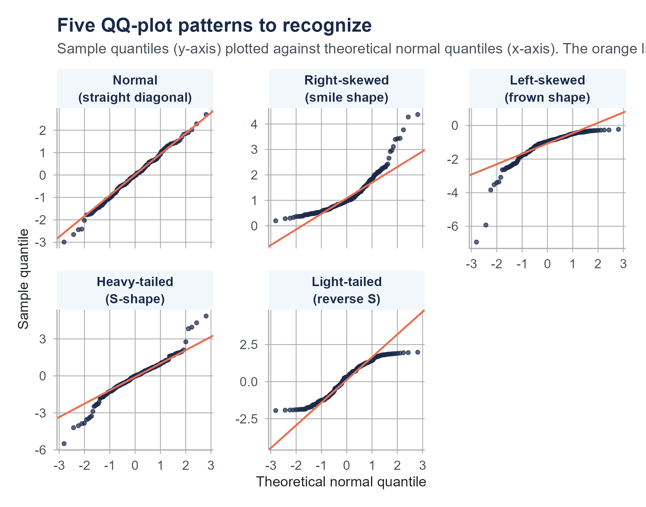
QQ plots are more useful than histograms for assessing normality because they make deviations from the expected pattern visually obvious, especially in the tails, which is where normal-based calculations tend to mislead you the most.
6.6.2 The Shapiro-Wilk Test
The Shapiro-Wilk test is a formal hypothesis test for normality. The null hypothesis is that the data come from a normal distribution. A small p-value is interpreted as evidence against that hypothesis, suggesting the data are not normal.
A word of caution before we go further. You will see references throughout this book and in the wider literature to a p-value being “below 0.05” as a kind of automatic rejection trigger. That convention has a long history, but treating any single threshold as a hard line between “real” and “not real” is one of the most over-criticized habits in modern statistics. Chapter 8 takes this on directly, including the practice known as p-hacking and the broader replication crisis it helped expose. For now, just note that a Shapiro-Wilk p-value of 0.04 is not categorically different from one of 0.06, and either way you should look at a QQ plot before drawing a conclusion.
A few additional cautions about the test itself.
First, with large samples, the Shapiro-Wilk test will reject normality even when the departure is trivially small and practically irrelevant. A dataset of 10,000 values might fail the test while being close enough to normal that all normal-based calculations work perfectly well.
Second, with small samples, the test has low power, meaning it may fail to detect non-normality even when the data are clearly not normal.
For these reasons, the QQ plot is often more informative than the formal test. Use both together when in doubt, but let the QQ plot guide your judgment about whether the non-normality is large enough to matter for your analysis.
A practical approach is this. If the QQ plot looks reasonably straight and the Shapiro-Wilk p-value is not unusually small, you can proceed with normal-based methods. If the QQ plot shows clear curvature in a small sample, or if the test produces a very small p-value alongside a visibly bent QQ plot, take that seriously and consider alternatives like nonparametric methods or data transformations. And if you have a very large sample and the test rejects normality but the QQ plot looks fine, the departure is probably too small to worry about.
Ask an AI tool to analyze a dataset and it will almost certainly start computing means, standard deviations, and z-scores. It may even generate confidence intervals and p-values without checking whether the underlying data is approximately normal. Most AI tools treat normality as the default assumption rather than something to be verified.
This matters because many real-world distributions are not normal, and some are far from normal. Income data is right-skewed. Medical cost data has extreme outliers. Customer lifetime value data often follows a power law. For these distributions, the mean and standard deviation can be misleading summaries, and z-scores computed from them can mischaracterize how unusual a value really is. A z-score of 3.0 under a normal distribution corresponds to the 99.87th percentile. Under a heavy-tailed distribution, a value three standard deviations above the mean might be far more common than that.
Before trusting any AI-generated analysis that relies on normal distribution calculations, check the shape of your data. A histogram or QQ plot takes seconds to produce and can save you from conclusions that are precisely computed and fundamentally wrong.
6.7 From Individual Values to Sample Means
Everything we have discussed so far concerns individual observations. The z-score for a single baby’s weight. The probability that a single randomly selected baby falls below a threshold. But in practice, researchers and decision-makers usually work not with single values but with averages computed from samples.
A hospital administrator does not ask, “What is the probability that one baby weighs less than 2,500 grams?” The question becomes, “If we look at the average birth weight across the 200 deliveries in our unit last month, what can we infer about the population of mothers we serve?”
A quality control engineer does not ask, “What is the probability that one widget is too heavy?” They ask, “If the average weight across a sample of 50 widgets exceeds a threshold, should we stop the production line?”
This shift, from reasoning about individuals to reasoning about sample averages, is where the most important ideas in this chapter live. And it is a shift that mirrors how decisions are made in the real world. A school board evaluating a new reading curriculum does not look at one student’s test score. They look at the average across hundreds of students. A public health official monitoring air quality does not rely on one sensor reading from one afternoon. They look at the average across many readings over time. The entire apparatus of modern evidence-based decision-making, from clinical trials to A/B testing on websites, rests on the behavior of sample averages rather than individual observations.
6.8 Sampling Distributions
6.8.1 The Concept
Imagine the following thought experiment. You have a large population, say, all full-term newborns in the United States in a given year, roughly 3.6 million babies. The population has a mean birth weight of \(\mu = 3400\) grams and a standard deviation of \(\sigma = 500\) grams.
Now imagine you randomly select 25 babies and compute the mean weight of your sample. You might get \(\bar{x} = 3,452\) grams. Put that sample back (or just imagine the population is so large it does not matter). Draw another sample of 25 and compute the mean. You might get \(\bar{x} = 3,378\) grams. Do it again: \(\bar{x} = 3,421\) grams. Again: \(\bar{x} = 3,339\) grams.
If you did this thousands of times, drawing a fresh sample of 25 each time and recording the sample mean, you would build up a collection of sample means. That collection has its own distribution, its own shape, center, and spread. This distribution of sample means is called the sampling distribution of the sample mean.
The sampling distribution is not the distribution of the data. It is the distribution of the statistic (in this case, the mean) computed across many hypothetical samples. This distinction is absolutely critical to understanding inference.
6.8.2 Properties of the Sampling Distribution
The sampling distribution of the sample mean has three key properties. All of them follow from mathematical probability theory, and all of them can be verified through simulation.
1. Center. The mean of the sampling distribution equals the population mean.
\[\mu_{\bar{x}} = \mu\]
If the population mean birth weight is 3,400 grams, then the average of all possible sample means (across all possible samples of size \(n\)) is also 3,400 grams. The sample mean is an unbiased estimator of the population mean. It does not systematically overshoot or undershoot.
2. Spread. The standard deviation of the sampling distribution is smaller than the population standard deviation, by a factor of \(\sqrt{n}\).
\[\sigma_{\bar{x}} = \frac{\sigma}{\sqrt{n}}\]
This quantity, the standard deviation of the sampling distribution, has a special name. It is called the standard error of the mean.
For our birth weight example with \(\sigma = 500\) and \(n = 25\):
\[\sigma_{\bar{x}} = \frac{500}{\sqrt{25}} = \frac{500}{5} = 100 \text{ grams}\]
Individual birth weights vary with a standard deviation of 500 grams, but sample means of 25 babies vary with a standard deviation of only 100 grams. Averages are less variable than individuals. This should match your intuition. It would be surprising to find one baby weighing 4,400 grams (2 standard deviations above the mean), but it would be very surprising to find that the average weight of 25 randomly selected babies was 4,400 grams. That would be 10 standard errors above the population mean, an event so improbable it essentially cannot happen by chance.
3. Shape. This is where the Central Limit Theorem enters the picture, and it deserves its own section.
6.9 Standard Error vs. Standard Deviation
This is the concept that trips up more introductory statistics students than perhaps any other. Let us be as clear as we can.
The standard deviation (\(\sigma\) or \(s\)) measures how much individual values spread out around the mean of the distribution. A standard deviation of 500 grams for birth weights means individual babies vary by about 500 grams from the average.
The standard error (\(\sigma_{\bar{x}}\) or \(SE\)) measures how much sample means spread out around the population mean if you were to take many samples of the same size. A standard error of 100 grams (when \(n = 25\)) means that sample means of 25 babies vary by about 100 grams from the true population average.
Here is another way to think about it. The standard deviation is a property of the population (or data). It stays the same no matter how many observations you collect. If birth weights have a standard deviation of 500 grams, that is true whether you sample 10 babies or 10,000 babies. The underlying variability in the population does not change because you measured more of it.
The standard error is a property of the sampling process. It depends on both the population standard deviation and the sample size. And it shrinks as the sample size grows. With \(n = 25\), the standard error is 100 grams. With \(n = 100\), it drops to 50 grams. With \(n = 400\), it is 25 grams.
\[\sigma_{\bar{x}} = \frac{\sigma}{\sqrt{n}}\]
This formula encodes a foundational idea in statistics. Larger samples give you more precise estimates. But the improvement follows a square root pattern, not a linear one. To cut the standard error in half, you need to quadruple the sample size. To cut it to a third, you need nine times as many observations. There are diminishing returns to collecting more data, which is why sample size planning matters so much in research design.
When reading research papers, pay attention to whether authors report “standard deviation” or “standard error” on their graphs and tables. They are different quantities that serve different purposes, and confusing them is one of the most common errors in published research. A graph showing error bars with standard errors looks more precise than the same graph with standard deviation bars, which can mislead readers about how variable the underlying data are.
Let us explore a concrete comparison to drive this home.
Suppose you survey commuters about their one-way commute time. The population has \(\mu = 27\) minutes and \(\sigma = 12\) minutes.
- Individual commute times range widely. About 68% of people commute between 15 and 39 minutes (the mean plus or minus one standard deviation).
- Sample means with \(n = 36\) have a standard error of \(12/\sqrt{36} = 2\) minutes. About 68% of sample means of 36 commuters would fall between 25 and 29 minutes, a much narrower range.
- Sample means with \(n = 144\) have a standard error of \(12/\sqrt{144} = 1\) minute. About 68% of these sample means would fall between 26 and 28 minutes.
The individual data are noisy. The sample means are much less noisy. And as the sample gets bigger, the sample means cluster ever more tightly around the true population mean.
6.10 The Central Limit Theorem
We now arrive at what is, without exaggeration, the most important result in introductory statistics. It is the reason that so many of the methods in the rest of this book work. It is the reason we can build confidence intervals and perform hypothesis tests. It is the bridge between probability theory and statistical practice.
6.10.1 The Statement
The Central Limit Theorem (CLT) states the following.
If you draw random samples of size \(n\) from any population with mean \(\mu\) and finite standard deviation \(\sigma\), the sampling distribution of the sample mean \(\bar{x}\) will be approximately normal with mean \(\mu\) and standard deviation \(\sigma / \sqrt{n}\), provided \(n\) is sufficiently large.
In notation:
\[\bar{X} \sim N\left(\mu, \frac{\sigma}{\sqrt{n}}\right) \quad \text{approximately, for large } n\]
Or equivalently, the standardized version:
\[Z = \frac{\bar{X} - \mu}{\sigma / \sqrt{n}}\]
follows approximately a standard normal \(N(0, 1)\) distribution.
6.10.2 Why This Result Matters
The Central Limit Theorem has a long history. Versions of it were proved by Abraham de Moivre in 1733 (for the binomial case) and generalized by Pierre-Simon Laplace in the early 1800s, but it took over a century of further mathematical work before the theorem was stated and established in full generality. The name “Central Limit Theorem” itself dates to George Pólya in 1920, who called it “central” not because it occupies a central position in a distribution, but because it is of central importance to the field of probability. Without this theorem, the framework of confidence intervals, hypothesis tests, and regression analysis that fills the rest of this book would not hold together.
Read the statement again, especially the part that says “from any population.”
The population could be normally distributed. It could be skewed. It could be uniform. It could be bimodal. It could have a bizarre, irregular shape unlike anything in a textbook. It does not matter. As long as the population has a finite mean and a finite standard deviation, the sampling distribution of the mean will approach normality as the sample size grows.
This is what makes the result so useful in practice: we do not need to know the shape of the population distribution to make inferences about the mean. We only need a large enough sample. The normal distribution is more than one model among many. It is the universal destination of the sampling distribution of the mean, regardless of where the journey starts.
6.10.3 How Large Is “Large Enough”?
The CLT says the approximation improves as \(n\) increases, but how large does \(n\) need to be? The answer depends on how far the population distribution is from normal.
- If the population is already normal, the sampling distribution of the mean is exactly normal for any sample size, even \(n = 1\). The CLT’s approximation is perfect from the start.
- If the population is roughly symmetric (like a uniform distribution), \(n = 15\) or \(n = 20\) is often enough for the sampling distribution to look very close to normal.
- If the population is moderately skewed, \(n = 30\) is the traditional guideline, though this is a rule of thumb, not a law of nature.
- If the population is extremely skewed or has very heavy tails, you might need \(n = 50\), \(n = 100\), or even more.
The traditional advice of “\(n \geq 30\) and you’re fine” is a simplification. It works in many common situations but not all. The best practice is to think about the shape of your population and adjust your expectations accordingly. Simulation can help. If you generate random samples from a distribution that resembles your population and plot the resulting sample means, you can see directly whether the sampling distribution looks approximately normal at your sample size.
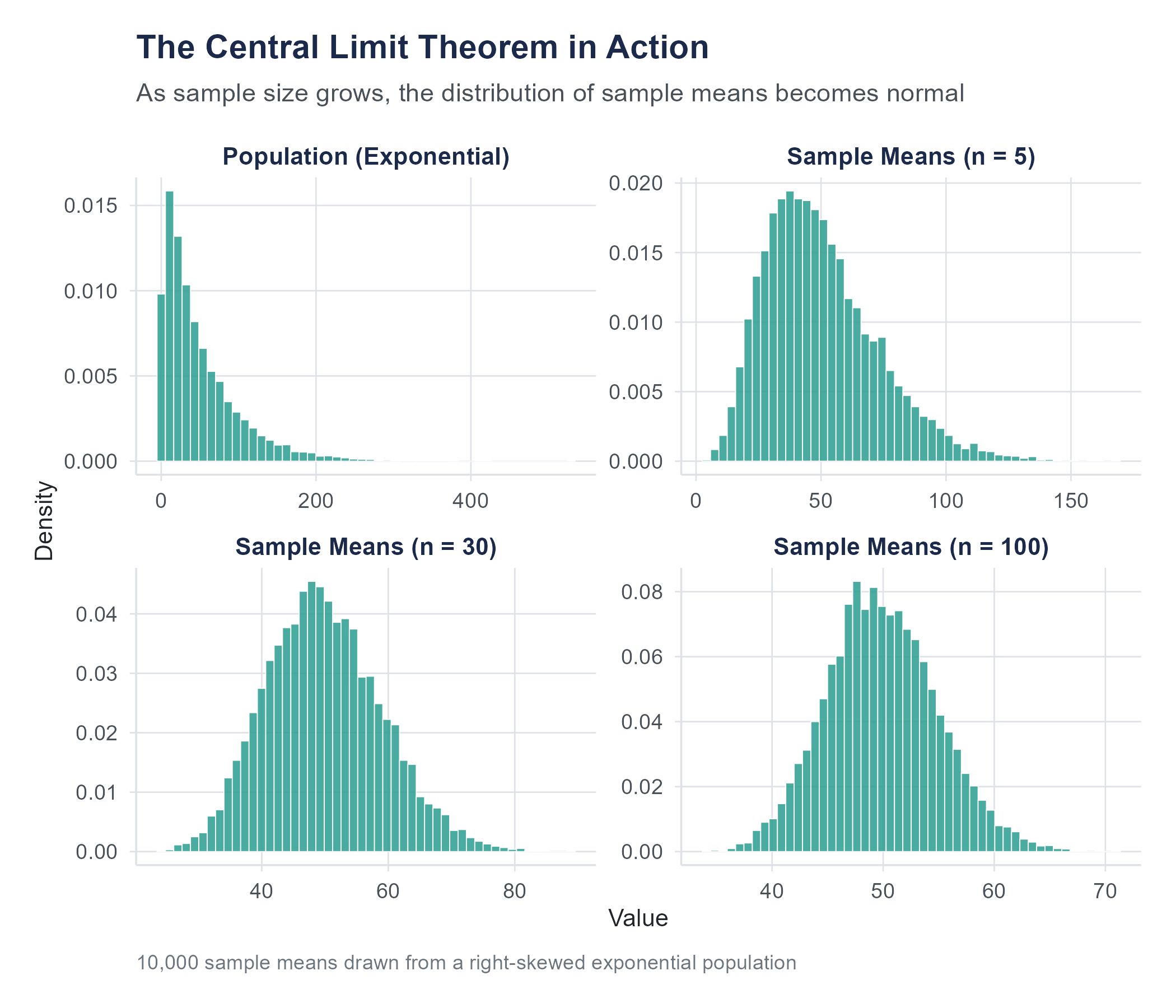
Return to the Distribution Explorer and switch to the Sampling Distribution view. Choose a skewed population shape, set the sample size to 5, and draw repeated samples. Then increase \(n\) to 30, then 100. Watch the sampling distribution of the mean transform from skewed to approximately normal as \(n\) grows. There is no better way to internalize the Central Limit Theorem than to watch it happen in real time.
6.10.4 A Visual Walkthrough
Here is what you would see if you ran a simulation.
Start with a right-skewed population. Think of income data or response time data, a large cluster of low-to-moderate values with a long tail stretching to the right.
Draw samples of size \(n = 5\) and plot the means. The distribution of sample means is still somewhat right-skewed, though less so than the population. The center is at the population mean, but the shape is not yet normal.
Increase to \(n = 15\). The distribution of sample means is now closer to symmetric. The right-skew is fading, though you might still detect a slight asymmetry.
Increase to \(n = 30\). The distribution looks quite normal. A QQ plot would show points falling close to a straight line.
Increase to \(n = 100\). The distribution is, for all practical purposes, perfectly normal. The spread has also narrowed considerably compared to \(n = 5\).
At every stage, the center stays the same, at the population mean. At every stage, the spread decreases. And the shape steadily approaches the bell curve.
6.10.5 The CLT in Action
Let us work through a complete example that puts all the ideas together.
A city’s department of transportation wants to study commute times. They know from census data that the average commute time in their city is \(\mu = 32\) minutes with a standard deviation of \(\sigma = 14\) minutes. The distribution of individual commute times is right-skewed (many short commutes, fewer very long ones).
A researcher draws a random sample of \(n = 49\) commuters. What is the probability that the sample mean commute time exceeds 35 minutes?
Step 1. Identify the sampling distribution.
By the CLT, the sampling distribution of \(\bar{X}\) is approximately normal with
\[\mu_{\bar{x}} = 32 \quad \text{and} \quad \sigma_{\bar{x}} = \frac{14}{\sqrt{49}} = \frac{14}{7} = 2 \text{ minutes}\]
Step 2. Standardize.
\[z = \frac{35 - 32}{2} = \frac{3}{2} = 1.50\]
Step 3. Find the probability.
\[P(\bar{X} > 35) = P(Z > 1.50) = 1 - P(Z \leq 1.50) = 1 - 0.9332 = 0.0668\]
There is about a 6.7% chance that a random sample of 49 commuters will have a mean commute time exceeding 35 minutes.
Notice that we used the normal distribution even though the population of commute times is right-skewed. The CLT is what licenses that move. We are not saying individual commute times are normal. We are saying that the average of 49 randomly selected commute times is approximately normal.
6.10.6 What the CLT Does Not Say
A few common misconceptions are worth addressing.
The CLT does not say the data become normal. It says the sampling distribution of the mean becomes normal. If you take a sample of 100 incomes from a right-skewed population, the 100 income values in your sample will still look right-skewed. But the distribution of all possible sample means from samples of 100 will be approximately normal. The distinction is subtle and important.
The CLT does not apply to all statistics. The theorem is about the mean. There are similar results for some other statistics (proportions, for example, which we will see in later chapters), but not all statistics have sampling distributions that approach normality. The median, the range, and the maximum all have sampling distributions with different properties.
The CLT does not eliminate the need for random sampling. The theorem assumes your samples are drawn randomly from the population. If your sample is biased, if you only survey people who volunteer, or only measure widgets from one machine, the CLT cannot rescue you. A beautiful normal sampling distribution is useless if it is centered at the wrong value because the sampling process was flawed.
The CLT does not guarantee useful results with small samples from extreme distributions. If your population distribution is wildly skewed or has very heavy tails (meaning extreme values are common), the CLT’s approximation may require a much larger sample than the traditional rule of thumb suggests. Consider the distribution of wealth, as opposed to income, in the United States. Wealth is so extremely concentrated that sample means can behave erratically even with samples of several hundred observations. A single billionaire in a sample of 500 people will have a dramatic effect on the sample mean, and it takes a very large sample before the CLT’s reassurance of approximate normality becomes practically reliable. Knowing that the CLT exists does not excuse you from thinking carefully about whether your particular data and sample size meet its assumptions in a meaningful way.
6.11 Putting It All Together
Let us trace the arc of this chapter’s logic, because the pieces build on each other.
Individual values from a normal distribution can be standardized using z-scores, which tell you how many standard deviations a value is from the mean. Using the standard normal distribution, you can calculate the probability of observing values in any range.
When you shift from individual values to sample means, a new distribution emerges, the sampling distribution. This distribution is centered at the population mean, has a standard deviation called the standard error (which equals \(\sigma / \sqrt{n}\)), and, by the Central Limit Theorem, is approximately normal regardless of the shape of the underlying population, provided the sample is large enough.
This chain of ideas, from individual variation to sampling variation to the guaranteed normality of the sampling distribution, is what makes statistical inference possible. In the next two chapters, we will use these ideas to build confidence intervals and to test hypotheses. Every confidence interval you construct, every p-value you calculate, relies on the sampling distribution being approximately normal. The Central Limit Theorem is why that reliance is justified.
Let us close by returning to where we started. When a hospital weighs a newborn and compares that weight to a distribution, it is applying the ideas from the first half of this chapter, z-scores, areas under the curve, and the Empirical Rule. When a researcher collects data on hundreds of births and uses the average to draw conclusions about a population, they are relying on the ideas from the second half, sampling distributions, standard error, and the Central Limit Theorem. The individual measurement and the sample average are both governed by the mathematics of the normal distribution, but in different ways and for different reasons. Understanding that distinction is the conceptual core of statistical inference, and it is what the next several chapters will build upon.
6.12 Looking Ahead
With the normal distribution and the Central Limit Theorem in hand, we now have the machinery to move from description to inference. We know that sample means follow an approximately normal distribution centered at the population mean, with a spread that shrinks predictably as the sample grows. The next chapter puts this machinery to work. Given a single sample mean, how do we construct a range of plausible values for the population mean? How precise is our estimate, and what determines that precision? Those are the questions of confidence intervals, and they are the first formal tool of statistical inference. If the Central Limit Theorem is the engine, confidence intervals are the first thing we build with it.
6.13 Further Reading and References
The following works are cited in this chapter or provide valuable additional context for the ideas covered here.
On the normal distribution and its history: Stigler, S. M. (1986). The history of statistics: The measurement of uncertainty before 1900. Harvard University Press. (A scholarly but readable history covering the development of the normal distribution by de Moivre, Laplace, and Gauss, and the emergence of the Central Limit Theorem.)
On birth weight data and clinical thresholds: Martin, J. A., Hamilton, B. E., Osterman, M. J. K., & Driscoll, A. K. (2019). Births: Final data for 2018. National Vital Statistics Reports, 68(13). National Center for Health Statistics. (The CDC’s authoritative source for U.S. birth weight distributions, the data underlying this chapter’s examples.)
On the Central Limit Theorem: Fischer, H. (2011). A history of the Central Limit Theorem: From classical to modern probability theory. Springer. (A comprehensive account of how the CLT evolved from de Moivre’s early work through Lindeberg, Lévy, and Feller, for readers interested in the mathematical backstory.)
On the misuse of normality assumptions in finance: Taleb, N. N. (2007). The black swan: The impact of the highly improbable. Random House. (A forceful, accessible argument about how assuming normality in financial markets led to catastrophic underestimation of tail risks, contributing to the 2008 financial crisis discussed in this chapter.)
For further reading on distributions and sampling: Diez, D. M., Çetinkaya-Rundel, M., & Barr, C. D. (2019). OpenIntro Statistics (4th ed.). OpenIntro. (A free, open-source statistics textbook with clear coverage of the normal distribution, sampling distributions, and the Central Limit Theorem, with worked examples and exercises.)
On pediatric growth standards and reference populations: WHO Multicentre Growth Reference Study Group. (2006). WHO child growth standards: Length/height-for-age, weight-for-age, weight-for-length, weight-for-height and body mass index-for-age: Methods and development. World Health Organization. (The source for the growth standards discussed in this chapter’s Ethics Moment, based on breastfed children from six countries across five continents.)
6.14 Key Terms
- Normal distribution: A continuous probability distribution defined by its mean (\(\mu\)) and standard deviation (\(\sigma\)), with a symmetric, bell-shaped density curve.
- Standard normal distribution: The normal distribution with \(\mu = 0\) and \(\sigma = 1\). The reference distribution used in z-tables.
- Probability density function (PDF): A function that describes the relative likelihood of a continuous random variable taking any given value. Areas under the curve represent probabilities.
- Z-score: The number of standard deviations a value is above or below the mean. Calculated as \(z = (x - \mu)/\sigma\).
- Empirical Rule (68-95-99.7 Rule): For a normal distribution, approximately 68% of values fall within 1 standard deviation of the mean, 95% within 2, and 99.7% within 3.
- Z-table (Standard normal table): A table giving the cumulative probability \(P(Z \leq z)\) for values of \(z\) in a standard normal distribution.
- Percentile (Quantile): The value below which a specified percentage of observations fall. The 10th percentile is the value below which 10% of the data lie.
- QQ plot (Quantile-quantile plot): A graphical tool for assessing whether data follow a theoretical distribution, typically the normal. Points falling near a straight line suggest normality.
- Shapiro-Wilk test: A formal hypothesis test for normality. A small p-value suggests the data are not normally distributed.
- Sampling distribution: The probability distribution of a statistic (such as the sample mean) computed from all possible samples of a given size from a population.
- Standard error: The standard deviation of the sampling distribution of a statistic. For the sample mean, \(SE = \sigma / \sqrt{n}\) when \(\sigma\) is known, or \(SE = s / \sqrt{n}\) when it is estimated from the sample.
- Central Limit Theorem (CLT): The theorem stating that the sampling distribution of the sample mean approaches a normal distribution as the sample size increases, regardless of the population’s shape, provided the population has a finite mean and finite standard deviation.
- Unbiased estimator: A statistic whose sampling distribution is centered at the true population parameter. The sample mean is an unbiased estimator of the population mean.
A full R walkthrough of this chapter is online at stats.marginoferrormedia.com/walkthroughs/r-ch06.html. It covers dnorm/pnorm/qnorm/rnorm essentials, QQ plots and Shapiro-Wilk on the births14 data, plus a CLT simulation showing sample means converging to normality.
6.15 Exercises
6.15.1 Check Your Understanding
These questions test whether you grasp the core concepts. You should be able to answer them without performing calculations.
1. What two parameters completely determine a normal distribution? What does each one control about the shape of the curve?
2. A z-score of \(-2.5\) indicates that a value is _________ standard deviations _________ the mean. In terms of the Empirical Rule, would you consider this value common or unusual?
3. Explain in your own words why the total area under a normal density curve equals 1.
4. The Empirical Rule says about 95% of values fall within 2 standard deviations of the mean. If you are told that a dataset has a mean of 50 and a standard deviation of 8, what range captures about 95% of the values (assuming the data are approximately normal)?
5. You look at a QQ plot and see points that follow the diagonal line closely in the middle but curve sharply upward at the right end. What does this suggest about the data’s distribution?
6. A classmate says, “The Central Limit Theorem tells us that if we collect a large enough sample, our data will be normally distributed.” What is wrong with this statement?
7. Why is the standard error always smaller than the standard deviation (assuming \(n > 1\))? Explain the logic, not just the formula.
8. Two populations have the same mean. Population A has \(\sigma = 10\) and population B has \(\sigma = 30\). You draw samples of \(n = 100\) from each. Which population’s sample means will have a larger standard error? By what factor?
9. Suppose a population is heavily right-skewed. A researcher draws random samples of size \(n = 5\) and plots the sampling distribution of the mean. Another researcher does the same with \(n = 200\). Whose sampling distribution will look more like a normal distribution? Why?
10. Explain why the Central Limit Theorem is necessary for confidence intervals and hypothesis tests to work, even when the population is not normally distributed.
6.15.2 Apply It
These problems require calculations. Show your work.
1. Adult male heights in a certain country are approximately normally distributed with \(\mu = 175\) cm and \(\sigma = 7\) cm.
What is the z-score for a man who is 168 cm tall?
What proportion of men are taller than 185 cm?
What proportion of men have heights between 170 cm and 180 cm?
2. A standardized reading test has scores that are normally distributed with \(\mu = 500\) and \(\sigma = 80\).
What score separates the top 5% of students from the rest?
What score marks the 25th percentile?
A student scores 620. What is this student’s z-score, and what percentage of students scored lower?
3. The time it takes a barista at a busy coffee shop to prepare an espresso drink is normally distributed with \(\mu = 4.2\) minutes and \(\sigma = 0.8\) minutes.
What proportion of drinks take more than 5.5 minutes?
What proportion of drinks are prepared in under 3 minutes?
The shop guarantees drinks within 6 minutes or they are free. What percentage of drinks will be free?
4. A factory produces ball bearings with a target diameter of 10.00 mm. The actual diameters are normally distributed with \(\mu = 10.00\) mm and \(\sigma = 0.05\) mm. Ball bearings are rejected if their diameter is less than 9.90 mm or greater than 10.10 mm.
What z-scores correspond to the rejection thresholds?
What proportion of ball bearings are rejected?
If the factory produces 20,000 ball bearings per day, how many are expected to be rejected daily?
5. A population of monthly cellphone bills has \(\mu = \$85\) and \(\sigma = \$32\). A researcher takes a random sample of \(n = 64\) customers.
What are the mean and standard error of the sampling distribution of \(\bar{X}\)?
What is the probability that the sample mean exceeds \(\$90\)?
What is the probability that the sample mean is between \(\$80\) and \(\$90\)?
6. The amount of soda dispensed by a vending machine is normally distributed with \(\mu = 12.0\) oz and \(\sigma = 0.3\) oz.
What is the probability that a single cup contains less than 11.5 oz?
If a quality inspector measures 9 cups, what is the probability that the sample mean is less than 11.5 oz?
Compare your answers to (a) and (b) and explain why they differ.
7. Household electricity consumption in a region has \(\mu = 950\) kWh per month and \(\sigma = 200\) kWh. The distribution is right-skewed.
Can you use the normal distribution to find the probability that a single randomly selected household uses more than 1,200 kWh? Why or why not?
Can you use the normal distribution to find the probability that the mean consumption of a sample of \(n = 50\) households exceeds 1,000 kWh? Justify your answer.
If the answer to (b) is yes, compute the probability.
8. Resting heart rates for healthy adults are approximately normally distributed with \(\mu = 72\) bpm and \(\sigma = 8\) bpm.
What percentage of adults have resting heart rates below 60 bpm?
Above what heart rate do the top 10% of adults fall?
A doctor’s office measures the average resting heart rate of 16 patients during a wellness day. What is the probability that this average exceeds 76 bpm?
9. An airline knows that the weight of checked baggage per passenger is normally distributed with \(\mu = 42\) pounds and \(\sigma = 10\) pounds. A small regional flight carries 36 passengers.
What are the mean and standard error of the sampling distribution of the mean baggage weight per passenger?
The cargo hold can safely handle a mean baggage weight of up to 45 pounds per passenger. What is the probability that the mean weight exceeds this limit?
If the airline wanted the probability in (b) to be less than 1%, how many passengers would they need to sample or account for? (Hint: find the \(n\) that makes \(P(\bar{X} > 45) < 0.01\).)
10. A professor’s exam scores are approximately normally distributed with \(\mu = 74\) and \(\sigma = 11\).
What proportion of students score an A (90 or above)?
The professor curves the exam so that the top 15% get A’s. What is the minimum score for an A under this curve?
If a class has 40 students, what is the probability that the class average is below 70?
The following three exercises use the birth-weights.csv dataset available on the companion website. This dataset contains 944 observations drawn from the OpenIntro births14 dataset, a real sample of 2014 CDC natality data. Variables include baby_id, birth_weight_g (birth weight in grams), gestational_weeks, mother_age, prenatal_visits, and smoking_status (Yes/No). Because the dataset includes preterm births, the distribution of birth weights is slightly left-skewed (skewness = −0.985). The full-term subset (gestational weeks ≥ 37) contains 829 observations and is more symmetric.
11. Using the birth-weights.csv dataset, compute the sample mean and standard deviation of birth_weight_g for all 944 infants. Create a histogram of birth weights and overlay (or sketch) a normal curve using your computed mean and standard deviation. Does the distribution appear approximately normal? Create a QQ plot of birth weights to further assess normality. You should find a sample mean of approximately 3,266 grams and a standard deviation of approximately 593 grams. Note any left skew caused by the inclusion of preterm births. Then repeat the histogram and QQ plot for only the full-term infants (gestational weeks ≥ 37). Comment on how restricting to full-term births affects the shape of the distribution.
12. Using the sample mean and standard deviation you computed in Problem 11 (approximately 3,266 g and 593 g), calculate the z-score for a birth weight of 2,500 grams (the clinical threshold for low birth weight). You should find \(z \approx -1.29\), giving a normal-model prediction of about 9.9% below 2,500 g. Now count the actual number of infants in the dataset with birth_weight_g below 2,500 and compute the observed proportion (you should find it is close to 9.8%). How does the observed proportion compare to the normal model’s prediction? Also compute the z-score for 4,000 grams (\(z \approx 1.24\)) and compare the predicted and observed proportions above that threshold (observed: about 10.8%). What do these comparisons tell you about how well the normal model fits these data, particularly in the tails?
13. Separate the data by smoking_status (846 non-smokers and 80 smokers). For smokers and non-smokers separately, compute the mean and standard deviation of birth_weight_g. You should find that the mean birth weight for non-smokers is approximately 3,296 grams and for smokers approximately 2,948 grams, a difference of about 348 grams. Now suppose you draw random samples of \(n = 25\) non-smoking mothers from this dataset. Using the Central Limit Theorem, compute the standard error of the sample mean. What is the probability that a random sample of 25 non-smoking mothers would produce a sample mean birth weight below 3,200 grams?
6.15.3 Think Deeper
These questions require more interpretation and critical thinking. There may not be a single correct answer.
1. Birth weights are approximately, but not perfectly, normally distributed. The normal model works well for full-term singleton births but less well when you include premature births, multiple births (twins, triplets), or do not account for differences across demographic groups. Discuss the tradeoffs of using a single normal model for birth weights versus using separate models for different subpopulations. When might a single model be adequate, and when could it lead to poor clinical decisions?
2. The Empirical Rule tells us that about 99.7% of values in a normal distribution fall within 3 standard deviations of the mean. In the financial world, events beyond 3 standard deviations are sometimes called “tail events” or “black swans.” During the 2008 financial crisis, several market moves were described as “25-sigma events,” meaning they were 25 standard deviations from the expected value. If the normal model were correct, such events would be so improbable that they should essentially never happen in the lifetime of the universe. What does this tell you about whether financial returns follow a normal distribution? What are the practical consequences of assuming normality when the true distribution has heavier tails?
3. A pharmaceutical company runs a clinical trial with \(n = 400\) patients and finds that the sample mean improvement in a symptom score is \(\bar{x} = 2.1\) points, with a standard error of 0.5 points. Another company runs a smaller trial with \(n = 25\) patients studying a different treatment and finds \(\bar{x} = 4.8\) points, with a standard error of 3.2 points. Both improvements are positive. Which result gives you more confidence that the treatment actually works? Explain your reasoning in terms of the sampling distribution and the relationship between sample size, standard error, and the reliability of the sample mean as an estimate.
4. A news article reports that “the average American checks their phone 144 times per day, based on a survey of 1,000 adults.” The standard deviation of phone-checking frequency is likely very large, perhaps 80 or more, given how widely this behavior varies. Despite this large individual variation, the article treats the average of 144 as a precise number. Using your understanding of the standard error, calculate the approximate standard error for this estimate. Is the article’s implied precision justified? What additional information would help you evaluate the claim?
5. The Central Limit Theorem is sometimes described as “the reason statistics works.” But the theorem requires random sampling, which is rarely achieved perfectly in practice. Most surveys have some nonresponse bias. Most experiments lose participants to dropout. Most observational datasets come from convenience samples. If the CLT’s assumption of random sampling is so routinely violated, why do statistical methods still produce useful results in practice? Under what circumstances would violations of random sampling be severe enough to make CLT-based inference misleading?