Free Preview: Chapter 1
Why Statistics Matters Now
This is the complete Chapter 1 from Margin of Error. When you’re ready for the rest, get the book.
Why Statistics Matters Now
The Water Was Poisoned
In April 2014, the city of Flint, Michigan switched its water supply from the Detroit Water and Sewerage Department to the Flint River. The decision was a cost-cutting measure. Officials assured residents the water was safe.
Within weeks, residents noticed the water looked wrong. It smelled wrong. It tasted wrong. Some reported rashes after bathing. Others watched their hair fall out. They complained, and they were told the water met all federal standards.
They were being lied to, though whether the lie was deliberate or negligent would become its own debate. What was not debatable was the chemistry. The Flint River water was highly corrosive, and the city had failed to apply the corrosion-control treatment required by federal law. As untreated river water flowed through Flint’s aging lead pipes, it leached lead, a potent neurotoxin, directly into the drinking water of roughly 100,000 people. Among the most vulnerable were children, for whom even small amounts of lead exposure can cause irreversible damage to cognitive development.
The story of how this crisis was uncovered is a story about statistics.
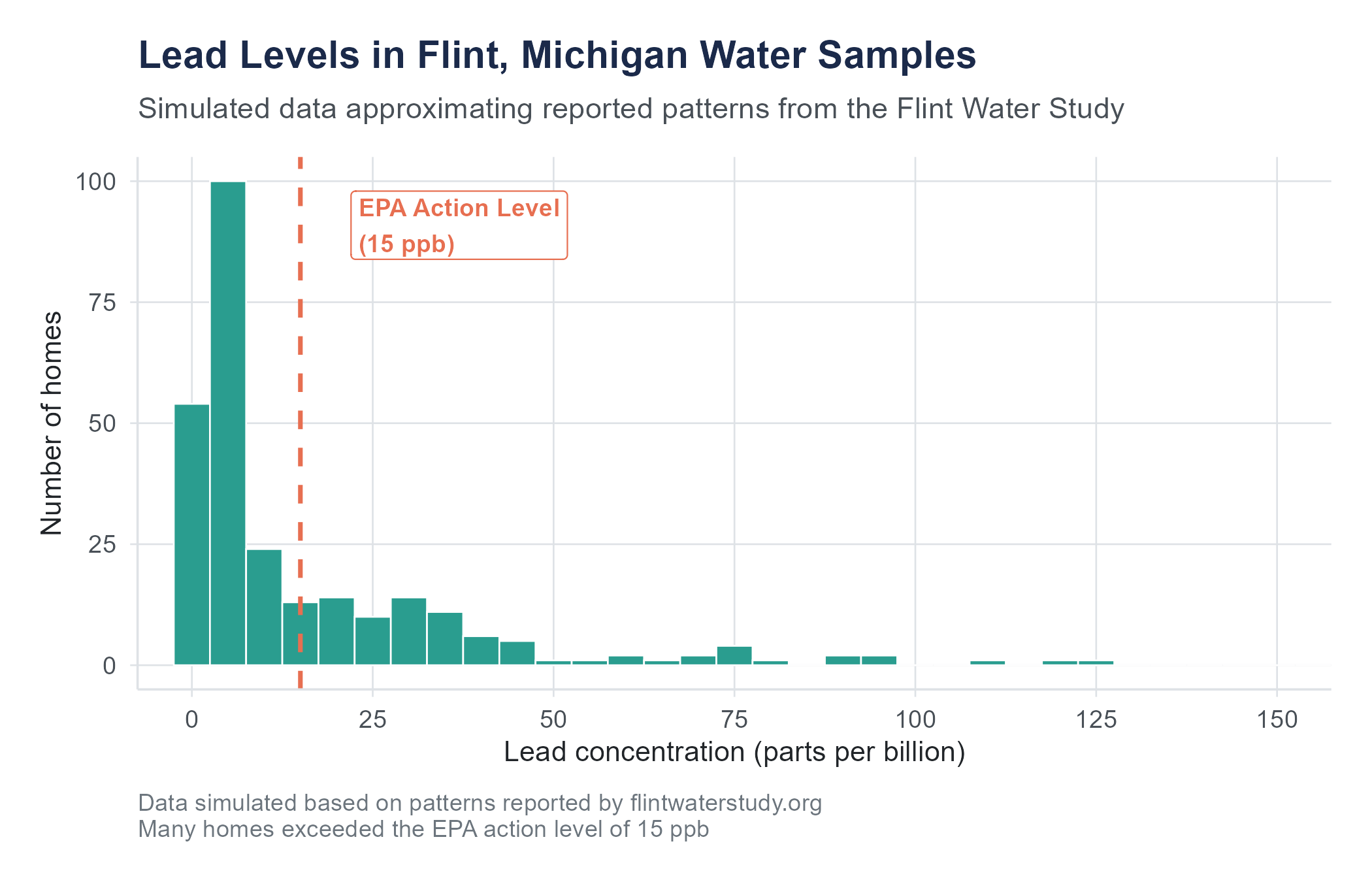
Marc Edwards, an environmental engineering professor at Virginia Tech, had a track record of investigating water contamination. When Flint residents reached out to him, his team organized a citizen science project. They sent water-testing kits to hundreds of Flint households and analyzed the samples. The data showed lead levels far exceeding the EPA action level of 15 parts per billion (ppb). Some homes tested above 100 ppb. A few exceeded 1,000 ppb.
At the same time, Dr. Mona Hanna-Attisha, a pediatrician at Hurley Medical Center in Flint, was growing concerned. She obtained blood lead level data for children in Flint from before and after the water switch. Using statistical analysis, she compared the percentage of children with elevated blood lead levels (above 5 micrograms per deciliter) across the two time periods. Her analysis showed that the percentage of children with elevated blood lead levels had roughly doubled after the water source change, and in some zip codes the increase was even more pronounced.
When Hanna-Attisha presented her findings, state officials publicly dismissed them. They said her data was wrong, her methods were flawed, her conclusions were irresponsible. She went back to her data, reconfirmed her analysis, and stood firm. Within weeks, the state was forced to acknowledge what the data made undeniable: the water in Flint was poisoning its children.
Two researchers. Two datasets. Two statistical analyses. That is what it took to force the truth into the open against an establishment that preferred to deny it.
This is what statistics is for.
But notice what statistics required in Flint. It was not enough to have data. Residents had data in the most visceral sense, they could see and smell and taste that something was wrong. What they lacked was the ability to translate their experience into evidence that institutions would be forced to take seriously. Edwards needed a systematic sampling plan that could withstand scrutiny, not just a few alarming numbers but a distribution of lead levels across hundreds of homes that painted an undeniable picture. Hanna-Attisha needed a comparison framework, before-and-after data analyzed with methods that controlled for alternative explanations. Both needed to present their findings in ways that could survive hostile examination by officials who had every incentive to discredit them.
This is a pattern you will see throughout this book. The statistical tools themselves are not complicated. A mean is a mean. A comparison is a comparison. What makes the difference is knowing which tool to use, knowing what questions to ask of the data, and knowing how to defend your conclusions when they are challenged. Those skills, the skills of statistical thinking, are what separate someone who can crunch numbers from someone who can change minds with evidence.
What Statistics Is (And What It Is Not)
If your previous experience with statistics involves memorizing formulas, plugging numbers into a calculator, and hoping the answer matches the back of the book, let me suggest a different frame. That approach, the mechanical one, misses the point of the discipline entirely. It turns statistics into a set of rituals: do this step, then this step, then report this number. Rituals are easy to follow and easy to forget. What stays with you is understanding.
Statistics is a way of reasoning under uncertainty. The world is complicated. Information is incomplete. People disagree about causes and effects. Data has noise. And yet, decisions must be made. Should this drug go to market? Is this school program working? Did this marketing campaign increase sales, or did sales go up for a different reason? Are the children of Flint sicker than they should be?
We cannot answer these questions by intuition alone. Intuition is powerful, but it is also unreliable, subject to every cognitive bias catalogued by decades of psychology research. We cannot answer them by anecdote. One person’s story, no matter how compelling, cannot tell us what is happening across a population. And we cannot answer them by collecting data and staring at it, because raw data without analysis is just a spreadsheet.
Statistics gives us a framework for moving from data to defensible conclusions. It provides tools for summarizing what we observe, quantifying how confident we should be, testing whether patterns are real or accidental, and making predictions about what might happen next. It is, in a sense, the grammar of evidence. Just as knowing grammar helps you write clearly and spot bad arguments, knowing statistics helps you think clearly about data and spot bad analyses.
Here is what statistics is not: a set of mechanical procedures that produce truth. No statistical test can tell you what to believe. No p-value can decide whether a policy is good. No regression coefficient can settle a moral argument. Statistics provides evidence, and evidence must be interpreted by people who understand both the methods and the context. The methods are this book’s job. The context is yours.
Statistics Is Not Math (Exactly)
Students often arrive in a statistics course expecting it to feel like a math class. There will be formulas, yes. There will be numbers. You will occasionally need to square things and take square roots. But statistics is not a branch of mathematics in the way that calculus or linear algebra is. Mathematics deals in certainty: given these axioms, this theorem follows. Statistics deals in uncertainty: given this data, here is what we can reasonably conclude, and here is how confident we should be about that conclusion.
This distinction matters because it means that two competent statisticians can look at the same data and reach different conclusions, not because one of them made an arithmetic error, but because they made different judgment calls about what method to use, what variables to include, how to handle missing data, or what level of evidence to require. These are not failures of the discipline. They are features of reasoning about a world that is irreducibly uncertain.
If you find the formulas in this book intimidating, I have good news: the formulas are tools, not the point. The point is the reasoning. A student who understands why we compute a confidence interval and what it means but needs to look up the formula is in far better shape than a student who can compute the interval flawlessly but has no idea what to do with the result.
The Three Big Questions
Almost every statistical analysis, from the simplest bar chart to the most complex machine learning model, is trying to answer one of three questions:
What happened? This is description. How many customers did we have last quarter? What was the average income in this zip code? What percentage of patients experienced side effects? Descriptive statistics organizes and summarizes data so we can see patterns.
Is it real? This is inference. We observed a difference between two groups, but could that difference have arisen by chance? We see a trend in the data, but would the trend hold up with new data? Inferential statistics helps us move from what we see in a sample to conclusions about a larger population, and it quantifies the uncertainty involved.
What will happen? This is prediction. Given what we know about past customers, which new prospects are likely to buy? If we increase advertising spending, what is our best estimate of the effect on sales? Based on a patient’s symptoms and test results, what is the probability of a particular diagnosis? Predictive modeling uses patterns in existing data to forecast outcomes. This is where statistics overlaps most with machine learning, and where the distinction between correlation and causation becomes most consequential, because a prediction based on a spurious pattern will fail the moment conditions change.
These three questions are not always cleanly separable. A good analysis often involves all three. But keeping them in mind will help you understand why we use the tools we use throughout this book.
Statistics in Everyday Decisions
You may think statistics is something that happens in research labs and corporate boardrooms, and it does, but it also happens every time you make a decision under uncertainty, which is to say, constantly.
When you check the weather forecast and see “70% chance of rain,” you are consuming a statistical prediction. That number came from a model that analyzed atmospheric data, compared current conditions to historical patterns, and produced a probability. You then make a judgment call: bring an umbrella, move the picnic indoors, or take your chances. The model does not make the decision. You do. But the model gives you something better than guessing.
When you read that a new medication “reduces the risk of heart attack by 50%,” that sounds dramatic. But statistics teaches you to ask: 50% of what? If the baseline risk was 2 in 1,000, a 50% reduction means it dropped to 1 in 1,000. That is a difference of one person per thousand, which might not change your decision about whether to take a pill with unpleasant side effects every day for the rest of your life. The percentage sounds large. The absolute numbers tell a different story. Learning to ask the right follow-up questions is a core statistical skill.
When a company advertises that “9 out of 10 dentists recommend” their toothpaste, a statistically literate person wants to know: 9 out of 10 dentists surveyed about what? Were they asked to choose between this brand and nothing at all, or between this brand and its competitors? How were these dentists selected? Were they paid? The claim is technically a statistic, but without context, it communicates almost nothing.
When your social media feed shows you an article claiming that people who own dogs live 24% longer, statistics gives you the vocabulary to ask whether this was an experiment (it was not, because researchers did not randomly assign people to own dogs) and whether there might be confounding variables (dog owners may be wealthier, more active, less likely to live alone, all of which independently predict longer life). The dogs might not be doing the work. They might just be along for the ride.
These examples share a common thread: someone is presenting a number, and that number is supposed to influence what you think or what you do. Statistical literacy is the ability to evaluate whether the number deserves that influence. It is a form of self-defense.
Types of Data: The Raw Material
Before you can analyze data, you need to understand what kind of data you have. This sounds simple, and in a sense it is, but getting it wrong leads to analyses that do not make sense. You would not try to calculate the average zip code, but people do try to calculate the average of survey ratings on a 1-to-5 scale and then argue about whether a 3.7 means something different from a 3.4, which turns out to be a more interesting question than it first appears.
Variables
A variable is any characteristic that can vary across the people, things, or events you are studying. Height is a variable. Gender is a variable. Number of purchases last month is a variable. Whether a customer churned is a variable.
The cases, or units of observation, are the people, things, or events themselves. In a dataset of 500 customers, each customer is a case (one row in the spreadsheet), and the columns, things like age, purchase amount, satisfaction rating, region, are the variables. This rows-and-columns structure is so fundamental that it is worth pausing to make sure it is clear before we go further.
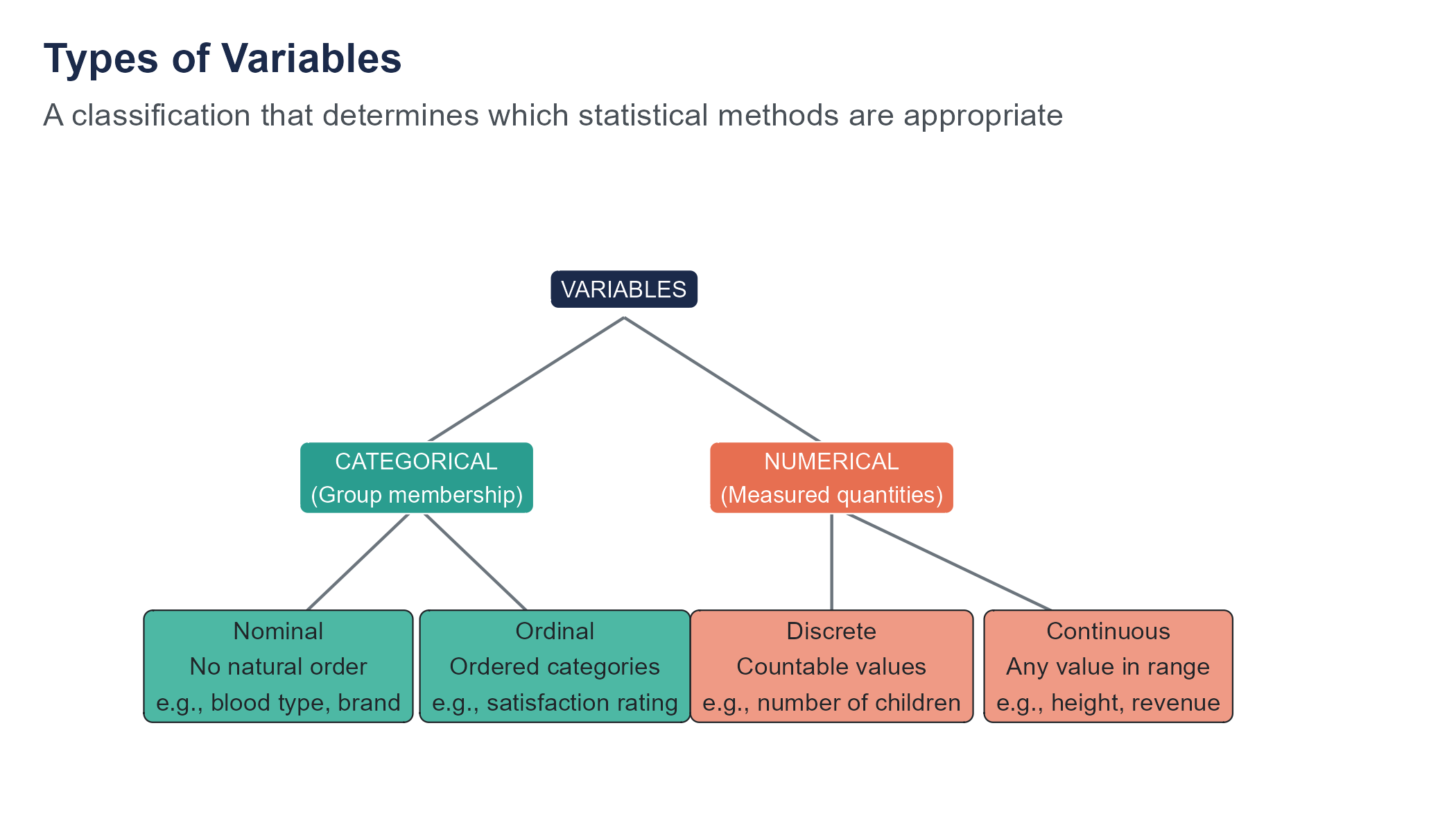
Categorical Variables
A categorical variable places each case into one of a set of groups or categories.
Nominal variables have categories with no natural ordering. Examples: blood type (A, B, AB, O), state of residence, brand of phone, industry classification. You can count how many cases fall into each category and compute proportions, but calculating a mean makes no sense.
Ordinal variables have categories with a natural order, but the distances between categories are not necessarily equal. Examples: education level (high school, bachelor’s, master’s, doctorate), customer satisfaction (very dissatisfied, dissatisfied, neutral, satisfied, very satisfied), pain rating on a 1-to-10 scale. You can say one category is higher than another, but you cannot confidently say the gap between “satisfied” and “very satisfied” is the same size as the gap between “neutral” and “satisfied.”
The question of whether to treat ordinal data as numerical (computing means and standard deviations) or categorical (computing frequencies and proportions) generates one of the longest-running debates in statistics. In practice, researchers often treat Likert-scale items (1 through 5 or 1 through 7) as numerical. Whether this is appropriate depends on context. We will revisit this in later chapters.
Numerical Variables
A numerical variable (also called quantitative) represents a measured quantity where arithmetic operations are meaningful.
Discrete numerical variables take on countable values, usually integers. Examples: number of children in a household (0, 1, 2, 3, …), number of defective items in a shipment, number of website visits.
Continuous numerical variables can take any value within a range, including decimals. Examples: height (5.74 feet), temperature (98.6 degrees), time to complete a task (43.7 seconds), revenue ($1,247,893.41). In practice, all measurements are rounded to some level of precision, but the underlying concept is that the variable could, in principle, take infinitely many values.
Identifying Variable Types in Practice
Let’s apply this framework to a real situation. Imagine a hospital tracking patient data. For each patient, the hospital records:
- Patient ID (like MRN-00482): Nominal. It is a label, nothing more. The fact that it contains numbers does not make it numerical.
- Age: Continuous numerical. A patient could be 42.7 years old, even if the hospital rounds to whole years.
- Blood pressure (systolic, in mmHg): Continuous numerical.
- Number of previous hospitalizations: Discrete numerical. You can have 0, 1, 2, or 3 previous stays, but not 2.7.
- Primary diagnosis (diabetes, pneumonia, heart failure): Nominal. There is no inherent ordering among diseases.
- Pain level (1 to 10 scale): Ordinal. The distances between levels are not guaranteed to be equal. The jump from 2 to 3 might feel very different from the jump from 8 to 9.
- Insurance type (private, Medicare, Medicaid, uninsured): Nominal.
- Discharge status (discharged home, transferred, deceased): Nominal.
Notice how a single dataset can contain all four types of variables. Getting the classification right is not academic. If someone computes the “average insurance type,” the software might produce a number, but that number is nonsense. If someone treats pain level as continuous and runs a sophisticated regression, the results might be interpretable, or they might be misleading, depending on whether the gaps between pain levels are roughly equal in the population being studied.
Why This Matters
The type of variable determines which statistical methods are appropriate. You summarize categorical data with counts, proportions, and bar charts. You summarize numerical data with means, standard deviations, and histograms. You compare groups of categorical data with chi-square tests and groups of numerical data with t-tests or ANOVA. Choosing the wrong method for your variable type produces output that looks like an answer but is not one.
Throughout this book, one of the first things we will do with any new dataset is identify the variable types. It is the statistical equivalent of reading the ingredients before you start cooking.
The “It Has Numbers So It Must Be Numerical” Trap
One of the most common mistakes beginners make is assuming that any variable containing numbers is numerical. This seems logical, but it is wrong often enough to be worth highlighting.
Zip codes are numbers. But what does an “average zip code” of 48,203.7 mean? Nothing. Zip codes are labels assigned to geographic areas, and the fact that they happen to be numeric is an accident of the postal system. Jersey numbers in basketball are numbers, but calculating that the average jersey number on a team is 23.4 is meaningless. Social Security numbers, credit card numbers, phone numbers, account numbers, all of these contain digits but are not numerical variables. No arithmetic operation on them produces useful information.
Going the other direction, some variables that look categorical have a numerical interpretation lurking underneath. A student’s class year (freshman, sophomore, junior, senior) is ordinal, but it also corresponds to years of college completed (roughly 1, 2, 3, 4), and in some analyses treating it as numerical is reasonable. A Likert scale rating of 1 to 5 is technically ordinal, but if you are averaging across thousands of responses, treating it as numerical often produces results that are practical and defensible, even if purists object. The key is to make the choice deliberately, with awareness of the assumption you are making, rather than by default.
The safest habit is to ask yourself two questions whenever you encounter a variable: “Would it make sense to add or average these values?” and “Do the numbers represent a real quantity, or are they just convenient labels?” If the answer to the first question is no, or the answer to the second is “just labels,” you are dealing with a categorical variable regardless of what the data looks like.
Where Data Comes From (And Why You Should Care)
Data does not appear out of thin air. Someone decides what to measure, how to measure it, whom to measure, and when. Each of those decisions shapes what the data can and cannot tell you. Understanding the origin of your data is not a preliminary step you rush through to get to the interesting analysis. It is the analysis, or at least the part that determines whether the analysis means anything.
Consider a simple example. A manager looks at quarterly sales data and notices that revenue is higher in quarters when the company ran social media campaigns. She concludes that social media drives revenue. But she has not considered that the company tends to run social media campaigns during the holiday season, when revenue is naturally higher anyway. The data is accurate. The math is correct. But the conclusion is wrong because she did not ask a basic question about where the pattern came from.
Every dataset tells two stories. There is the story in the data: the patterns, the trends, the relationships between variables. And there is the story behind the data: how it was collected, why it was collected, what was included, and what was left out. The second story is at least as important as the first, and it is the one most people ignore.
Populations and Samples
The population is the entire group you want to know about. All registered voters in the United States. All customers who purchased from your website this year. All children in Flint who were exposed to contaminated water.
A sample is a subset of the population that you actually observe. We rarely have data on an entire population. Instead, we collect data from a sample and use it to draw conclusions about the population. This leap, from sample to population, is the central challenge of statistical inference, and we will spend much of this book learning how to do it well and understanding when it goes wrong.
The quality of your conclusions depends entirely on the quality of your sample. A biased sample produces biased conclusions, no matter how sophisticated your analysis. We will cover sampling methods in detail in Chapter 2.
Consider a concrete example. Suppose a university wants to know what percentage of its 15,000 students support a tuition increase to fund a new recreation center. Surveying all 15,000 students is impractical, so the university surveys 400 students instead. If those 400 are selected randomly, meaning every student has an equal chance of being included, then the percentage who support the increase in the sample should be close to the percentage in the full student body. How close? That depends on the sample size and the variability in opinions, and we will learn to quantify “how close” precisely when we study confidence intervals in Chapter 7.
But if the survey is conducted by setting up a table outside the existing recreation center, the sample is no longer random. Students who already use the rec center, and therefore benefit most from an upgrade, are overrepresented. The result will overestimate support. The math might be perfect. The conclusion will still be wrong, not because of a computational error but because of a sampling error. This is the kind of error that no amount of statistical sophistication can fix after the fact.
Observational Studies vs. Experiments
In an observational study, researchers collect data by observing subjects as they naturally are. They do not intervene or assign treatments. Most business and social science research is observational: surveys, transaction records, census data, web analytics.
In an experiment, researchers deliberately assign treatments to subjects and then compare outcomes. The gold standard is a randomized controlled experiment, where subjects are randomly assigned to a treatment group or a control group. Random assignment is a deceptively simple idea with profound consequences. By letting chance determine who gets the treatment and who does not, you ensure that, on average, the two groups are similar in every way except the treatment. Any pre-existing differences, age, income, health, personality, motivation, all of them, get distributed approximately equally between the groups. This means that if the treatment group does better than the control group, the most plausible explanation is the treatment, because nothing else systematically differs between the groups.
The distinction matters enormously for one reason: causation. Experiments can support causal claims. Observational studies, in general, cannot. If you observe that people who exercise more also weigh less, you have found an association. You have not proven that exercise causes weight loss, because exercisers might differ from non-exercisers in a dozen other ways, diet, genetics, occupation, socioeconomic status, motivation, access to healthy food, that also affect weight. The people who choose to exercise might be exactly the kind of people who would weigh less regardless. Without random assignment, you cannot disentangle the effect of exercise from the characteristics of people who exercise.
This is one of the most important ideas in the entire book, and we will return to it again and again: correlation does not imply causation. You have heard this before. By the end of this book, you will understand exactly why it is true and what it takes to move beyond correlation to causal claims.
A Business Example
Suppose a retail company notices that customers who use its mobile app spend 35% more per year than customers who do not. The marketing team proposes spending $2 million to acquire more app users, reasoning that getting people onto the app will increase their spending.
Do you see the problem? The data shows an association between app usage and spending. But customers who downloaded the app may already have been the company’s most engaged and highest-spending customers. They did not spend more because of the app. They downloaded the app because they were already committed to the brand. Spending $2 million to push the app on less-engaged customers might produce no increase in revenue at all.
To determine whether the app actually causes higher spending, the company would need an experiment: randomly assign some new customers to receive a prompt to download the app and others to receive no prompt, then compare spending over the next year. Only that kind of design can disentangle the effect of the app from the characteristics of the people who voluntarily use it.
This is not a hypothetical. Companies make this mistake constantly. They observe that their best customers behave in a certain way, invest heavily in getting other customers to mimic that behavior, and then wonder why the results are disappointing. The answer, almost always, is confounding. The behavior was a symptom of engagement, not a cause of it.
Data Quality: Garbage In, Garbage Out
The most elegant statistical analysis in the world is worthless if the data feeding it is flawed. This principle is old enough to have a cliche: garbage in, garbage out. But it is worth dwelling on, because in practice, data quality problems are far more common and far more damaging than choosing the wrong statistical test.
Common Data Quality Problems
Missing data. Values are missing because a survey respondent skipped a question, a sensor malfunctioned, a record was lost. The pattern of missingness matters. If data is missing at random, some methods can handle it. If data is missing for a reason related to the variable itself (e.g., people with high incomes are less likely to report their income), the missingness introduces bias.
Measurement error. The value recorded does not match the true value. Self-reported data is particularly prone to this. People misremember, exaggerate, or shade the truth. But measurement error also affects supposedly objective data, instruments can be miscalibrated, definitions can be inconsistent, data entry can introduce typos.
Selection bias. The sample does not represent the population. Online surveys miss people without internet access. Customer satisfaction surveys miss customers who already left. Hospital data overrepresents people who sought treatment, missing those who were sick but did not see a doctor.
Confounding. A third variable influences both the variable you think of as the cause and the variable you think of as the effect, creating a spurious association. We will spend considerable time on this problem.
Survivorship bias. You analyze data only on the things that survived some selection process, ignoring those that did not. During World War II, the mathematician Abraham Wald famously demonstrated this error when the U.S. military studied bullet holes on returning bombers and proposed armoring the wrong areas. We will tell this story in full in Chapter 2. The key insight is that your data only includes survivors, and that applies far beyond military aviation. When you study successful companies, you miss the companies that tried the same strategies and failed. When you study long-lived people, you miss those who died young. When you study companies that IPO’d, you miss the startups that never made it.
Data entry and processing errors. Someone typed 10000 instead of 1000. A column was mislabeled. A decimal point ended up in the wrong place. A data merge went wrong and matched the wrong records. These errors are mundane and disturbingly common.
A Cautionary Tale: The Spreadsheet Error That Changed History
In 2010, two Harvard economists, Carmen Reinhart and Kenneth Rogoff, published an influential paper arguing that countries whose national debt exceeded 90% of GDP experienced sharply lower economic growth. The finding was cited by policymakers around the world to justify austerity measures, spending cuts that affected millions of people during the aftermath of the global financial crisis.
Three years later, a graduate student named Thomas Herndon tried to replicate their results for a class assignment. He could not. When he obtained the original spreadsheet, he discovered several problems. One was a simple coding error: a formula in Microsoft Excel had excluded five countries from an average because the cell range was wrong. Another was a questionable decision about which data points to include and which to exclude. When the errors were corrected and the excluded data was added back, the dramatic growth cliff at 90% debt largely disappeared.
The original finding was not fabricated. The economists had not committed fraud. They had made a spreadsheet mistake that anyone could make and a subjective data selection decision that happened to point in a particular direction. But the policy consequences were enormous. Governments had used the 90% threshold to justify austerity programs that cut public services, reduced government employment, and slowed economic recovery. A data entry error in a single Excel cell had, through its influence on policy, touched the lives of millions.
The First Rule of Data Analysis
Before you compute a single summary statistic, look at your data. Examine its structure. Check for oddities. Ask how it was collected. Ask who collected it and why. Ask what might be missing. This sounds tedious, and it can be. But skipping it is how careers get ruined. Ask the researchers who built conclusions on spreadsheets with sorting errors, or the analysts who reported wrong numbers because two datasets were joined on the wrong key. Ask Reinhart and Rogoff, whose reputations were defined more by a spreadsheet error than by decades of otherwise respected work.
Data quality is an ethical issue, more than a technical one. When Flint officials reported water testing results, they used sampling methods that systematically avoided the worst-affected homes, a practice sometimes called “strategic sampling.” The data they published was not technically fabricated. It was strategically collected to produce a predetermined conclusion. This is one of the most dangerous forms of data manipulation because the numbers look clean. Being literate about data quality is your first defense against being misled, and your first obligation if you are the one producing the analysis.
The AI Question
You are learning statistics at a peculiar moment in history. Artificial intelligence systems can now generate analyses, build predictive models, write code, produce visualizations, and summarize findings faster than any human. If a machine can do all that, why should you spend a semester learning to do it yourself?
The answer is that computation is the easy part. It always has been. Even before AI, a calculator could compute a mean, and software could run a regression. The hard parts, the parts that matter, have always been the parts that require judgment:
- Is this the right question to ask?
- Is this data appropriate for answering it?
- Does this analysis method match the structure of the data?
- Are the assumptions of the method satisfied?
- What do the results actually mean in context?
- Who is affected by these findings, and what are the consequences of getting it wrong?
AI cannot reliably answer any of these questions. It can produce confident-sounding responses to all of them, which is arguably worse than not answering at all. A machine that generates a wrong answer with no hesitation is more dangerous than a machine that admits it does not know.
Consider what happened when Flint officials insisted the water was safe. The data they cited was real. The summaries were calculated correctly. The problem was not computation, it was judgment. They chose what to measure (lead levels at carefully selected homes), how to measure it (flushing the tap before testing, which reduced lead readings), and how to interpret the results (within federal limits, therefore safe). Every one of those choices required human judgment, and every one was wrong in ways that hurt real people.
Statistical literacy is the ability to evaluate these judgments. In an age when AI can produce endless analyses, the person who can tell the difference between a good analysis and a bad one has never been more valuable.
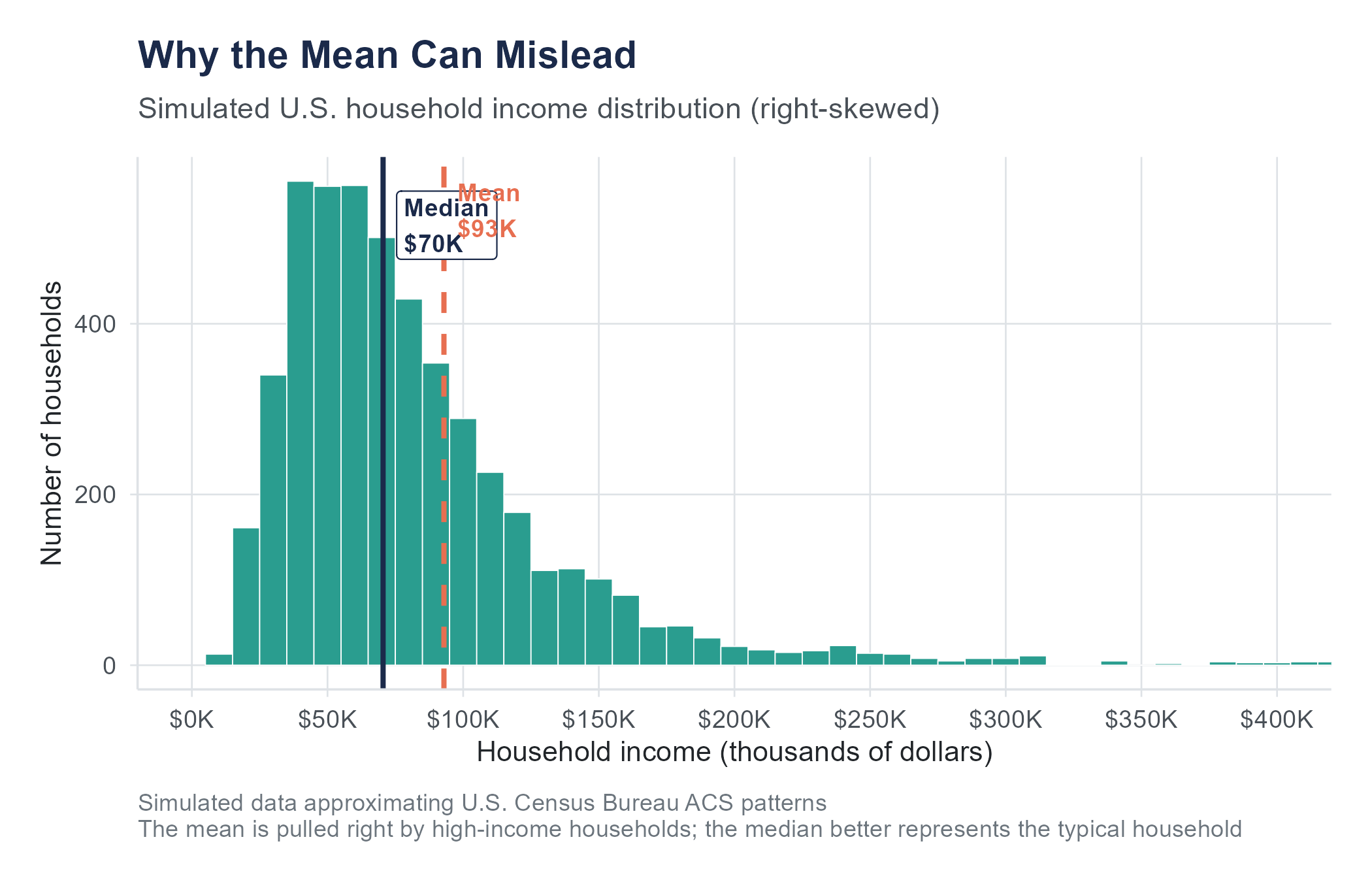
Try asking a large language model to explain why the mean is preferred over the median. Many will give you a confident explanation about the mean “using all the data” and being “more efficient.” What they often fail to mention is that the mean is not preferred when the data is heavily skewed. The median household income in the United States is approximately $74,580, but the mean is considerably higher, pulled upward by a small number of extremely high incomes. A student who blindly accepts the AI’s advice and reports the mean would produce a misleading picture of what a typical American household earns. The statistical concept is simple. Knowing when to apply it requires the kind of contextual judgment that AI does not possess.
What AI Can and Cannot Do
Let’s be specific about what current AI tools handle well and where they fall short in the context of statistics:
AI can perform calculations quickly and accurately. It can run statistical tests, fit models, and generate visualizations if given clean data and clear instructions. It can look up formulas and explain procedures. For routine computation, AI is a useful assistant.
AI struggles with determining whether the assumptions of a test are met, understanding the context behind data, recognizing when results are technically correct but substantively misleading, handling ambiguous or incomplete data, and making judgment calls about what analysis to run in the first place.
AI fails at ethical reasoning about data use, understanding the social consequences of an analysis, and knowing what it does not know. When an AI tool encounters a question it cannot answer, it often answers anyway, with unearned confidence.
Your goal in this book is not to become a calculator. It is to become a thinker, someone who knows which questions to ask, which methods to apply, what the results mean, and whether the analysis was done with integrity. These are human skills. They are the skills this book teaches.
Using AI as a Learning Tool (Not a Crutch)
Throughout this book, you will occasionally see suggestions for how AI tools can support your learning. Used well, they can be quite helpful. If you are struggling with a concept, asking an AI to explain it a different way can sometimes unblock your understanding faster than re-reading the same paragraph five times. If you have written R code that produces an error, AI can often identify the syntax mistake. If you need to generate practice problems, AI is tireless.
But there is a line between using AI as a tutor and using it as a shortcut. If you paste an exercise into an AI tool and submit whatever it produces, you will get a grade for that assignment, but you will not get the learning. And the learning is the product you are paying for. Employers are not hiring you for your ability to copy-paste prompts. They are hiring you for your ability to look at data and figure out what it means, what it does not mean, and what to do about it.
Here is a useful rule of thumb: if you cannot explain your answer without referring to what the AI told you, you do not yet understand it. Use AI to help you get to understanding, not to bypass it.
Reading the News Statistically
Once you develop statistical thinking, you will start noticing how numbers are used, and misused, in the media, in advertising, in political arguments. This can be both empowering and maddening.
A headline screams: “New Study Finds Chocolate Reduces Risk of Heart Disease.” The statistically literate reader asks: was this an experiment or an observational study? If observational (and it almost certainly was), then confounders could explain the association. Perhaps people who eat moderate amounts of chocolate also have other lifestyle habits that promote heart health. What was the sample size? Who funded the study? Was the study published in a peer-reviewed journal, or just announced in a press release? What was the effect size—beyond whether the result passed a statistical test, was the reduction in risk large enough to be practically meaningful?
A politician claims: “Crime is up 15% under the current administration.” The statistically literate listener asks: up 15% compared to what baseline? If crime dropped dramatically during an unusual period (say, a pandemic when people stayed home) and then partially returned to normal, a 15% increase from the abnormal low might still represent a historically normal level. What category of crime is being measured? Is it violent crime, property crime, or all crime? Are we looking at reported crimes or arrests or convictions? Each produces different numbers.
A company advertises: “Clinically proven to reduce wrinkles.” The statistically literate consumer asks: proven in what kind of study? How many participants? Compared to what, a placebo, a competitor, or nothing? What does “reduce wrinkles” mean operationally, and who judged the reduction?
These are not rhetorical questions. They are the exact questions that statistical training teaches you to ask. By the end of this book, they will become second nature.
Key Terms
- Statistics: The science of collecting, organizing, analyzing, and interpreting data to make informed decisions under uncertainty.
- Variable: A characteristic that can take different values across cases or observations.
- Categorical variable: A variable whose values represent group membership. Includes nominal (no natural order) and ordinal (natural order) types.
- Numerical variable: A variable whose values represent measured quantities. Includes discrete (countable) and continuous (any value in a range) types.
- Population: The entire group of interest.
- Sample: A subset of the population from which data is collected.
- Observational study: A study in which researchers observe subjects without intervening or assigning treatments.
- Experiment: A study in which researchers deliberately assign treatments to subjects and compare outcomes.
- Randomized controlled experiment: An experiment where subjects are randomly assigned to treatment and control groups.
- Confounding variable: A variable that influences both the explanatory variable and the response variable, creating a misleading association between them.
- Selection bias: Systematic error arising from how subjects are chosen for a sample or study.
- Missing data: Values that are absent from a dataset, potentially introducing bias depending on the pattern and reason for missingness.
Exercises
Check Your Understanding
In the Flint water crisis, Dr. Hanna-Attisha compared blood lead levels in children before and after the water source change. Was this an observational study or an experiment? Explain your reasoning.
Identify the variable type (nominal, ordinal, discrete numerical, or continuous numerical) for each of the following:
- A customer’s zip code
- The number of products in a shopping cart
- A student’s letter grade (A, B, C, D, F)
- The time a customer spent on a website (in seconds)
- A person’s blood type
- The number of siblings a person has
- Temperature measured in Fahrenheit
- A hotel star rating (1 through 5 stars)
Explain the difference between a population and a sample. Why do we typically work with samples rather than populations?
A news article states: “People who eat breakfast every day earn 20% more than people who skip breakfast.” Does this mean eating breakfast causes higher earnings? What alternative explanations might account for this association?
Describe two ways that data quality problems could lead to incorrect conclusions. Use examples different from those given in the chapter.
What is the difference between a discrete numerical variable and a continuous numerical variable? Give one example of each that was not used in the chapter.
A company surveys its current customers about satisfaction and finds that 89% are satisfied. What kind of bias might affect this result, and in which direction?
Explain why the distinction between observational studies and experiments matters for making causal claims.
In your own words, explain what the phrase “garbage in, garbage out” means in the context of data analysis.
A researcher collects data on the relationship between ice cream sales and drowning deaths and finds a strong positive association. More ice cream sales coincide with more drownings. Should the researcher conclude that ice cream causes drowning? What is a more plausible explanation?
Apply It
(See Appendix B for complete variable descriptions for all datasets used in these exercises.)
For the following problems, use the Flint water dataset available on the companion website (datasets/flint-water-lead.csv). This dataset contains real lead testing results from the Virginia Tech Flint Water Study, collected during the Flint water crisis. It includes lead levels in parts per billion for 271 Flint homes. The data was originally compiled by the Virginia Tech research team and is publicly available.
Load the dataset and identify each variable. Classify each as nominal, ordinal, discrete numerical, or continuous numerical. How many observations (cases) are in the dataset? How many variables?
Examine the lead level variable. What is the highest value in the dataset? The lowest? Based on the EPA action level of 15 ppb, what proportion of homes in the sample exceed this threshold?
Examine the dataset for missing values. Are there any? In many real-world datasets, missing values are common. If this dataset has no missing values, explain why a carefully curated research dataset might be more complete than data collected through routine record-keeping. What kinds of lead testing data might go missing in a less controlled setting?
The dataset includes a variable for ward (geographic district within Flint). How many distinct wards are represented? Is this variable categorical or numerical? Explain.
Create a simple summary of lead levels by ward. You do not need formal statistical tests yet, just compute the count, mean, and median lead level for each ward. What do you notice?
Using any data source you can find (the U.S. Census Bureau’s American Community Survey is a good starting point), find three variables about a city or county of your choice. Identify each variable’s type. Describe one question you could potentially answer by analyzing the relationship between two of these variables.
A local coffee shop tracks the following for each transaction: date, time of day, drink ordered, size (small/medium/large), price paid, whether the customer used a loyalty card (yes/no), and the barista who made the drink. Classify each variable and identify which would be useful for answering the question: “Do loyalty card users spend more per visit?”
Find a news article that reports a statistical finding (e.g., “Study finds that X is associated with Y”). Identify: (a) the population of interest, (b) the sample used, (c) whether the study was observational or experimental, and (d) whether the article’s headline implies causation. If it does, is that implication justified?
A company wants to know whether a new website design leads to more purchases. They show the new design to visitors from California and the old design to visitors from New York, then compare purchase rates. What is wrong with this approach? What would you recommend instead?
Consider a dataset that contains the following variables for a set of 1,000 employees: employee ID, department, years of experience, annual salary, performance rating (1-5), and whether the employee was promoted in the past year (yes/no). For each variable, identify its type. Then propose two specific questions that could be investigated using this dataset, and identify which variables you would need for each question.
Think Deeper
In the Flint case, state officials initially dismissed Dr. Hanna-Attisha’s findings by questioning her methodology. Later, their own data confirmed her conclusions. What does this episode suggest about the relationship between statistical evidence and institutional power? How should a data analyst respond when their findings are politically inconvenient?
The chapter argues that statistical literacy is more important in the age of AI, not less. Do you agree? Can you think of a scenario where relying on an AI tool for statistical analysis without understanding the underlying methods could lead to harm?
The chapter mentions “strategic sampling,” the practice of selecting samples in a way that produces a desired result. This is different from outright fabrication of data, but the effect can be similar. Should strategic sampling be treated as a form of scientific fraud? Who has the responsibility to catch it?
Suppose you are hired as a data analyst for a company that asks you to analyze customer data that was collected without customers’ knowledge or explicit consent. The data is already collected. The analysis could help improve the product. What ethical considerations should guide your decision about whether to proceed?
Think about a decision that affects your community (a school policy, a local business decision, a government program). What data would you want to see before that decision is made? What kind of study (observational or experimental) would be most appropriate for gathering that data? What practical or ethical barriers might prevent the ideal study from being conducted?
The chapter distinguishes between three big questions statistics can answer: “What happened?”, “Is it real?”, and “What will happen?” Think of a real-world situation (in business, healthcare, education, or policy) where all three questions are relevant. Describe specifically what each question would look like in that context.
The next eleven chapters are even better. From Facebook’s mood experiment to the gender wage gap debate, every chapter builds your statistical thinking through stories that matter.
Buy Print Edition ($39.99) Buy Kindle ($14.99) See All Chapters