# Loads tidyverse, book color palette, and theme_moe()
# Download _common.R from the Datasets page if running locally
source("_common.R")Chapter 5: Probability
Overview
Probability quantifies uncertainty. Every time a medical test returns a result, probability determines how much you should trust it. In this walkthrough, we explore COVID testing data to see how sensitivity, specificity, and Bayes’ theorem work in practice — and why a “positive” test does not always mean what you think it means. This walkthrough accompanies Chapter 5 of Margin of Error.
Setup
Load and Explore the Data
The dataset contains 2,000 COVID test results. Each row is a patient with a true infection status and a test result.
covid <- read_csv("data/covid-testing.csv")Rows: 2000 Columns: 5
── Column specification ────────────────────────────────────────────────────────
Delimiter: ","
chr (4): truly_infected, test_result, age_group, risk_category
dbl (1): patient_id
ℹ Use `spec()` to retrieve the full column specification for this data.
ℹ Specify the column types or set `show_col_types = FALSE` to quiet this message.glimpse(covid)Rows: 2,000
Columns: 5
$ patient_id <dbl> 1, 2, 3, 4, 5, 6, 7, 8, 9, 10, 11, 12, 13, 14, 15, 16, …
$ truly_infected <chr> "No", "No", "No", "No", "No", "No", "No", "No", "No", "…
$ test_result <chr> "Negative", "Negative", "Negative", "Negative", "Negati…
$ age_group <chr> "60-74", "30-44", "30-44", "18-29", "30-44", "18-29", "…
$ risk_category <chr> "Low", "Medium", "Low", "Medium", "Low", "High", "Low",…How prevalent is COVID in this sample? The prevalence — the proportion of people who are truly infected — is the starting point for every probability calculation that follows.
prevalence <- mean(covid$truly_infected == "Yes")
cat("Prevalence (proportion truly infected):", round(prevalence, 4), "\n")
Prevalence (proportion truly infected): 0.05 Two-Way Table: Test Result vs. True Status
A two-way table (also called a confusion matrix) cross-tabulates test results against the truth. This single table contains everything we need to compute sensitivity, specificity, and predictive values.
conf_table <- table(
  Test = covid$test_result,
  Truth = covid$truly_infected
)
conf_table
Truth
Test No Yes
Negative 1810 9
Positive 90 91Add marginal totals to see the full picture.
addmargins(conf_table) Truth
Test No Yes Sum
Negative 1810 9 1819
Positive 90 91 181
Sum 1900 100 2000Sensitivity and Specificity
Sensitivity is the probability of testing positive given that you are truly infected: P(Positive | Infected). A test with high sensitivity rarely misses true cases.
Specificity is the probability of testing negative given that you are truly not infected: P(Negative | Not Infected). A test with high specificity rarely raises false alarms.
# True Positives, False Negatives, True Negatives, False Positives
TP <- conf_table["Positive", "Yes"]
FN <- conf_table["Negative", "Yes"]
TN <- conf_table["Negative", "No"]
FP <- conf_table["Positive", "No"]

sensitivity <- TP / (TP + FN)
specificity <- TN / (TN + FP)

cat("Sensitivity: P(Positive | Infected) =", round(sensitivity, 4), "\n")
Sensitivity: P(Positive | Infected) = 0.91 cat("Specificity: P(Negative | Not Infected) =", round(specificity, 4), "\n")Specificity: P(Negative | Not Infected) = 0.9526 Positive Predictive Value (PPV)
The question patients actually care about is: given that I tested positive, what is the probability I am truly infected? That is the PPV — P(Infected | Positive).
ppv <- TP / (TP + FP)
cat("PPV: P(Infected | Positive) =", round(ppv, 4), "\n")
PPV: P(Infected | Positive) = 0.5028 Notice that PPV depends heavily on prevalence. Even a highly specific test produces many false positives when the disease is rare.
Bayes’ Theorem by Hand
Bayes’ theorem lets us calculate PPV from sensitivity, specificity, and prevalence without needing the raw table:
\[ PPV = \frac{\text{Sensitivity} \times \text{Prevalence}}{\text{Sensitivity} \times \text{Prevalence} + (1 - \text{Specificity}) \times (1 - \text{Prevalence})} \]
ppv_bayes <- (sensitivity * prevalence) /
  (sensitivity * prevalence + (1 - specificity) * (1 - prevalence))

cat("PPV via Bayes' theorem:", round(ppv_bayes, 4), "\n")
PPV via Bayes' theorem: 0.5028 The two PPV values should match (within rounding).
Law of Large Numbers: Simulating Coin Flips
Probability also governs random processes like coin flips. The Law of Large Numbers says that as the number of trials grows, the observed proportion converges to the true probability.
set.seed(42)
n_flips <- 1000
flips <- sample(0:1, n_flips, replace = TRUE)
running_prop <- cumsum(flips) / 1:n_flips

lln_data <- tibble(
  flip_number = 1:n_flips,
  running_proportion = running_prop
)

ggplot(lln_data, aes(x = flip_number, y = running_proportion)) +
  geom_line(color = moe_colors$teal, linewidth = 0.6) +
  geom_hline(yintercept = 0.5, linetype = "dashed", color = moe_colors$coral) +
  labs(
    title = "Law of Large Numbers in Action",
    subtitle = "Running proportion of heads stabilizes near 0.5",
    x = "Number of flips",
    y = "Proportion of heads"
  ) +
  theme_moe()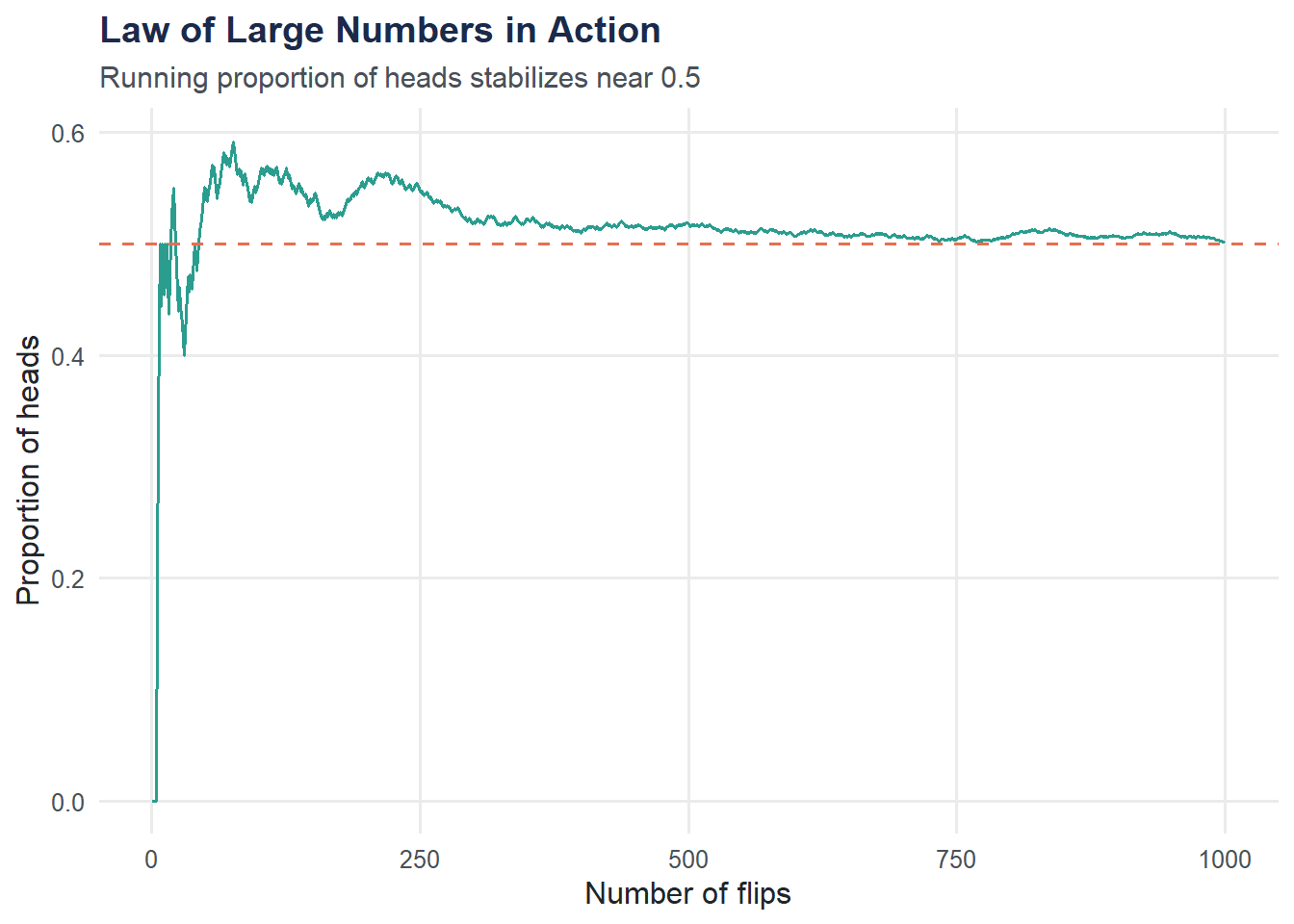
Binomial Distribution: Positive Tests in a Batch
If we test 20 patients and each has a fixed probability of testing positive, the number of positives follows a binomial distribution. We use dbinom() to compute and plot the exact probabilities.
# Use the observed positive rate as our probability
p_positive <- mean(covid$test_result == "Positive")

binom_data <- tibble(
  k = 0:20,
  probability = dbinom(0:20, size = 20, prob = p_positive)
)

ggplot(binom_data, aes(x = k, y = probability)) +
  geom_col(fill = moe_colors$navy, width = 0.7) +
  labs(
    title = "Binomial Distribution of Positive Tests",
    subtitle = paste0("n = 20 patients, P(positive) = ", round(p_positive, 3)),
    x = "Number of positive tests",
    y = "Probability"
  ) +
  scale_x_continuous(breaks = 0:20) +
  theme_moe()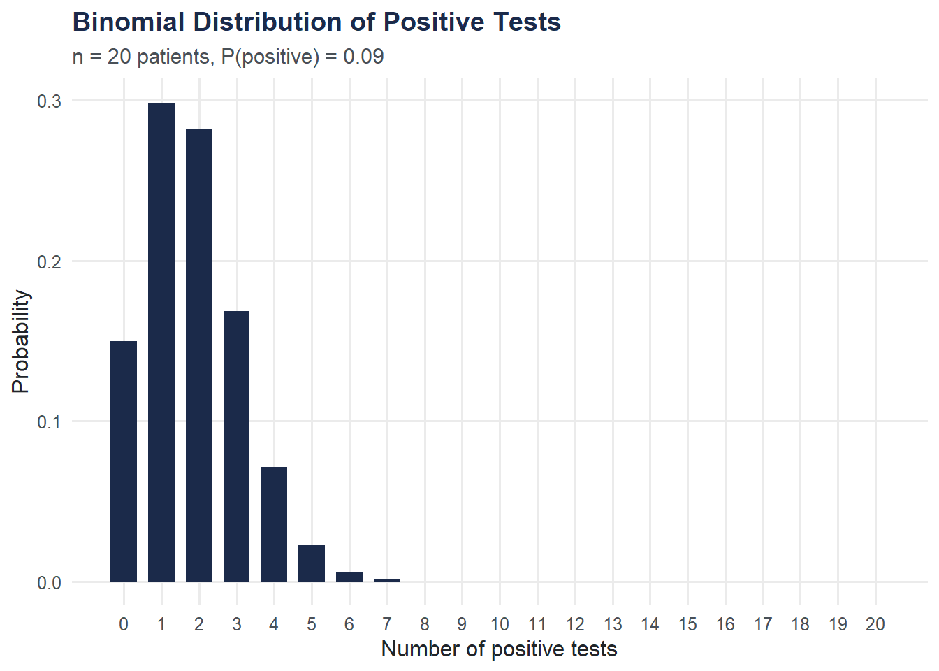
Visualization: Confusion Matrix as a Grouped Bar Chart
A grouped bar chart makes the confusion matrix easy to read at a glance: how do test results break down by true infection status?
covid |>
  count(truly_infected, test_result) |>
  ggplot(aes(x = truly_infected, y = n, fill = test_result)) +
  geom_col(position = "dodge", width = 0.7) +
  scale_fill_moe() +
  labs(
    title = "Confusion Matrix as a Grouped Bar Chart",
    subtitle = "Correct classifications dominate, but errors exist in both directions",
    x = "Truly Infected?",
    y = "Count",
    fill = "Test Result"
  ) +
  theme_moe()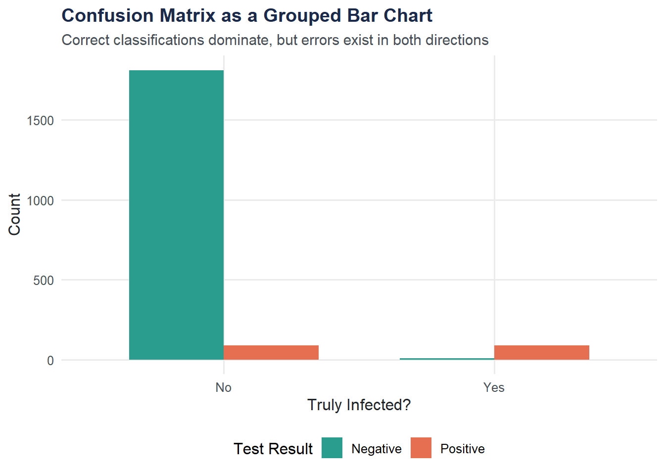
Try It Yourself
What happens to PPV if prevalence drops to 1%? Using the sensitivity and specificity you calculated above, apply Bayes’ theorem with
prevalence = 0.01. How does the PPV change? What does this imply about mass testing in low-prevalence populations?Simulate 10,000 coin flips. Repeat the Law of Large Numbers simulation with
n_flips <- 10000and plot the running proportion. How quickly does it stabilize compared to 1,000 flips?