# Loads tidyverse, book color palette, and theme_moe()
# Download _common.R from the Datasets page if running locally
source("_common.R")Chapter 1: Why Statistics Matters Now
Overview
Statistics helps us separate signal from noise — and sometimes the stakes are life and death. In this walkthrough, we use data from the Flint, Michigan water crisis to see why data skills matter. Lead-contaminated drinking water affected thousands of homes, and the data tell a story that numbers alone can make visible. This walkthrough accompanies Chapter 1 of Margin of Error.
Setup
Load and Explore the Data
The dataset contains lead measurements (in parts per billion) from 271 homes in Flint, Michigan. Each row represents a single water test from a home.
flint <- read_csv("data/flint-water-lead.csv")Rows: 271 Columns: 5
── Column specification ────────────────────────────────────────────────────────
Delimiter: ","
chr (2): home_id, draw_type
dbl (3): ward, zip_code, lead_ppb
ℹ Use `spec()` to retrieve the full column specification for this data.
ℹ Specify the column types or set `show_col_types = FALSE` to quiet this message.glimpse(flint)Rows: 271
Columns: 5
$ home_id <chr> "H001", "H002", "H004", "H005", "H006", "H007", "H008", "H00…
$ ward <dbl> 6, 9, 1, 8, 3, 9, 9, 5, 9, 3, 9, 5, 2, 7, 9, 9, 5, 6, 2, 6, …
$ zip_code <dbl> 48504, 48507, 48504, 48507, 48505, 48507, 48507, 48503, 4850…
$ lead_ppb <dbl> 0.344, 8.133, 1.111, 8.007, 1.951, 7.200, 40.630, 1.100, 10.…
$ draw_type <chr> "first", "first", "first", "first", "first", "first", "first…The glimpse() output tells us how many rows and columns we have, along with each variable’s type. Let’s get a statistical summary next.
summary(flint) home_id ward zip_code lead_ppb
Length:271 Min. :0.000 Min. :48502 Min. : 0.344
Class :character 1st Qu.:3.000 1st Qu.:48503 1st Qu.: 1.578
Mode :character Median :6.000 Median :48505 Median : 3.521
Mean :5.314 Mean :48505 Mean : 10.646
3rd Qu.:8.000 3rd Qu.:48506 3rd Qu.: 9.050
Max. :9.000 Max. :48532 Max. :158.000
draw_type
Length:271
Class :character
Mode :character
Identify Variable Types
Before any analysis, classify your variables. This determines which summaries and charts are appropriate.
str(flint)spc_tbl_ [271 × 5] (S3: spec_tbl_df/tbl_df/tbl/data.frame)
$ home_id : chr [1:271] "H001" "H002" "H004" "H005" ...
$ ward : num [1:271] 6 9 1 8 3 9 9 5 9 3 ...
$ zip_code : num [1:271] 48504 48507 48504 48507 48505 ...
$ lead_ppb : num [1:271] 0.344 8.133 1.111 8.007 1.951 ...
$ draw_type: chr [1:271] "first" "first" "first" "first" ...
- attr(*, "spec")=
.. cols(
.. home_id = col_character(),
.. ward = col_double(),
.. zip_code = col_double(),
.. lead_ppb = col_double(),
.. draw_type = col_character()
.. )
- attr(*, "problems")=<externalptr> - home_id — identifier (nominal)
- ward — categorical/nominal (geographic grouping)
- zip_code — categorical/nominal (looks numeric, but codes a location)
- lead_ppb — continuous (the measurement we care about)
- draw_type — categorical/nominal (first draw, flushed, etc.)
Check for Missing Values
Missing data can distort every calculation that follows. Always check before you analyze.
colSums(is.na(flint)) home_id ward zip_code lead_ppb draw_type
0 0 0 0 0 cat("Total missing values:", sum(is.na(flint)), "\n")Total missing values: 0 Visualize Lead Levels
The EPA action level for lead in drinking water is 15 parts per billion (ppb). A histogram shows how lead readings are distributed across homes and makes exceedances immediately visible.
ggplot(flint, aes(x = lead_ppb)) +
  geom_histogram(binwidth = 5, fill = moe_colors$teal, color = "white") +
  geom_vline(xintercept = 15, linetype = "dashed", linewidth = 1,
             color = moe_colors$coral) +
  annotate("text", x = 17, y = Inf, label = "EPA action level (15 ppb)",
           hjust = 0, vjust = 2, color = moe_colors$coral, fontface = "bold",
           size = 3.5) +
  labs(
    title = "Lead Levels in Flint Drinking Water",
    subtitle = "Many homes exceed the EPA action level",
    x = "Lead (parts per billion)",
    y = "Number of homes"
  ) +
  theme_moe()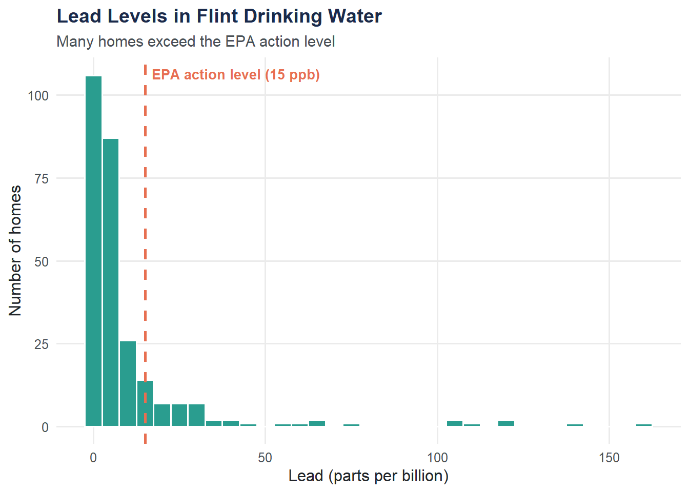
Homes Above the EPA Limit
What proportion of tested homes exceeded the 15 ppb threshold?
n_above <- sum(flint$lead_ppb > 15, na.rm = TRUE)
pct_above <- mean(flint$lead_ppb > 15, na.rm = TRUE) * 100

cat("Homes above 15 ppb:", n_above, "\n")
Homes above 15 ppb: 45 cat("Percentage above 15 ppb:", round(pct_above, 1), "%\n")Percentage above 15 ppb: 16.6 %Summarize Lead by Ward
Different neighborhoods may be affected differently. Grouping by ward reveals geographic patterns.
ward_summary <- flint |>
  group_by(ward) |>
  summarize(
    n_homes      = n(),
    mean_lead    = round(mean(lead_ppb, na.rm = TRUE), 1),
    median_lead  = round(median(lead_ppb, na.rm = TRUE), 1),
    max_lead     = max(lead_ppb, na.rm = TRUE),
    pct_above_15 = round(mean(lead_ppb > 15, na.rm = TRUE) * 100, 1)
  ) |>
  arrange(desc(mean_lead))

ward_summary
# A tibble: 10 × 6
ward n_homes mean_lead median_lead max_lead pct_above_15
<dbl> <int> <dbl> <dbl> <dbl> <dbl>
1 6 32 19.7 4.4 120 28.1
2 8 29 14.8 5.4 158 20.7
3 3 22 12.5 3.4 118. 13.6
4 7 39 11 5.2 105. 23.1
5 5 18 10.3 2.4 66.2 22.2
6 2 24 9.8 3 75.8 16.7
7 4 35 8.6 2 139. 11.4
8 9 41 6.6 3.8 40.6 9.8
9 1 30 4.2 2.4 23.8 6.7
10 0 1 0.7 0.7 0.739 0 ggplot(ward_summary, aes(x = reorder(factor(ward), mean_lead), y = mean_lead)) +
geom_col(fill = moe_colors$navy) +
geom_hline(yintercept = 15, linetype = "dashed", color = moe_colors$coral) +
coord_flip() +
labs(
title = "Mean Lead Level by Ward",
subtitle = "Dashed line = EPA action level (15 ppb)",
x = "Ward",
y = "Mean lead (ppb)"
) +
theme_moe()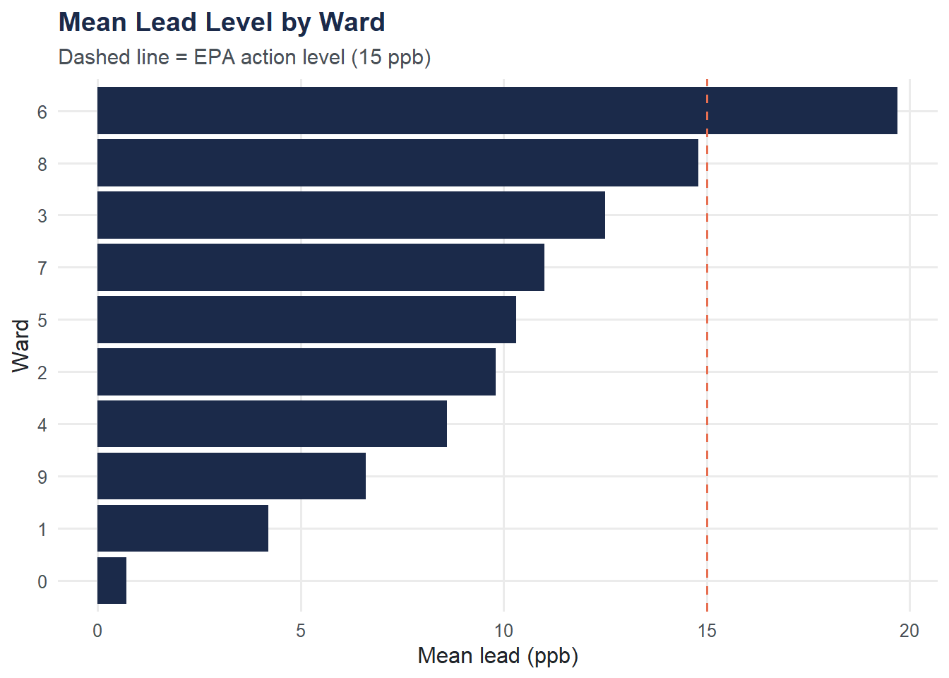
Try It Yourself
Mean vs. median. Calculate the overall median lead level. How does it compare to the mean? If the mean is substantially larger than the median, what does that tell you about the shape of the distribution?
Worst-hit ward. Using the
ward_summarytable above (or computing your own), which ward has the highest proportion of homes above 15 ppb? What might explain geographic differences in contamination?