# Loads tidyverse, book color palette, and theme_moe()
# Download _common.R from the Datasets page if running locally
source("_common.R")Chapter 10: Simple Linear Regression
Overview
Regression models the relationship between two variables with a line of best fit. In this walkthrough, we ask a policy-relevant question: does spending more per student lead to higher test scores? The answer is not as straightforward as you might expect. This walkthrough accompanies Chapter 10 of Margin of Error.
Setup
Load and Explore the Data
The dataset contains education statistics for all 50 U.S. states, including per-student spending, average test scores, and demographic indicators.
education <- read_csv("data/education-spending.csv")Rows: 50 Columns: 7
── Column specification ────────────────────────────────────────────────────────
Delimiter: ","
chr (1): state
dbl (6): spending_per_student, avg_score, median_household_income, pct_pover...
ℹ Use `spec()` to retrieve the full column specification for this data.
ℹ Specify the column types or set `show_col_types = FALSE` to quiet this message.glimpse(education)Rows: 50
Columns: 7
$ state <chr> "Alabama", "Alaska", "Arizona", "Arkansas", "C…
$ spending_per_student <dbl> 12903, 24479, 12363, 13959, 17178, 16331, 2662…
$ avg_score <dbl> 268.5, 283.0, 277.3, 276.0, 270.4, 287.4, 288.…
$ median_household_income <dbl> 59703, 88072, 74355, 55505, 91517, 89096, 8818…
$ pct_poverty <dbl> 16.2, 10.8, 12.5, 16.3, 12.2, 9.5, 9.8, 10.0, …
$ student_teacher_ratio <dbl> 17.9, 18.3, 22.8, 12.7, 21.8, 16.3, 11.7, 14.2…
$ pct_free_lunch <dbl> 60.2, 39.5, 50.3, 64.0, 58.2, 42.4, 41.9, 25.2…education |>
summarize(
across(c(spending_per_student, avg_score, pct_poverty),
list(mean = mean, sd = sd, min = min, max = max),
.names = "{.col}_{.fn}")
) |>
pivot_longer(everything(), names_to = "statistic", values_to = "value") |>
mutate(value = round(value, 1))# A tibble: 12 × 2
statistic value
<chr> <dbl>
1 spending_per_student_mean 17821.
2 spending_per_student_sd 5164.
3 spending_per_student_min 10445
4 spending_per_student_max 32497
5 avg_score_mean 283
6 avg_score_sd 7.6
7 avg_score_min 265
8 avg_score_max 299.
9 pct_poverty_mean 12.3
10 pct_poverty_sd 2.6
11 pct_poverty_min 7.4
12 pct_poverty_max 19.2Scatter Plot: Spending vs. Scores
Always plot first. A scatter plot reveals the direction, strength, and shape of the relationship before fitting a model.
ggplot(education, aes(x = spending_per_student, y = avg_score)) +
  geom_point(size = 3, color = moe_colors$teal, alpha = 0.8) +
  labs(
    title = "Does More Spending Mean Higher Scores?",
    subtitle = "Each point represents one U.S. state",
    x = "Spending per Student ($)",
    y = "Average Test Score"
  ) +
  theme_moe()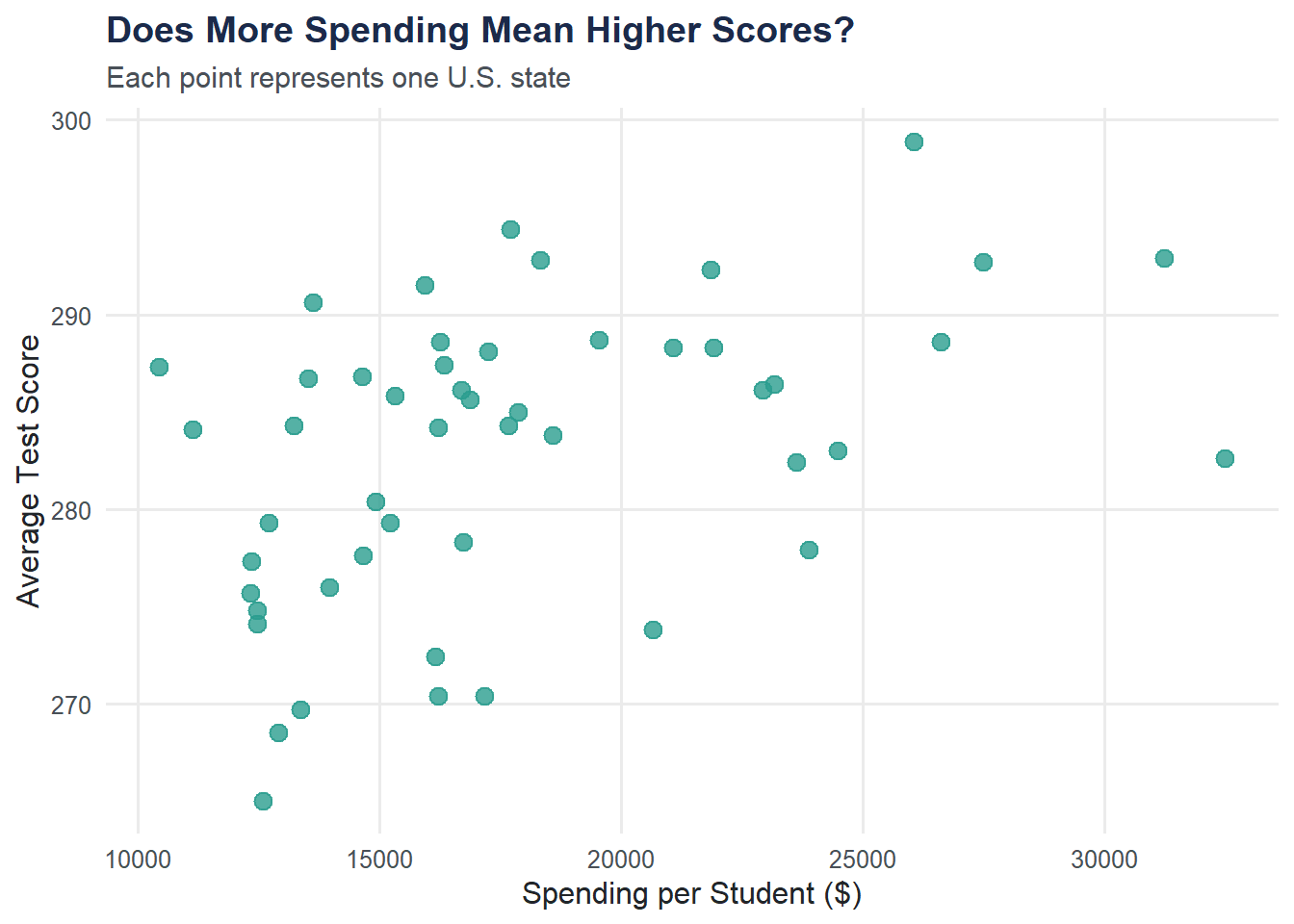
Correlation
The correlation coefficient quantifies the linear association between two variables.
r <- cor(education$spending_per_student, education$avg_score, use = "complete.obs")
cat("Correlation (r):", round(r, 3), "\n")
Correlation (r): 0.433 cat("R-squared (r²):", round(r^2, 3), "\n")R-squared (r²): 0.188 Fit the Regression Model
The lm() function fits a line that minimizes the sum of squared residuals.
model <- lm(avg_score ~ spending_per_student, data = education)
summary(model)
Call:
lm(formula = avg_score ~ spending_per_student, data = education)

Residuals:
     Min       1Q   Median       3Q      Max
-14.6741  -4.2677   0.8565   5.1683  11.4769

Coefficients:
                      Estimate Std. Error t value Pr(>|t|)
(Intercept)          2.717e+02  3.534e+00  76.872  < 2e-16 ***
spending_per_student 6.352e-04  1.906e-04   3.332  0.00166 **
---
Signif. codes:  0 '***' 0.001 '**' 0.01 '*' 0.05 '.' 0.1 ' ' 1

Residual standard error: 6.89 on 48 degrees of freedom
Multiple R-squared:  0.1879,    Adjusted R-squared:  0.171
F-statistic:  11.1 on 1 and 48 DF,  p-value: 0.001665
Key items to interpret:
- Intercept: the predicted score when spending is zero (usually not meaningful on its own).
- Slope: for each additional dollar spent per student, the average score changes by this amount.
- R-squared: the proportion of score variation explained by spending.
- p-value: whether the slope is statistically distinguishable from zero.
Scatter Plot with Regression Line
Adding the fitted line to the scatter plot makes the relationship concrete.
ggplot(education, aes(x = spending_per_student, y = avg_score)) +
  geom_point(size = 3, color = moe_colors$teal, alpha = 0.8) +
  geom_smooth(method = "lm", se = TRUE, color = moe_colors$coral, fill = moe_colors$coral, alpha = 0.15) +
  labs(
    title = "Regression: Spending per Student vs. Test Score",
    subtitle = paste0("R² = ", round(summary(model)$r.squared, 3)),
    x = "Spending per Student ($)",
    y = "Average Test Score"
  ) +
  theme_moe()
`geom_smooth()` using formula = 'y ~ x'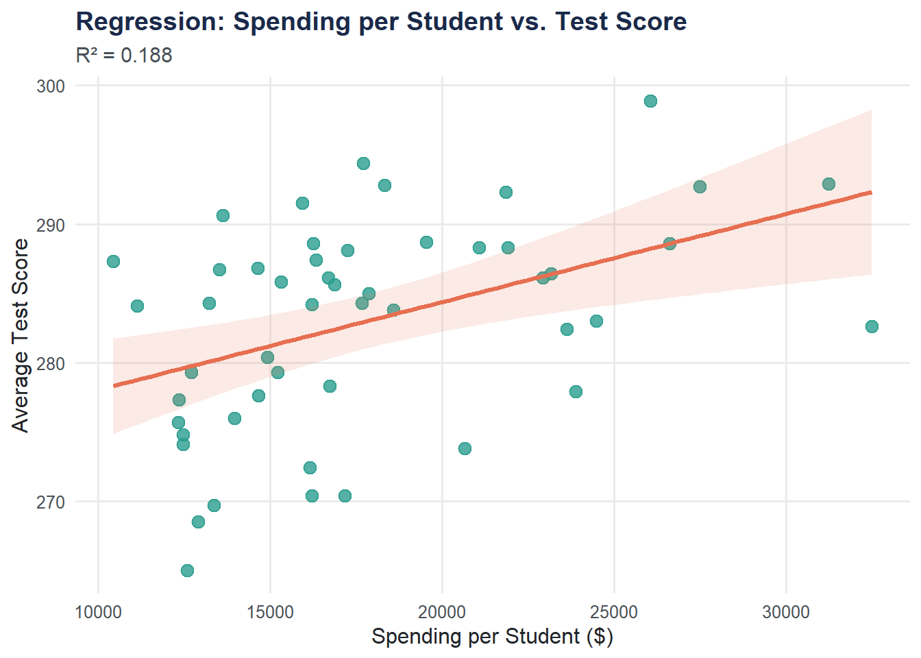
The shaded band shows the 95% confidence interval for the regression line.
Residual Plot
A residual plot checks whether the linear model is appropriate. We want a random scatter around zero — any pattern suggests the model is missing something.
resid_df <- data.frame(
  fitted = fitted(model),
  resid = resid(model)
)

ggplot(resid_df, aes(x = fitted, y = resid)) +
  geom_point(size = 3, color = moe_colors$navy, alpha = 0.7) +
  geom_hline(yintercept = 0, linetype = "dashed", color = moe_colors$coral) +
  labs(
    title = "Residual Plot",
    subtitle = "Look for random scatter around zero",
    x = "Fitted Values",
    y = "Residuals"
  ) +
  theme_moe()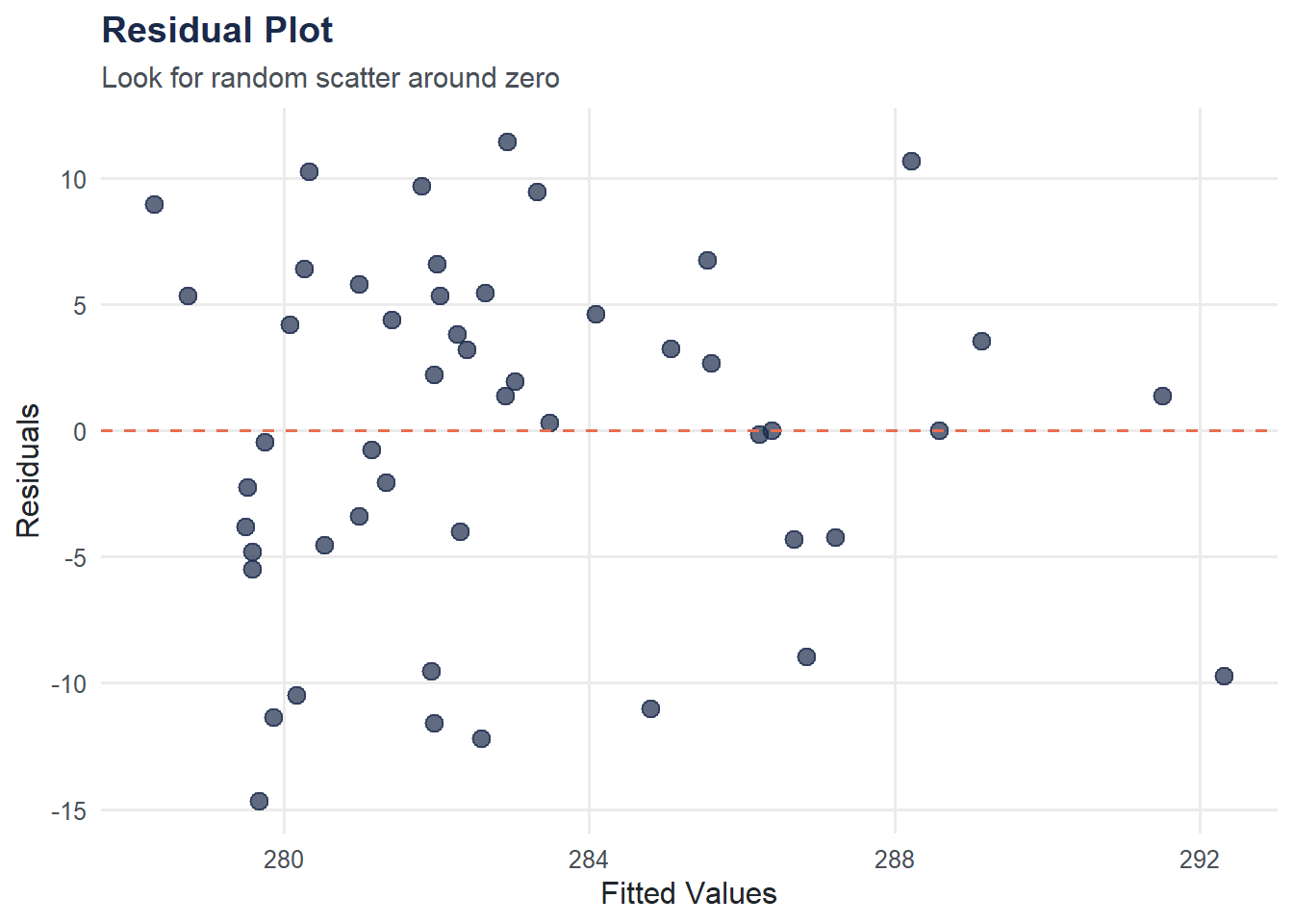
Prediction
We can use the model to predict the average score for a hypothetical state that spends $15,000 per student.
new_data <- data.frame(spending_per_student = 15000)
pred <- predict(model, newdata = new_data, interval = "confidence")
cat("Predicted avg_score at $15,000 spending:", round(pred[1], 1), "\n")
Predicted avg_score at $15,000 spending: 281.2 cat("95% confidence interval:", round(pred[2], 1), "to", round(pred[3], 1), "\n")95% confidence interval: 279 to 283.4 A warning about extrapolation: predictions are only reliable within (or near) the range of observed data. Predicting for a spending level of $50,000 would be extrapolation — the linear relationship may not hold that far out.
Try It Yourself
Poverty model. Fit a regression of
avg_scoreonpct_povertyusinglm(avg_score ~ pct_poverty, data = education). Is the relationship positive or negative? Does the direction make intuitive sense?Compare R-squared values. Look at the R-squared from the spending model and the poverty model. Which predictor explains more variation in test scores? What might that tell us about the drivers of student achievement?