# Loads tidyverse, book color palette, and theme_moe()
# Download _common.R from the Datasets page if running locally
source("_common.R")Chapter 3: Summarizing Data with Numbers
Overview
A good numerical summary captures the center, spread, and shape of a distribution in just a few numbers. In this walkthrough, we use household income data to see how different summary statistics tell different stories — and why choosing the right one matters. This walkthrough accompanies Chapter 3 of Margin of Error.
Setup
Load and Explore the Data
The dataset contains 500 households with income, education level, household size, and geographic region.
income <- read_csv("data/income-inequality.csv")Rows: 500 Columns: 6
── Column specification ────────────────────────────────────────────────────────
Delimiter: ","
chr (3): state, education_level, region
dbl (3): household_id, household_income, household_size
ℹ Use `spec()` to retrieve the full column specification for this data.
ℹ Specify the column types or set `show_col_types = FALSE` to quiet this message.glimpse(income)Rows: 500
Columns: 6
$ household_id <dbl> 1, 2, 3, 4, 5, 6, 7, 8, 9, 10, 11, 12, 13, 14, 15, 16…
$ state <chr> "Oklahoma", "Virginia", "Washington", "Washington", "…
$ household_income <dbl> 70800, 37000, 31100, 88500, 136000, 32700, 126000, 27…
$ education_level <chr> "Master", "High School", "Bachelor", "Master", "High …
$ household_size <dbl> 4, 2, 1, 2, 5, 1, 3, 2, 2, 2, 5, 3, 1, 2, 1, 2, 2, 4,…
$ region <chr> "Southwest", "Southeast", "West", "West", "West", "So…summary(income$household_income) Min. 1st Qu. Median Mean 3rd Qu. Max.
10000 35250 66200 105676 136425 1140800 Measures of Center
The mean and median answer the question “What’s typical?” — but they can give very different answers when the distribution is skewed.
income_mean <- mean(income$household_income, na.rm = TRUE)
income_median <- median(income$household_income, na.rm = TRUE)

cat("Mean household income:   $", format(round(income_mean), big.mark = ","), "\n")
Mean household income: $ 105,676 cat("Median household income: $", format(round(income_median), big.mark = ","), "\n")Median household income: $ 66,200 cat("Difference (mean - median): $", format(round(income_mean - income_median), big.mark = ","), "\n")Difference (mean - median): $ 39,476 When the mean is substantially larger than the median, the distribution is right-skewed — a few very high incomes pull the mean upward while the median stays anchored in the middle of the data.
Measures of Spread
Spread tells you how much variation exists. Two distributions can have the same center but very different spreads.
income_sd <- sd(income$household_income, na.rm = TRUE)
income_iqr <- IQR(income$household_income, na.rm = TRUE)
income_range <- range(income$household_income, na.rm = TRUE)

cat("Standard deviation: $", format(round(income_sd), big.mark = ","), "\n")
Standard deviation: $ 117,582 cat("IQR: $", format(round(income_iqr), big.mark = ","), "\n")IQR: $ 101,175 cat("Range: $", format(round(income_range[1]), big.mark = ","),
"to $", format(round(income_range[2]), big.mark = ","), "\n")Range: $ 10,000 to $ 1,140,800 Five-Number Summary
The five-number summary (minimum, Q1, median, Q3, maximum) gives a compact picture of the entire distribution.
quantile(income$household_income, na.rm = TRUE) 0% 25% 50% 75% 100%
10000 35250 66200 136425 1140800 fivenum(income$household_income)[1] 10000 35200 66200 136850 1140800Skewness: Comparing Mean and Median
ggplot(income, aes(x = household_income)) +
  geom_histogram(binwidth = 10000, fill = moe_colors$teal, color = "white") +
  geom_vline(xintercept = income_mean, linetype = "dashed",
             linewidth = 1, color = moe_colors$coral) +
  geom_vline(xintercept = income_median, linetype = "solid",
             linewidth = 1, color = moe_colors$navy) +
  annotate("text", x = income_mean + 5000, y = Inf, label = "Mean",
           vjust = 2, color = moe_colors$coral, fontface = "bold", size = 3.5) +
  annotate("text", x = income_median - 5000, y = Inf, label = "Median",
           vjust = 3.5, color = moe_colors$navy, fontface = "bold", size = 3.5) +
  labs(
    title = "Distribution of Household Income",
    subtitle = "Mean pulled right by high earners --- a hallmark of right skew",
    x = "Household income ($)",
    y = "Count"
  ) +
  scale_x_continuous(labels = scales::comma) +
  theme_moe()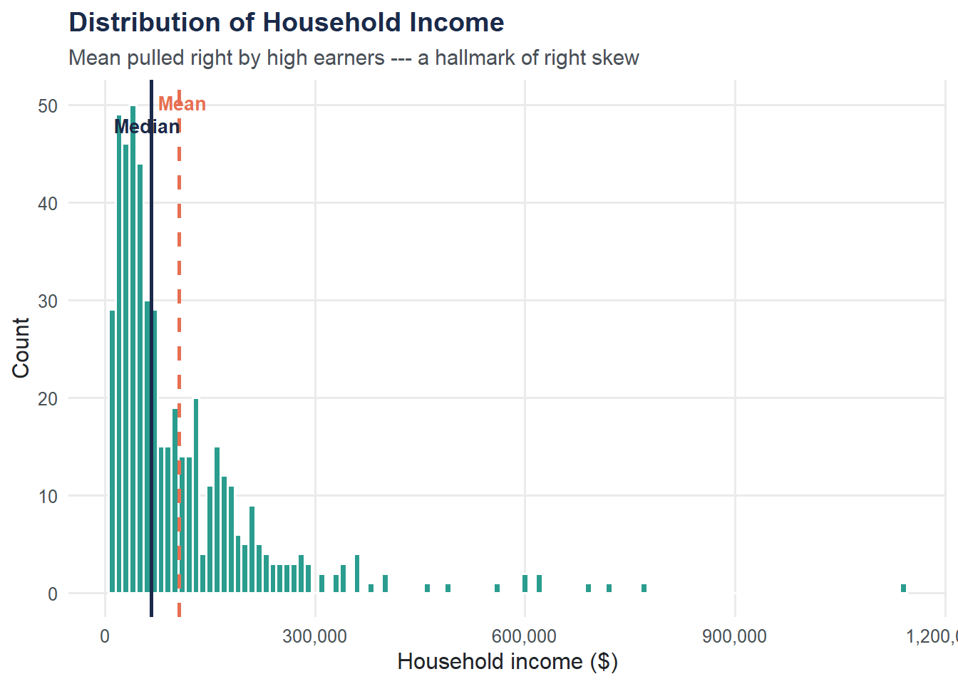
Summarize by Education Level
Does income differ by education? Grouping reveals patterns that overall summaries hide.
education_summary <- income |>
  group_by(education_level) |>
  summarize(
    n            = n(),
    mean_income  = round(mean(household_income, na.rm = TRUE)),
    median_income = round(median(household_income, na.rm = TRUE)),
    sd_income    = round(sd(household_income, na.rm = TRUE)),
    iqr_income   = round(IQR(household_income, na.rm = TRUE))
  ) |>
  arrange(desc(median_income))

education_summary
# A tibble: 4 × 6
education_level n mean_income median_income sd_income iqr_income
<chr> <int> <dbl> <dbl> <dbl> <dbl>
1 Doctorate 47 187628 137700 182029 167650
2 Master 96 171397 117700 155860 140825
3 Bachelor 157 100226 67900 92875 95700
4 High School 200 59150 41950 52739 46225ggplot(income, aes(x = reorder(education_level, household_income, FUN = median),
y = household_income, fill = education_level)) +
geom_boxplot(show.legend = FALSE, outlier.color = moe_colors$coral,
outlier.alpha = 0.6) +
scale_fill_moe() +
scale_y_continuous(labels = scales::comma) +
labs(
title = "Household Income by Education Level",
subtitle = "Higher education is associated with higher income and more spread",
x = "Education level",
y = "Household income ($)"
) +
theme_moe()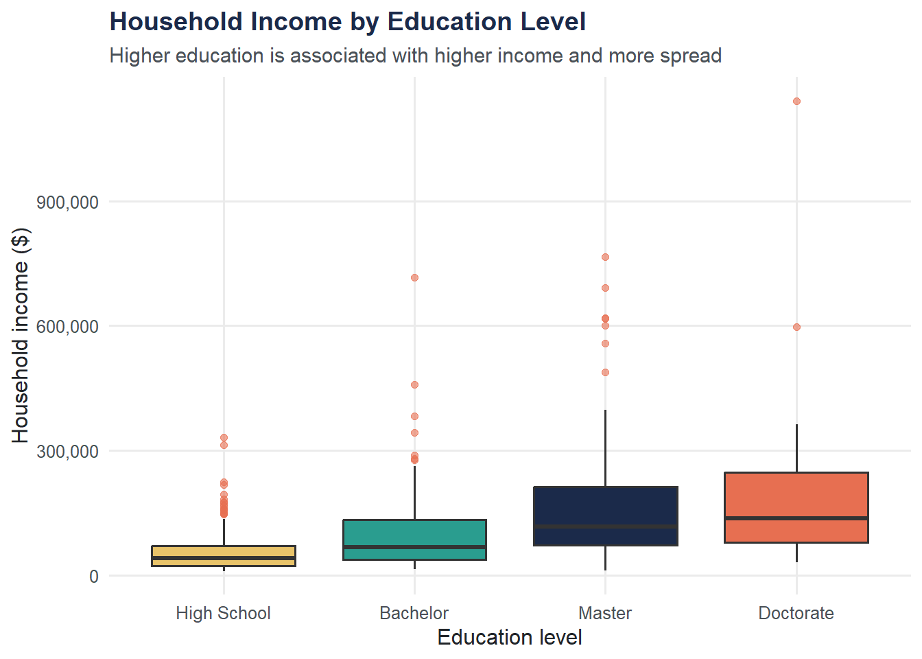
Outlier Detection Using the IQR Rule
An observation is flagged as an outlier if it falls below Q1 - 1.5 * IQR or above Q3 + 1.5 * IQR. This is exactly what a boxplot uses to draw its whiskers and points.
Q1 <- quantile(income$household_income, 0.25, na.rm = TRUE)
Q3 <- quantile(income$household_income, 0.75, na.rm = TRUE)
iqr_val <- Q3 - Q1

lower_fence <- Q1 - 1.5 * iqr_val
upper_fence <- Q3 + 1.5 * iqr_val

cat("Lower fence: $", format(round(lower_fence), big.mark = ","), "\n")
Lower fence: $ -116,512 cat("Upper fence: $", format(round(upper_fence), big.mark = ","), "\n")Upper fence: $ 288,188 outliers <- income |>
filter(household_income < lower_fence | household_income > upper_fence)
cat("Number of outliers:", nrow(outliers), "out of", nrow(income), "households\n")Number of outliers: 28 out of 500 householdscat("Percentage flagged:", round(nrow(outliers) / nrow(income) * 100, 1), "%\n")Percentage flagged: 5.6 %Try It Yourself
Regional comparison. Group the data by
regionand compute the mean, median, and IQR of household income for each region. Which region has the highest median income?Counting outliers. Using the IQR rule above, how many total outliers are flagged? Are they all on the high end, the low end, or both? What does this pattern tell you about the shape of the income distribution?