# Loads tidyverse, book color palette, and theme_moe()
# Download _common.R from the Datasets page if running locally
source("_common.R")
set.seed(42)Chapter 2: Research Design
Overview
Good research starts with good data collection. The way you draw a sample determines whether your conclusions generalize to the population you care about. In this walkthrough, we work with a dataset of 200 students and simulate four common sampling methods — simple random, stratified, cluster, and systematic — to see how each one performs. This walkthrough accompanies Chapter 2 of Margin of Error.
Setup
We set a seed so the random samples are reproducible. Change the seed to see different results.
Load and Explore the Population
Think of this dataset as the entire population of students at a small college. We know everything about them — the challenge is drawing a representative sample.
population <- read_csv("data/sampling-demo.csv")Rows: 200 Columns: 7
── Column specification ────────────────────────────────────────────────────────
Delimiter: ","
chr (5): student_id, major, year, housing, works_part_time
dbl (2): gpa, commute_distance_miles
ℹ Use `spec()` to retrieve the full column specification for this data.
ℹ Specify the column types or set `show_col_types = FALSE` to quiet this message.glimpse(population)Rows: 200
Columns: 7
$ student_id <chr> "S001", "S002", "S003", "S004", "S005", "S006",…
$ major <chr> "Engineering", "Engineering", "Sciences", "Scie…
$ gpa <dbl> 3.57, 2.13, 3.05, 3.37, 2.79, 3.23, 2.79, 2.86,…
$ year <chr> "Senior", "Sophomore", "Sophomore", "Freshman",…
$ commute_distance_miles <dbl> 0.5, 2.7, 0.5, 0.8, 6.3, 2.5, 0.7, 7.1, 0.8, 5.…
$ housing <chr> "On-campus", "On-campus", "On-campus", "Off-cam…
$ works_part_time <chr> "No", "Yes", "Yes", "No", "Yes", "No", "Yes", "…cat("Population size:", nrow(population), "\n")Population size: 200 cat("Population mean GPA:", round(mean(population$gpa), 3), "\n")Population mean GPA: 3.139 cat("Majors:", paste(unique(population$major), collapse = ", "), "\n")Majors: Engineering, Sciences, Liberal Arts, Business, Nursing population |>
count(major) |>
mutate(pct = round(n / sum(n) * 100, 1))# A tibble: 5 × 3
major n pct
<chr> <int> <dbl>
1 Business 38 19
2 Engineering 53 26.5
3 Liberal Arts 37 18.5
4 Nursing 27 13.5
5 Sciences 45 22.5Method 1: Simple Random Sample (SRS)
Every student has an equal chance of being selected. This is the gold standard — and the baseline against which we compare other methods.
srs <- population |>
  slice_sample(n = 40)

cat("SRS mean GPA:", round(mean(srs$gpa), 3), "\n")
SRS mean GPA: 3.232 srs |>
count(major) |>
mutate(pct = round(n / sum(n) * 100, 1))# A tibble: 5 × 3
major n pct
<chr> <int> <dbl>
1 Business 8 20
2 Engineering 12 30
3 Liberal Arts 4 10
4 Nursing 4 10
5 Sciences 12 30Method 2: Stratified Sample
We divide the population into strata (groups) by major and sample equally from each. This guarantees every major is represented.
stratified <- population |>
  group_by(major) |>
  slice_sample(n = 8) |>
  ungroup()

cat("Stratified mean GPA:", round(mean(stratified$gpa), 3), "\n")
Stratified mean GPA: 3.079 stratified |>
count(major) |>
mutate(pct = round(n / sum(n) * 100, 1))# A tibble: 5 × 3
major n pct
<chr> <int> <dbl>
1 Business 8 20
2 Engineering 8 20
3 Liberal Arts 8 20
4 Nursing 8 20
5 Sciences 8 20Method 3: Cluster Sample
Instead of sampling individuals, we randomly select entire clusters (here, majors) and include all students in those clusters.
selected_majors <- sample(unique(population$major), 2)
cat("Selected clusters:", paste(selected_majors, collapse = ", "), "\n")
Selected clusters: Business, Sciences cluster <- population |>
filter(major %in% selected_majors)
cat("Cluster sample size:", nrow(cluster), "\n")Cluster sample size: 83 cat("Cluster mean GPA:", round(mean(cluster$gpa), 3), "\n")Cluster mean GPA: 3.14 Method 4: Systematic Sample
Pick a random starting point, then take every kth student. With 200 students and a target of 40, we sample every 5th student.
k <- 5
start <- sample(1:k, 1)
cat("Starting at student:", start, "\n")
Starting at student: 2 systematic <- population |>
slice(seq(start, nrow(population), by = k))
cat("Systematic sample size:", nrow(systematic), "\n")Systematic sample size: 40 cat("Systematic mean GPA:", round(mean(systematic$gpa), 3), "\n")Systematic mean GPA: 3.119 Compare the Methods
How close does each method get to the true population mean GPA?
comparison <- tibble(
  method = c("Population", "Simple Random", "Stratified", "Cluster", "Systematic"),
  mean_gpa = c(
    mean(population$gpa),
    mean(srs$gpa),
    mean(stratified$gpa),
    mean(cluster$gpa),
    mean(systematic$gpa)
  ),
  n = c(nrow(population), nrow(srs), nrow(stratified),
        nrow(cluster), nrow(systematic))
)

comparison |>
  mutate(mean_gpa = round(mean_gpa, 3))
# A tibble: 5 × 3
method mean_gpa n
<chr> <dbl> <int>
1 Population 3.14 200
2 Simple Random 3.23 40
3 Stratified 3.08 40
4 Cluster 3.14 83
5 Systematic 3.12 40Visualize: Major Distribution Across Methods
A good sample mirrors the population’s composition. Let’s compare how each method represents the majors.
bind_rows(
  population |> mutate(method = "Population"),
  srs |> mutate(method = "Simple Random"),
  stratified |> mutate(method = "Stratified"),
  cluster |> mutate(method = "Cluster"),
  systematic |> mutate(method = "Systematic")
) |>
  count(method, major) |>
  group_by(method) |>
  mutate(pct = n / sum(n) * 100) |>
  ungroup() |>
  mutate(method = factor(method,
    levels = c("Population", "Simple Random", "Stratified",
               "Cluster", "Systematic"))) |>
  ggplot(aes(x = major, y = pct, fill = major)) +
  geom_col(show.legend = FALSE) +
  facet_wrap(~ method, ncol = 1) +
  scale_fill_moe() +
  labs(
    title = "How Well Does Each Sample Represent the Population?",
    subtitle = "Percentage of students by major across sampling methods",
    x = "Major",
    y = "Percentage"
  ) +
  theme_moe() +
  theme(axis.text.x = element_text(angle = 45, hjust = 1))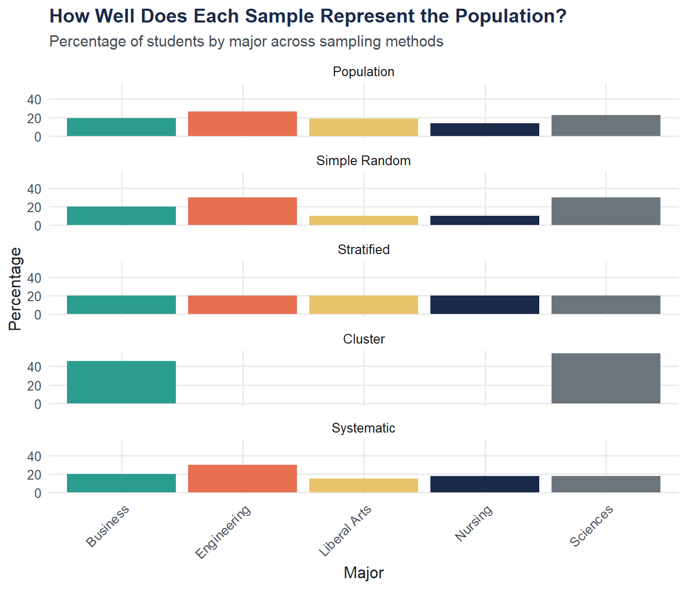
Try It Yourself
Sampling variability. Run the SRS code multiple times (change the seed each time with
set.seed()). Record the mean GPA from each run. How much does the mean vary from sample to sample? What does this tell you about sampling error?Best representation. Looking at the bar chart above, which sampling method produces a major distribution that most closely matches the population? Why might that be?