# Loads tidyverse, book color palette, and theme_moe()
# Download _common.R from the Datasets page if running locally
source("_common.R")Chapter 6: The Normal Distribution and CLT
Overview
The normal distribution is the backbone of statistical inference. Its bell-shaped curve appears everywhere — from measurement error to test scores — and the Central Limit Theorem (CLT) explains why. In this walkthrough, we explore the normal distribution’s properties and watch the CLT turn a skewed population into a beautifully normal sampling distribution. This walkthrough accompanies Chapter 6 of Margin of Error.
Setup
Working with the Normal Distribution in R
R provides four functions for any distribution. For the normal: dnorm() (density), pnorm() (cumulative probability), qnorm() (quantiles), and rnorm() (random draws).
# Density at z = 0
cat("dnorm(0):", dnorm(0), "\n")
dnorm(0): 0.3989423 # P(Z < 1.96) --- the famous 97.5th percentile
cat("pnorm(1.96):", round(pnorm(1.96), 4), "\n")pnorm(1.96): 0.975 # What z-value cuts off the top 5%?
cat("qnorm(0.95):", round(qnorm(0.95), 4), "\n")qnorm(0.95): 1.6449 # Generate 5 random standard normal values
set.seed(42)
cat("rnorm(5):", round(rnorm(5), 3), "\n")rnorm(5): 1.371 -0.565 0.363 0.633 0.404 Plotting the Standard Normal Curve
ggplot(data = tibble(x = c(-4, 4)), aes(x = x)) +
  stat_function(fun = dnorm, linewidth = 1, color = moe_colors$navy) +
  labs(
    title = "The Standard Normal Distribution",
    subtitle = "Mean = 0, Standard Deviation = 1",
    x = "z",
    y = "Density"
  ) +
  theme_moe()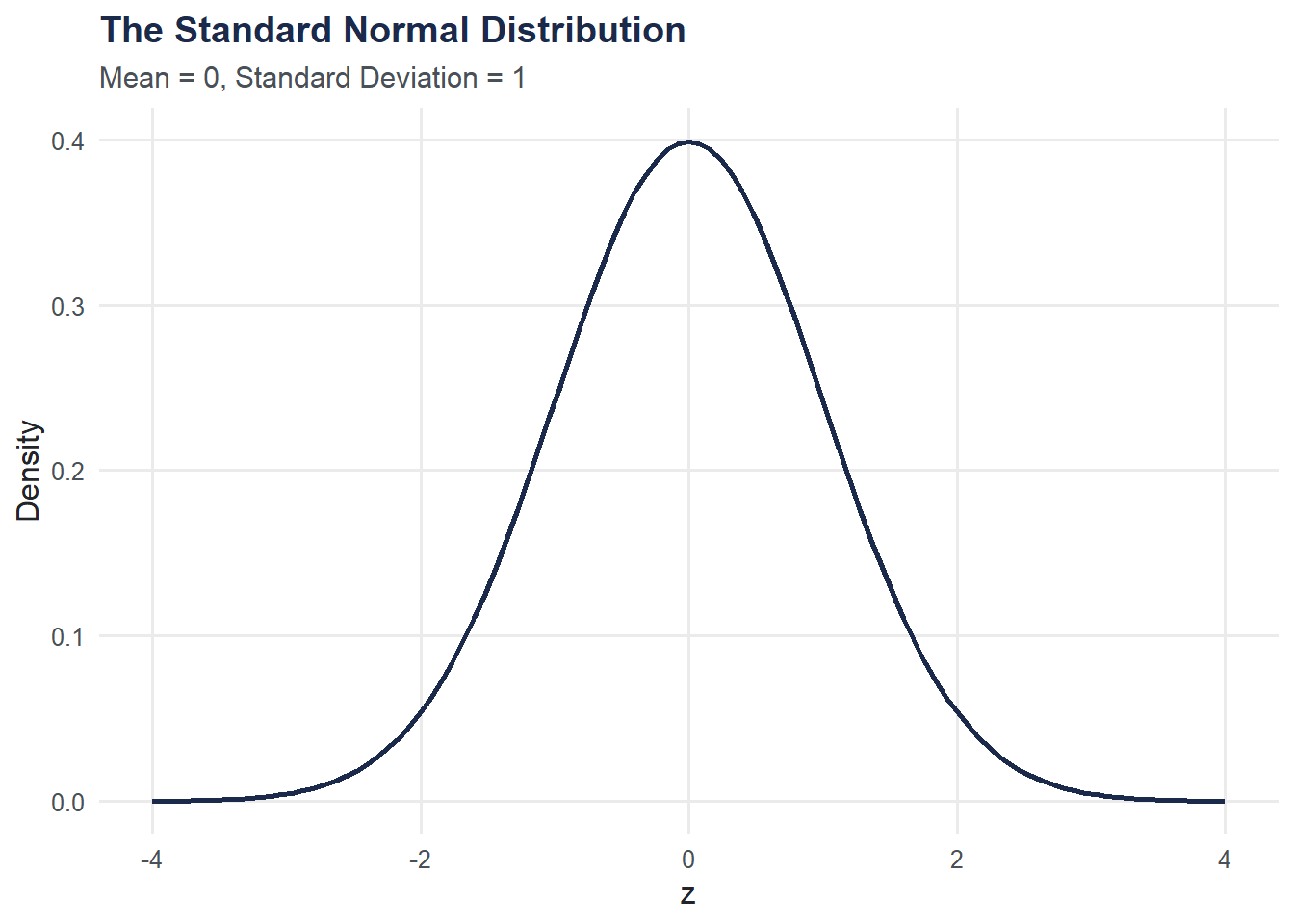
Shading Areas Under the Curve
The area under the curve represents probability. Let’s shade P(-1 < Z < 1), which is about 68%, and P(Z < 1.96), which is about 97.5%.
shade_data <- tibble(
  x = seq(-1, 1, length.out = 200),
  y = dnorm(x)
)

ggplot(data = tibble(x = c(-4, 4)), aes(x = x)) +
  stat_function(fun = dnorm, linewidth = 1, color = moe_colors$navy) +
  geom_area(data = shade_data, aes(x = x, y = y),
            fill = moe_colors$teal, alpha = 0.4) +
  annotate("text", x = 0, y = 0.15, label = "68.3%",
           color = moe_colors$navy, fontface = "bold", size = 5) +
  labs(
    title = "Area Between z = -1 and z = 1",
    subtitle = "About 68% of values fall within 1 SD of the mean",
    x = "z",
    y = "Density"
  ) +
  theme_moe()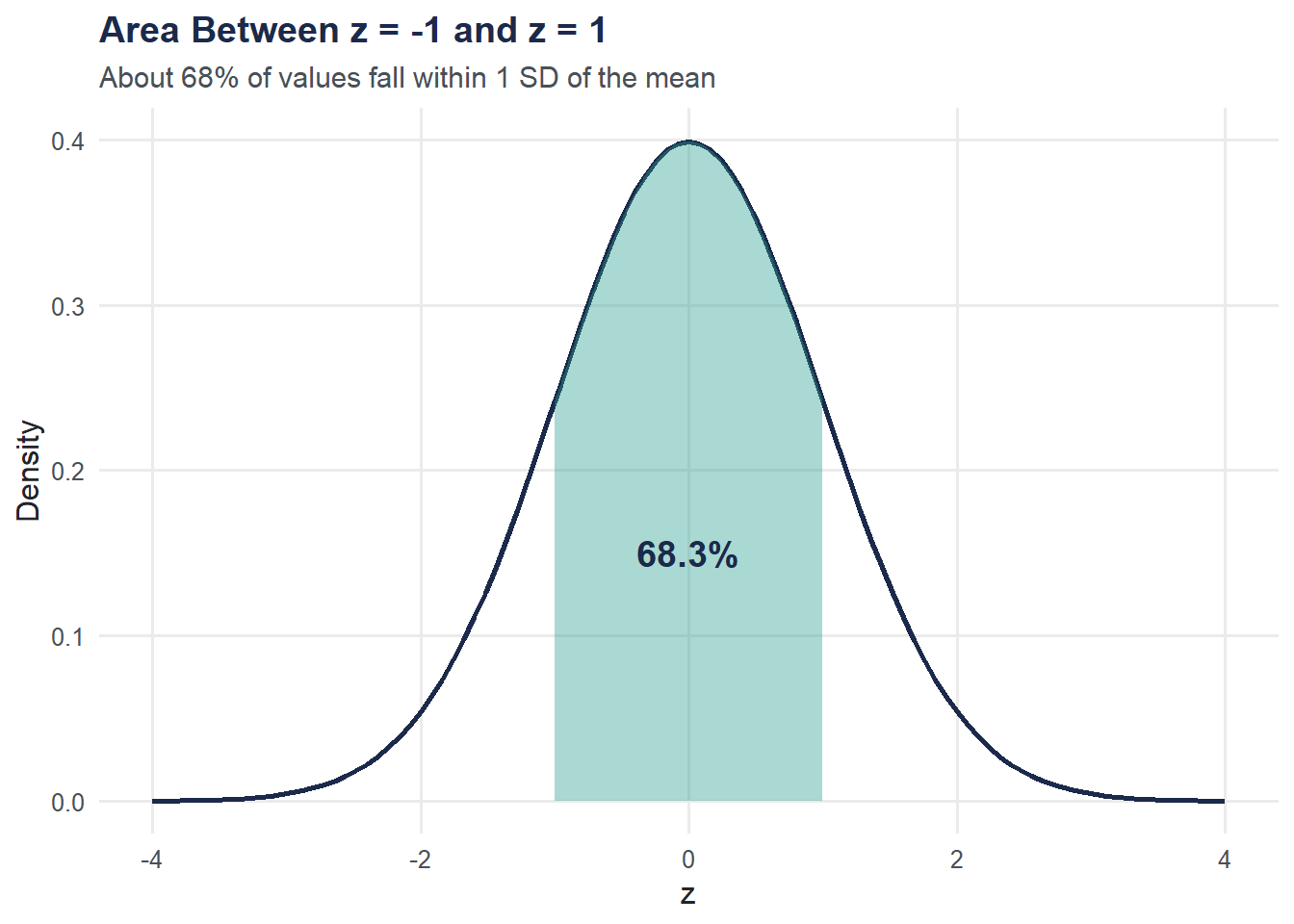
Verify with pnorm():
cat("P(-1 < Z < 1):", round(pnorm(1) - pnorm(-1), 4), "\n")P(-1 < Z < 1): 0.6827 z-Scores: From Raw Values to Probabilities
If IQ scores have mean = 100 and SD = 15, what proportion of people score above 120?
mean_iq <- 100
sd_iq <- 15
x <- 120

z <- (x - mean_iq) / sd_iq
cat("z-score for IQ = 120:", round(z, 3), "\n")
z-score for IQ = 120: 1.333 p_above <- 1 - pnorm(x, mean = mean_iq, sd = sd_iq)
cat("P(IQ > 120):", round(p_above, 4), "\n")P(IQ > 120): 0.0912 cat("That's about", round(p_above * 100, 1), "% of the population.\n")That's about 9.1 % of the population.QQ Plots: Checking Normality
A QQ plot compares your data’s quantiles to what you’d expect from a normal distribution. If the points follow the diagonal line, the data are approximately normal.
set.seed(42)
qq_data <- tibble(
  value = c(rnorm(200, mean = 50, sd = 10), rexp(200, rate = 0.1)),
  distribution = rep(c("Normal", "Right-Skewed (Exponential)"), each = 200)
)

ggplot(qq_data, aes(sample = value)) +
  stat_qq(color = moe_colors$teal, size = 1, alpha = 0.6) +
  stat_qq_line(color = moe_colors$coral, linewidth = 0.8) +
  facet_wrap(~ distribution, scales = "free") +
  labs(
    title = "QQ Plots: Normal vs. Skewed Data",
    subtitle = "Points on the line = normal; curvature = departure from normality",
    x = "Theoretical quantiles",
    y = "Sample quantiles"
  ) +
  theme_moe()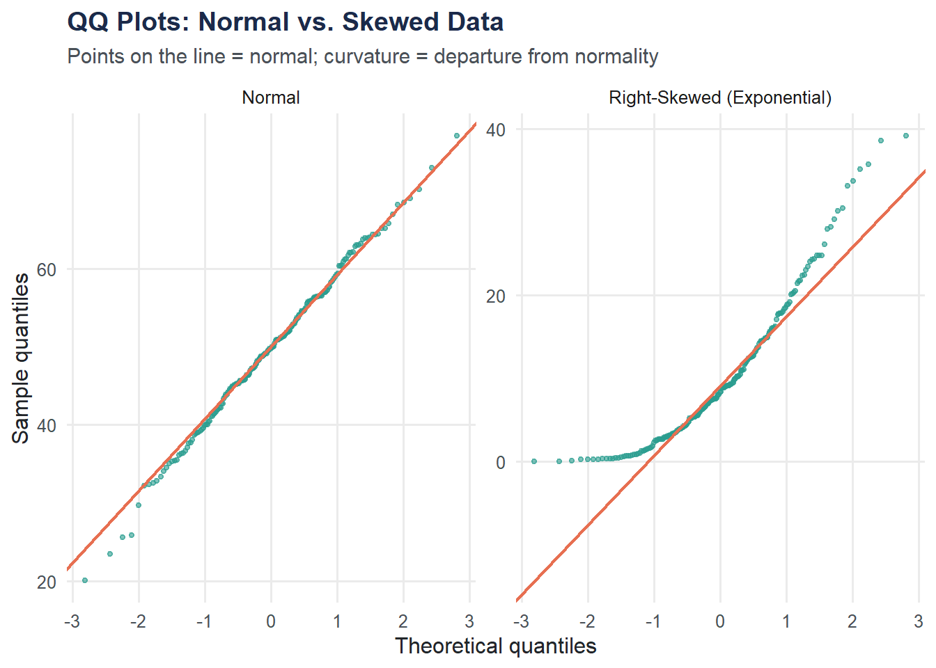
The normal data hugs the line. The exponential data curves away, especially in the upper tail — a signature of right skew.
Central Limit Theorem: Simulation
The CLT says that the sampling distribution of the mean is approximately normal, regardless of the population shape, as long as the sample size is large enough. Let’s demonstrate this using an exponential (right-skewed) population.
set.seed(42)
n_samples <- 1000
sample_size <- 30
rate <- 0.1  # Exponential rate; population mean = 1/rate = 10

sample_means <- replicate(n_samples, mean(rexp(sample_size, rate = rate)))

clt_data <- tibble(sample_mean = sample_means)

ggplot(clt_data, aes(x = sample_mean)) +
  geom_histogram(aes(y = after_stat(density)), bins = 40,
                 fill = moe_colors$teal, color = "white", alpha = 0.8) +
  stat_function(fun = dnorm,
                args = list(mean = 1/rate, sd = (1/rate)/sqrt(sample_size)),
                color = moe_colors$coral, linewidth = 1, linetype = "dashed") +
  labs(
    title = "Central Limit Theorem in Action",
    subtitle = "1,000 sample means (n = 30) from a right-skewed exponential population",
    x = "Sample mean",
    y = "Density"
  ) +
  theme_moe()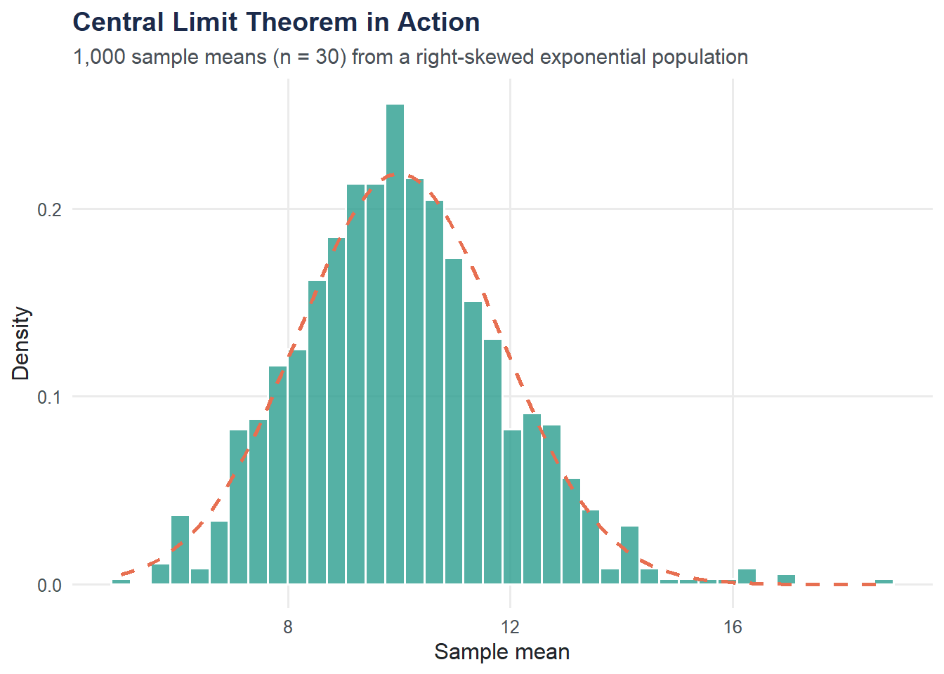
Even though the exponential distribution is heavily right-skewed, the distribution of sample means is nearly bell-shaped. The dashed curve is the theoretical normal approximation.
CLT Convergence: Varying Sample Size
How large does the sample need to be? Let’s try n = 5, 15, 30, and 50 and compare.
set.seed(42)
sample_sizes <- c(5, 15, 30, 50)

clt_vary <- map_dfr(sample_sizes, function(n) {
  means <- replicate(1000, mean(rexp(n, rate = rate)))
  tibble(sample_mean = means, n = paste("n =", n))
})

clt_vary$n <- factor(clt_vary$n, levels = paste("n =", sample_sizes))

ggplot(clt_vary, aes(x = sample_mean)) +
  geom_histogram(aes(y = after_stat(density)), bins = 35,
                 fill = moe_colors$navy, color = "white", alpha = 0.8) +
  facet_wrap(~ n, scales = "free_y") +
  labs(
    title = "CLT Convergence Across Sample Sizes",
    subtitle = "Sampling from an exponential population (mean = 10)",
    x = "Sample mean",
    y = "Density"
  ) +
  theme_moe()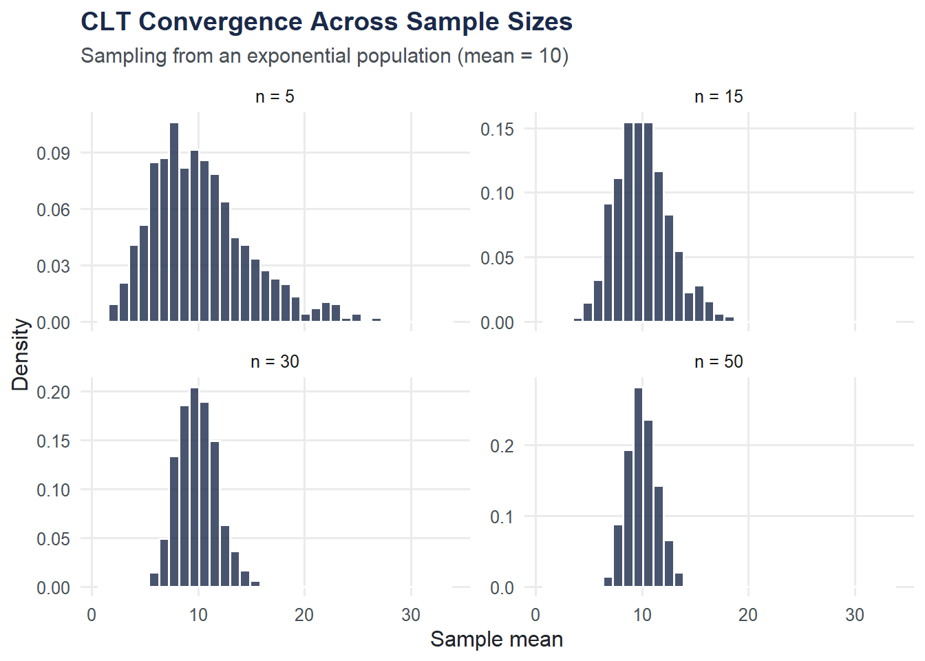
At n = 5 the distribution is still visibly skewed. By n = 30 it is close to normal. By n = 50 the approximation is excellent.
Try It Yourself
The 95% rule. What proportion of the standard normal distribution falls within 2 standard deviations of the mean? Use
pnorm(2) - pnorm(-2)to verify whether it is exactly 95% or just close to it.CLT with a uniform distribution. Repeat the CLT simulation using
runif(n, min = 0, max = 1)instead ofrexp(). The uniform distribution is symmetric, not skewed. Does the sampling distribution of the mean still become normal? How does the convergence speed compare to the exponential case?