# Loads tidyverse, book color palette, and theme_moe()
# Download _common.R from the Datasets page if running locally
source("_common.R")Chapter 4: Summarizing Data with Pictures
Overview
The right chart reveals what tables hide. In this walkthrough, we visualize the lasting effects of 1930s redlining on neighborhood demographics. The Home Owners’ Loan Corporation (HOLC) graded neighborhoods from A (“Best”) to D (“Hazardous”), and those grades shaped investment, housing, and racial composition for decades. We use histograms, density plots, boxplots, bar charts, and scatter plots to tell that story. This walkthrough accompanies Chapter 4 of Margin of Error.
Setup
Load and Explore the Data
The dataset contains 551 neighborhoods across multiple metro areas, each with a HOLC grade and demographic percentages.
housing <- read_csv("data/housing-redlining.csv")Rows: 551 Columns: 9
── Column specification ────────────────────────────────────────────────────────
Delimiter: ","
chr (2): metro_area, holc_grade
dbl (7): neighborhood_id, total_population, pct_white, pct_black, pct_hispan...
ℹ Use `spec()` to retrieve the full column specification for this data.
ℹ Specify the column types or set `show_col_types = FALSE` to quiet this message.glimpse(housing)Rows: 551
Columns: 9
$ neighborhood_id <dbl> 1, 2, 3, 4, 5, 6, 7, 8, 9, 10, 11, 12, 13, 14, 15, 16…
$ metro_area <chr> "Akron, OH", "Akron, OH", "Akron, OH", "Akron, OH", "…
$ holc_grade <chr> "A", "B", "C", "D", "A", "B", "C", "D", "A", "B", "C"…
$ total_population <dbl> 36963, 67816, 112694, 15144, 23303, 45230, 101538, 49…
$ pct_white <dbl> 66.8, 61.2, 64.9, 40.8, 72.9, 58.9, 56.0, 33.9, 66.6,…
$ pct_black <dbl> 23.3, 24.3, 20.3, 45.7, 7.8, 15.7, 16.5, 39.4, 4.4, 6…
$ pct_hispanic <dbl> 2.6, 3.3, 2.8, 3.8, 5.6, 9.6, 10.2, 13.5, 22.7, 27.6,…
$ pct_asian <dbl> 1.9, 5.0, 5.6, 3.0, 8.6, 5.6, 6.3, 4.4, 1.3, 2.5, 2.1…
$ pct_minority <dbl> 33.2, 38.8, 35.1, 59.2, 27.1, 41.1, 44.0, 66.1, 33.4,…housing |>
count(holc_grade) |>
mutate(pct = round(n / sum(n) * 100, 1))# A tibble: 4 × 3
holc_grade n pct
<chr> <int> <dbl>
1 A 138 25
2 B 138 25
3 C 137 24.9
4 D 138 25 HOLC grades run from A (the “best” neighborhoods, which received the most investment) to D (the “hazardous” neighborhoods, which were systematically denied lending). Let’s make sure the grade variable is ordered correctly for all our plots.
housing <- housing |>
  mutate(holc_grade = factor(holc_grade, levels = c("A", "B", "C", "D")))
Histogram: Minority Percentage Across All Neighborhoods
A histogram shows the overall shape of a single variable. Here we look at the distribution of minority population share.
ggplot(housing, aes(x = pct_minority)) +
  geom_histogram(binwidth = 5, fill = moe_colors$teal, color = "white") +
  labs(
    title = "Minority Population Share Across Neighborhoods",
    subtitle = "Many neighborhoods cluster at low or high minority percentages",
    x = "Minority population (%)",
    y = "Number of neighborhoods"
  ) +
  theme_moe()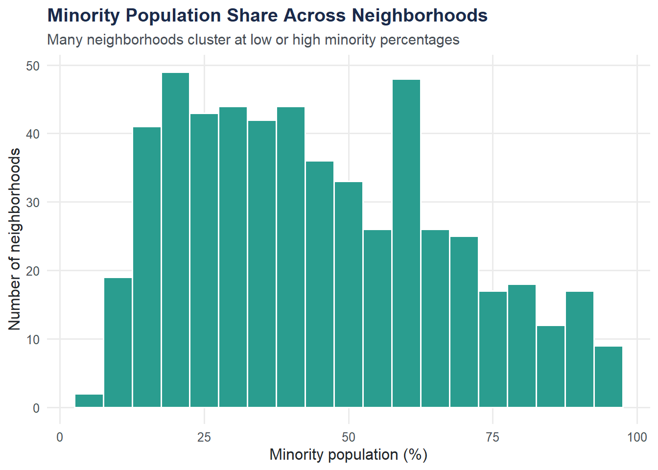
Density Plot by HOLC Grade
Overlaid density curves let us compare distributions across groups on the same axes. The shape differences tell the story.
ggplot(housing, aes(x = pct_minority, fill = holc_grade)) +
  geom_density(alpha = 0.5) +
  scale_fill_moe() +
  labs(
    title = "Minority Population by HOLC Grade",
    subtitle = "Grade D neighborhoods have far higher minority populations",
    x = "Minority population (%)",
    y = "Density",
    fill = "HOLC grade"
  ) +
  theme_moe()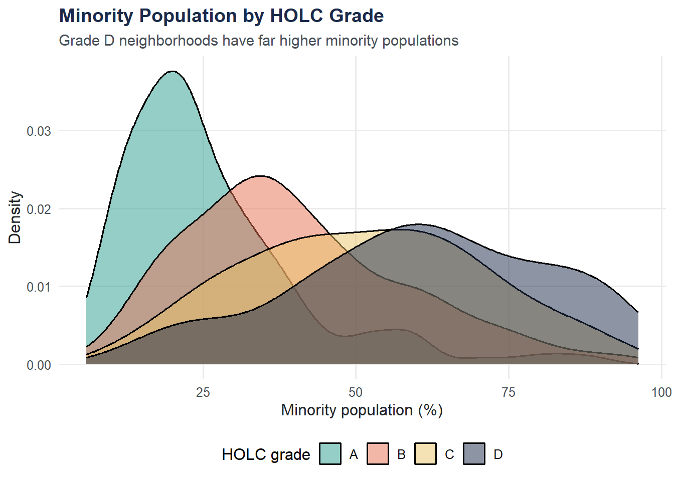
Boxplot by HOLC Grade
Boxplots summarize center, spread, and outliers in a compact form. They make group comparisons immediate.
ggplot(housing, aes(x = holc_grade, y = pct_minority, fill = holc_grade)) +
  geom_boxplot(show.legend = FALSE, outlier.color = moe_colors$coral,
               outlier.alpha = 0.6) +
  scale_fill_moe() +
  labs(
    title = "Minority Population by HOLC Grade",
    subtitle = "Systematic differences across neighborhood grades",
    x = "HOLC grade",
    y = "Minority population (%)"
  ) +
  theme_moe()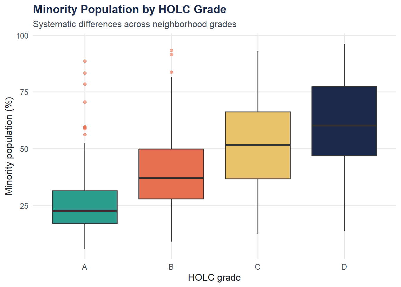
Bar Chart: Mean Minority Percentage by Grade
A bar chart of group means distills each group down to a single number. Useful for quick comparisons, but remember — it hides the spread.
housing |>
  group_by(holc_grade) |>
  summarize(mean_minority = mean(pct_minority, na.rm = TRUE)) |>
  ggplot(aes(x = holc_grade, y = mean_minority, fill = holc_grade)) +
  geom_col(show.legend = FALSE) +
  scale_fill_moe() +
  labs(
    title = "Average Minority Population by HOLC Grade",
    subtitle = "The pattern is stark: lower grades correlate with higher minority share",
    x = "HOLC grade",
    y = "Mean minority population (%)"
  ) +
  theme_moe()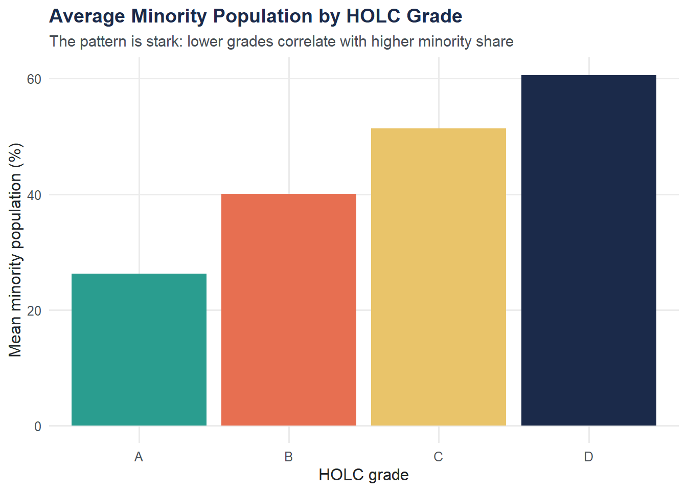
Scatter Plot: White vs. Black Population Share
A scatter plot reveals the relationship between two continuous variables. Color-coding by HOLC grade adds a third dimension.
ggplot(housing, aes(x = pct_white, y = pct_black, color = holc_grade)) +
  geom_point(alpha = 0.6, size = 2) +
  scale_color_moe() +
  labs(
    title = "White vs. Black Population Share by HOLC Grade",
    subtitle = "Grade A neighborhoods are overwhelmingly white; Grade D neighborhoods are not",
    x = "White population (%)",
    y = "Black population (%)",
    color = "HOLC grade"
  ) +
  theme_moe()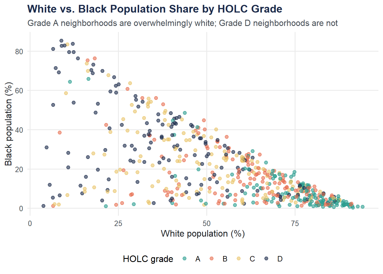
Correlation
Correlation quantifies the linear relationship between two variables. A value near -1 or +1 means a strong linear pattern; near 0 means little linear association.
cor_white_minority <- cor(housing$pct_white, housing$pct_minority, use = "complete.obs")
cat("Correlation between pct_white and pct_minority:", round(cor_white_minority, 3), "\n")
Correlation between pct_white and pct_minority: -1 This strong negative correlation is expected: as the white share increases, the minority share decreases (since minority percentage is defined as the complement of white percentage plus any overlap in categories).
Try It Yourself
Violin plot. Replace the boxplot above with a violin plot using
geom_violin(). What does the violin shape reveal about the distribution within each HOLC grade that the boxplot hides?Numeric HOLC grade. Create a numeric version of HOLC grade (A = 1, B = 2, C = 3, D = 4) and calculate the correlation between this numeric grade and
pct_minority. Is the relationship positive or negative? What does the magnitude tell you?Hint: You can convert with
as.numeric(housing$holc_grade)since we already set the factor levels in order.